Making shift happen.
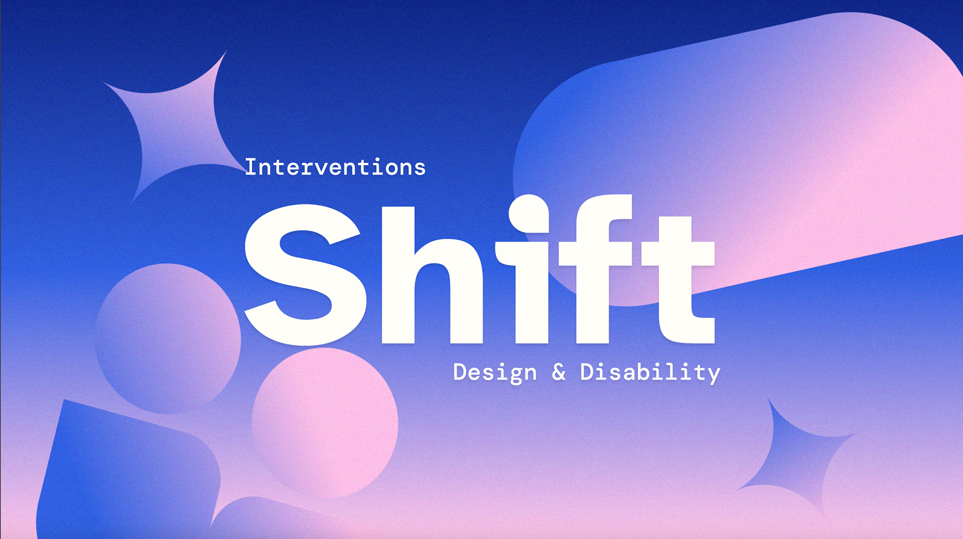
Interventions: Shift is a one-day design conference where ideas spark, disciplines unite, and disability takes center stage as a lens to reimagine our world. The conference's theme of design & disability explores how accessibility, inclusion, and co-design with disabled communities can reshape the way we create.
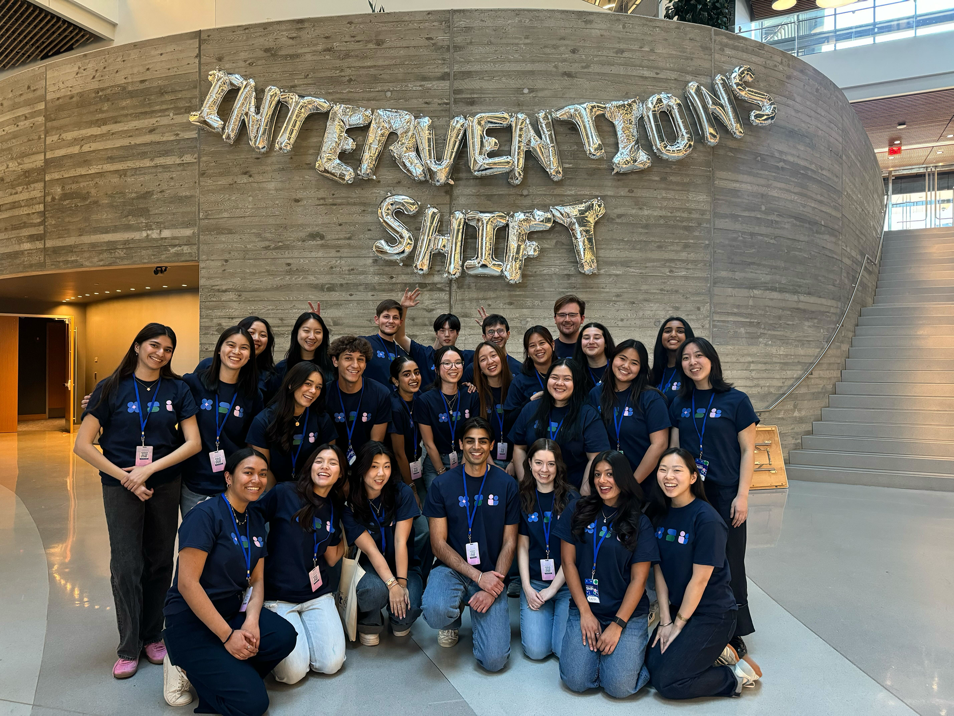
As a designer on the conference team, I played a key role in bringing Shift to life by developing and executing a cohesive brand identity from concept to completion.
Design Team: Brendan DiTullio, Jamie Tishkoff, Amie Chen, Erin Lee, Olivia Champagne, Tina Vo, Maddy Chang, Devina Mogha
Role
Designer
Tools
Adobe Suite, Figma
Organization
Scout

Goal
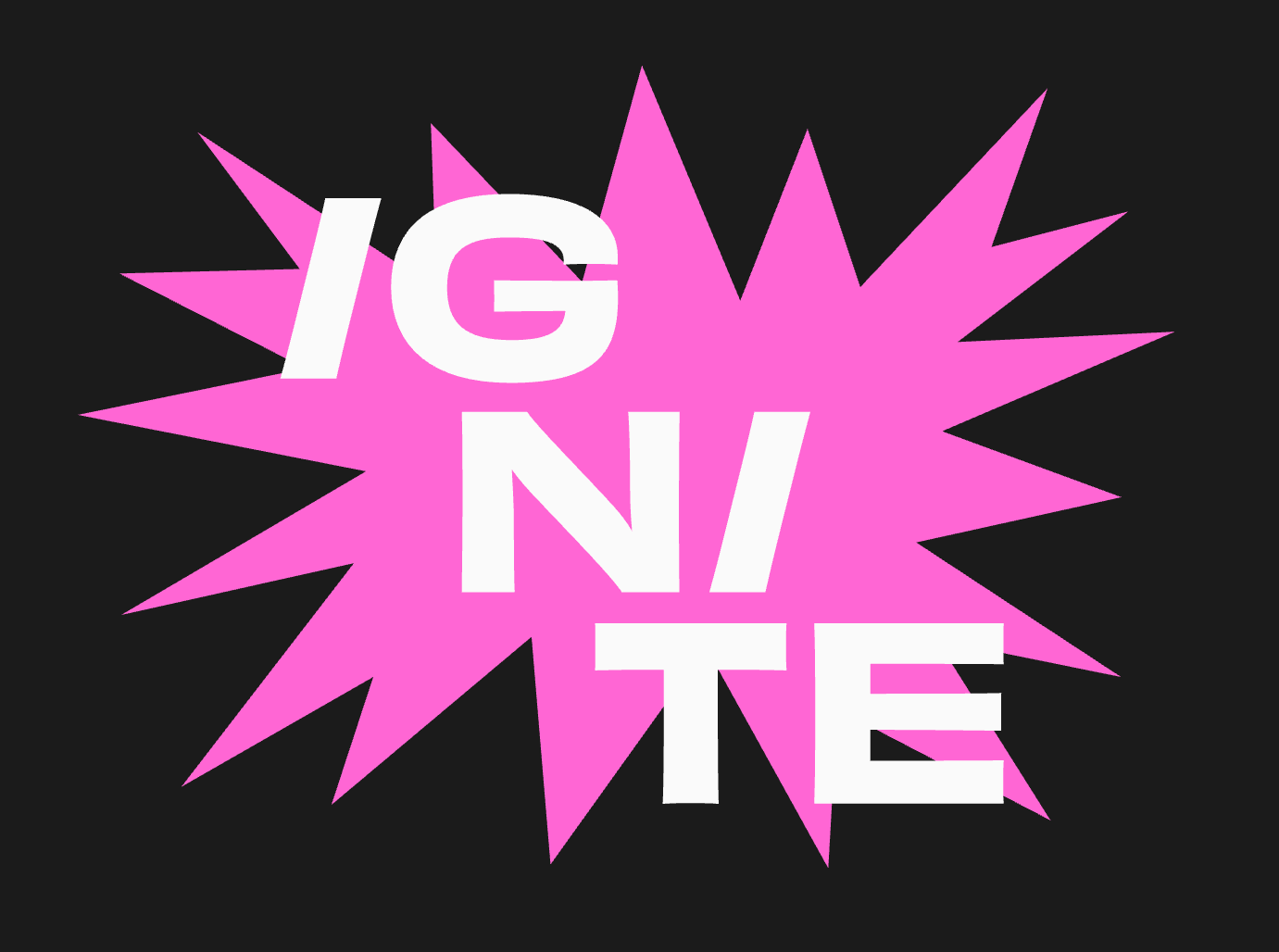
Shift is the eighth installment of Interventions, a conference series ran by Northeastern University's student design agency Scout. In past years, Interventions has been centered around the vague theme of design and its future. The 2025 conference introduced a sharper, more focused theme. A sharper theme required a sharper design strategy.
Our goal was to create a visual identity that reflected the conference's theme of designing for a future that includes everyone. With a cohort of 7 designers and a larger conference team of 28 students, we aimed to shift the world to a more inclusive tomorrow.
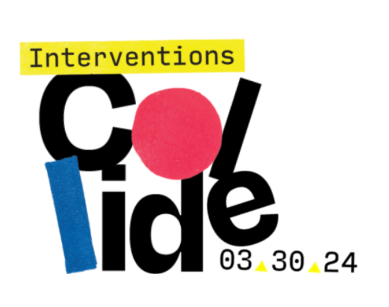
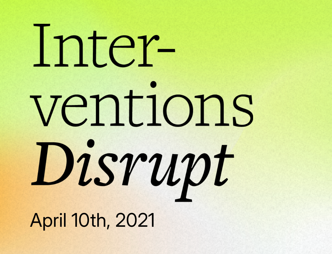
Conferences from previous years.
Process
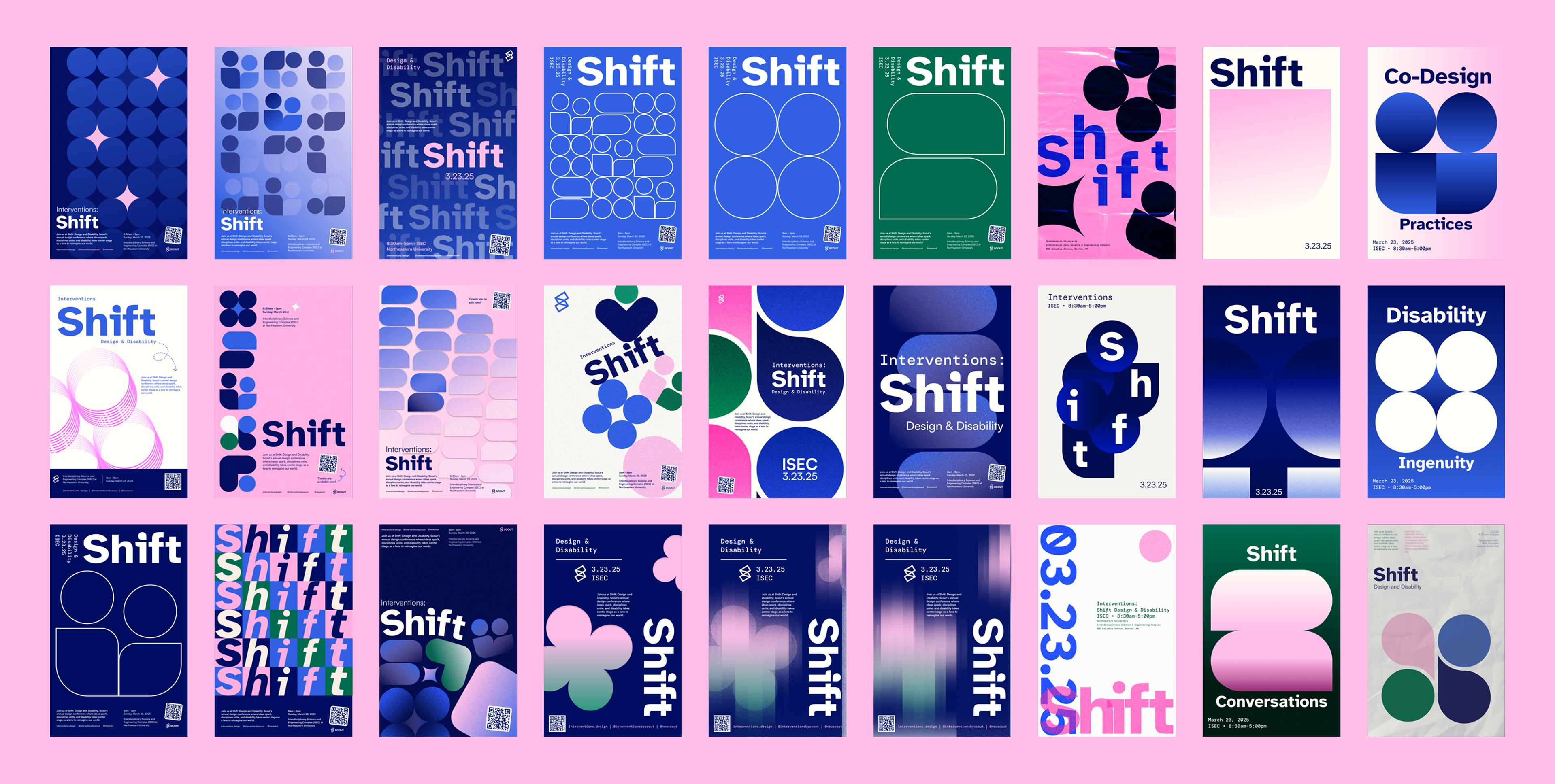
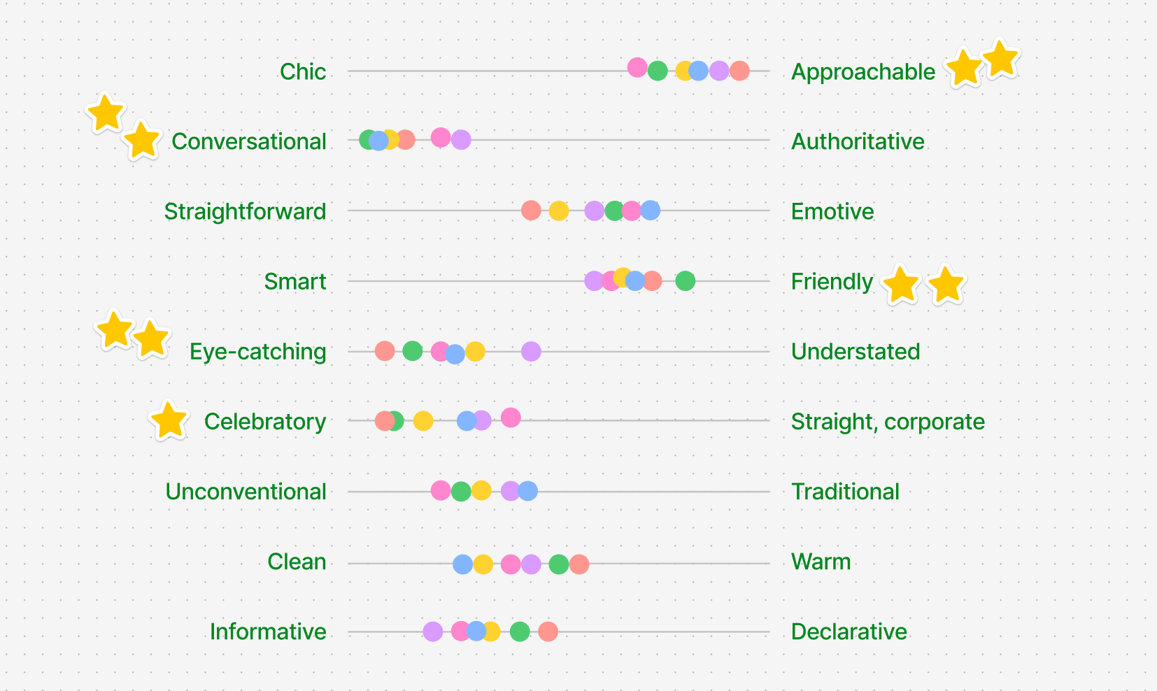
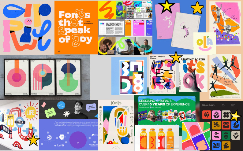
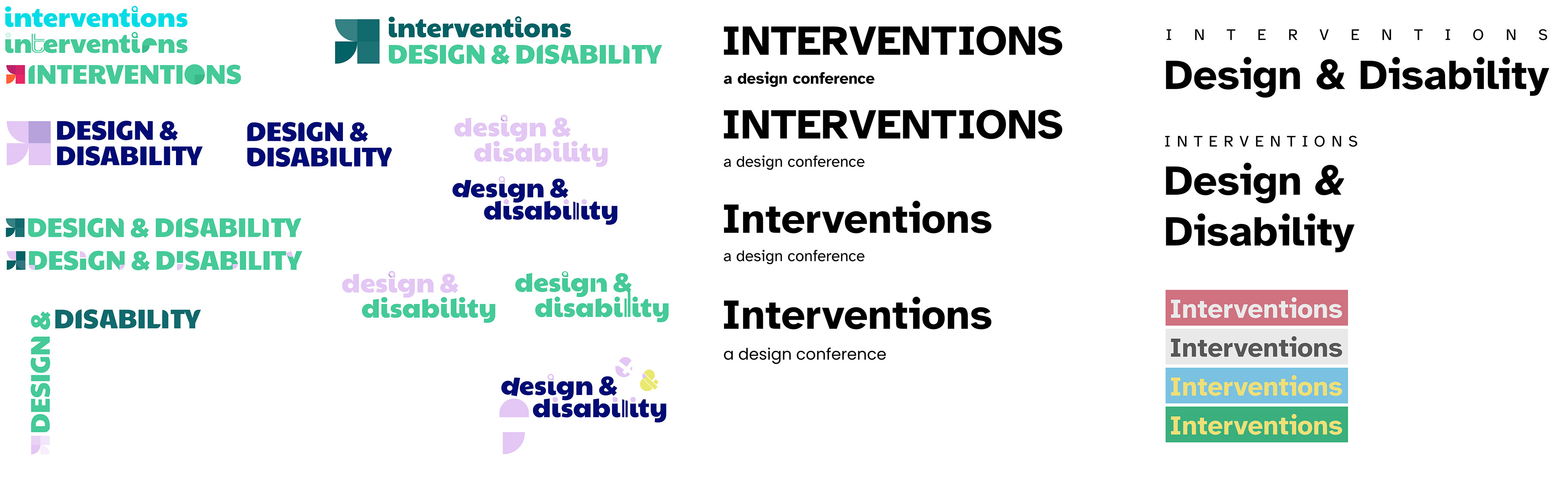
Over 6 months, we ideated and experimented with different ways to represent disability within a design sphere. We began with brainstorming sessions to define the conference’s theme, mood, and goals-utilizing personality levers, moodboards, and team-wide discussions to guide the creative direction.
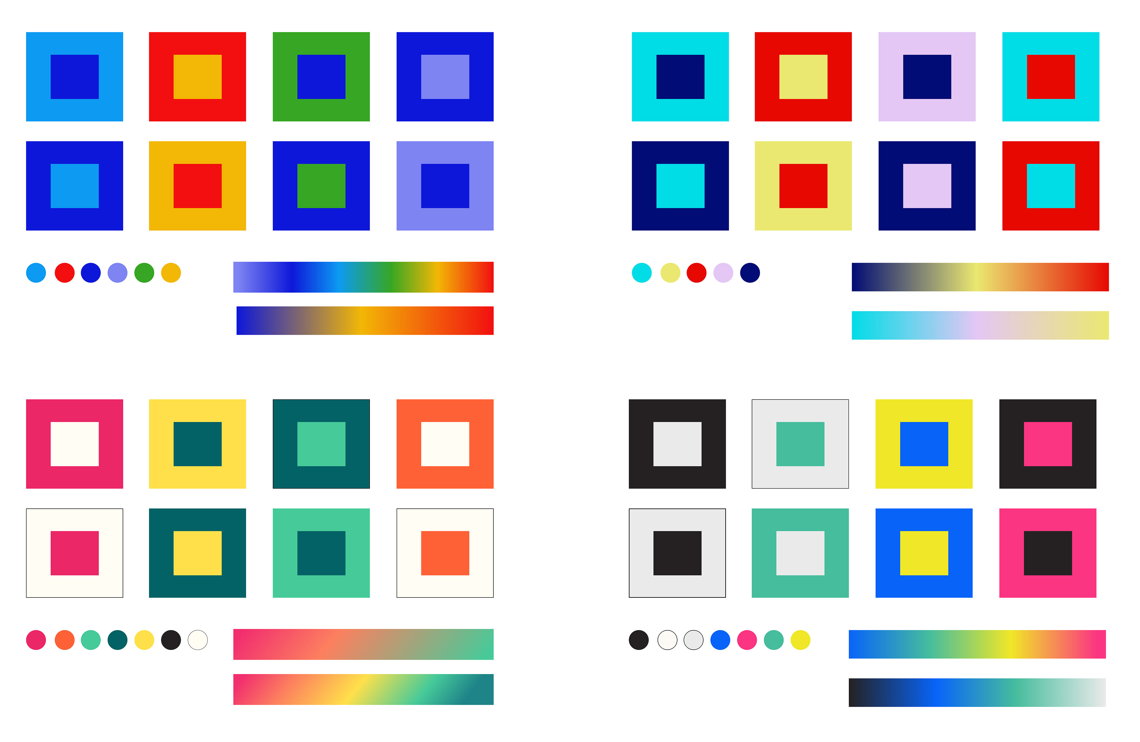
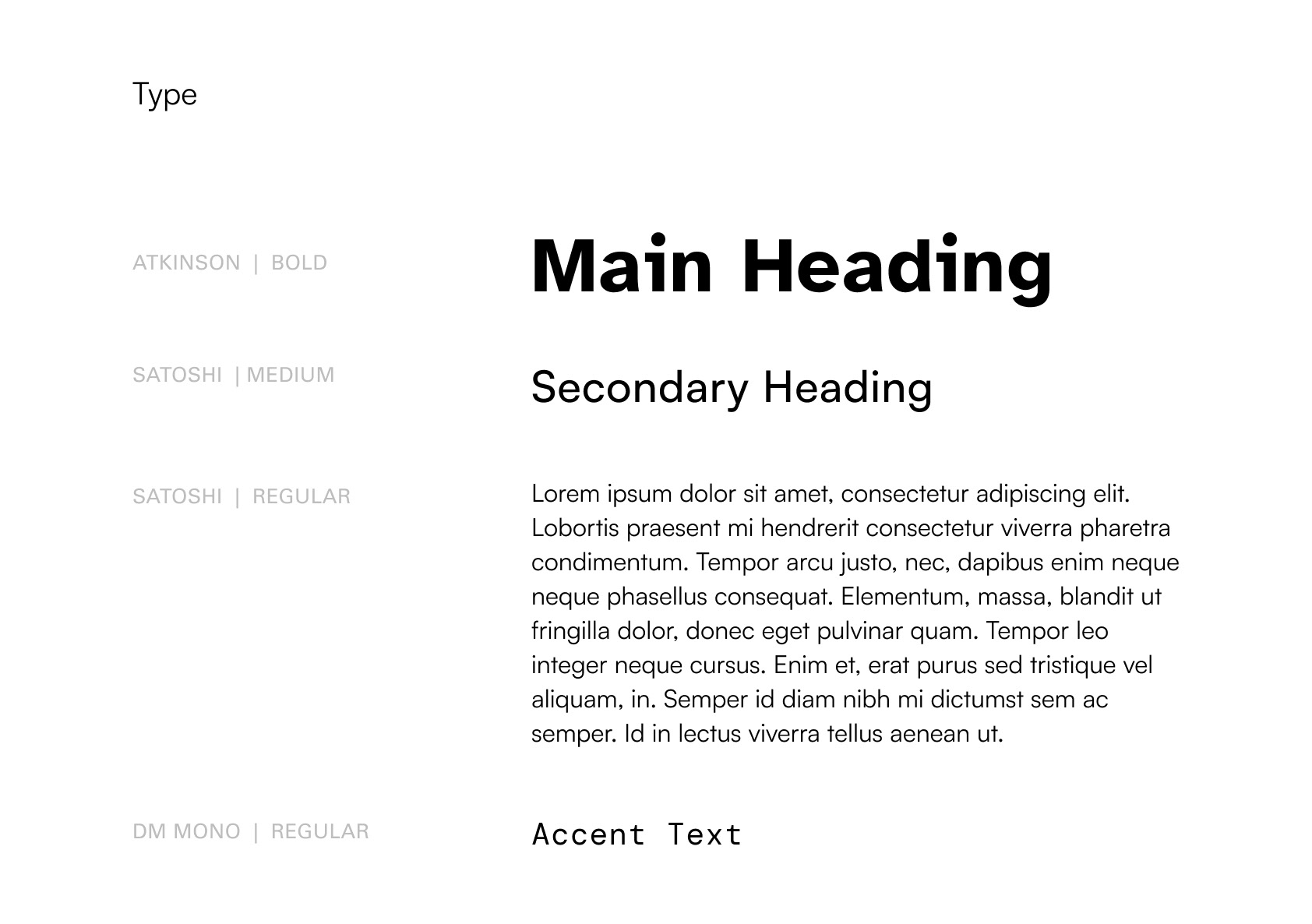
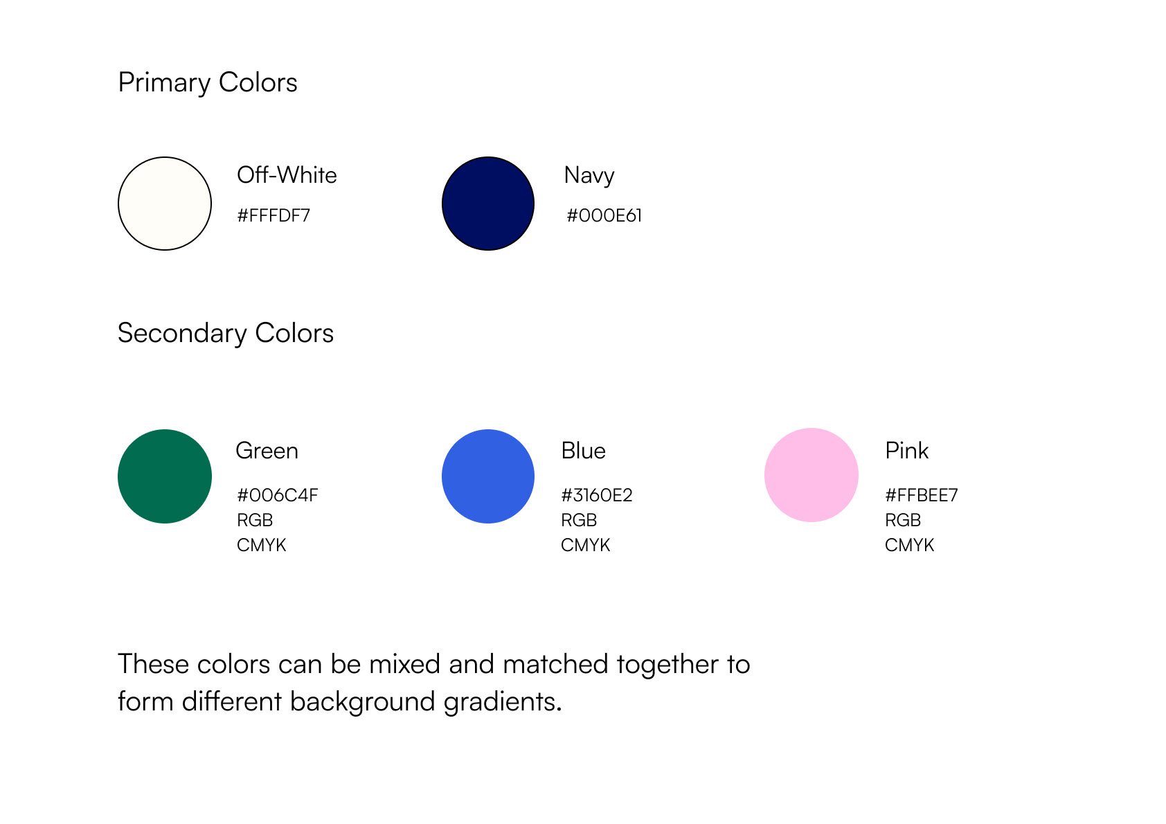
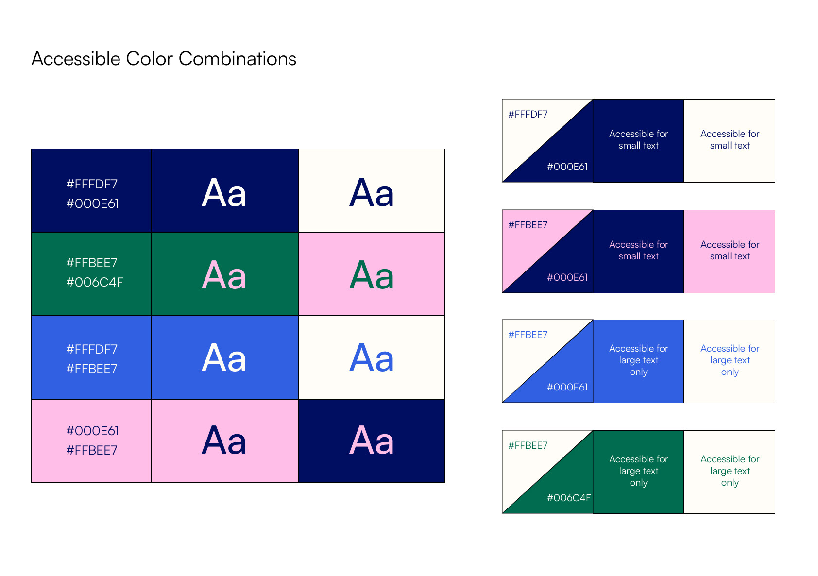
Throughout our process we treated accessibility not as an afterthought, but as a foundation. This involved making choices such as using an ADA compliant color palette and selecting a highly legible typeface.
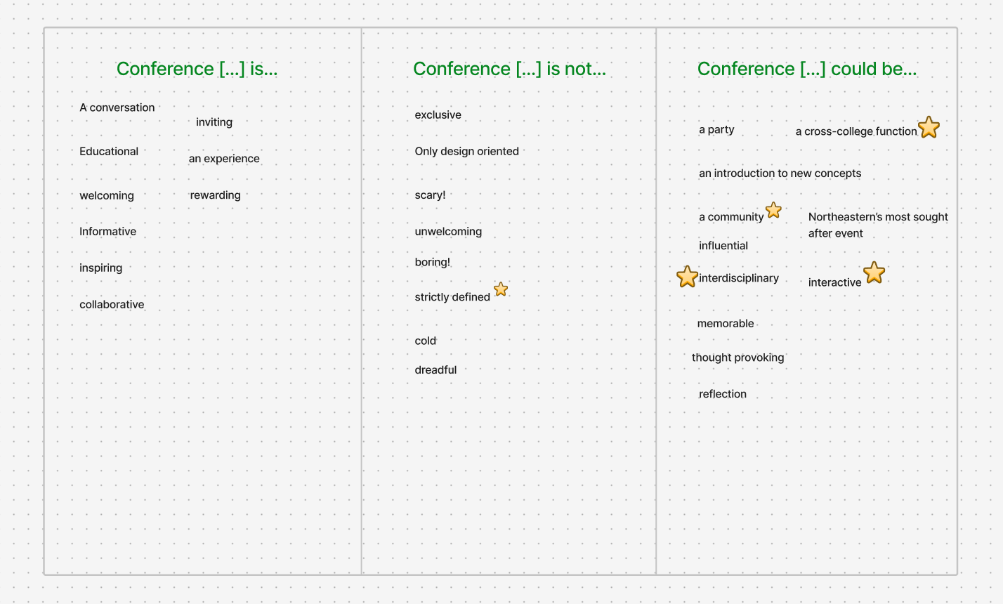
How do you draw from, represent, and celebrate disability, and where does it overlap with design?
Product
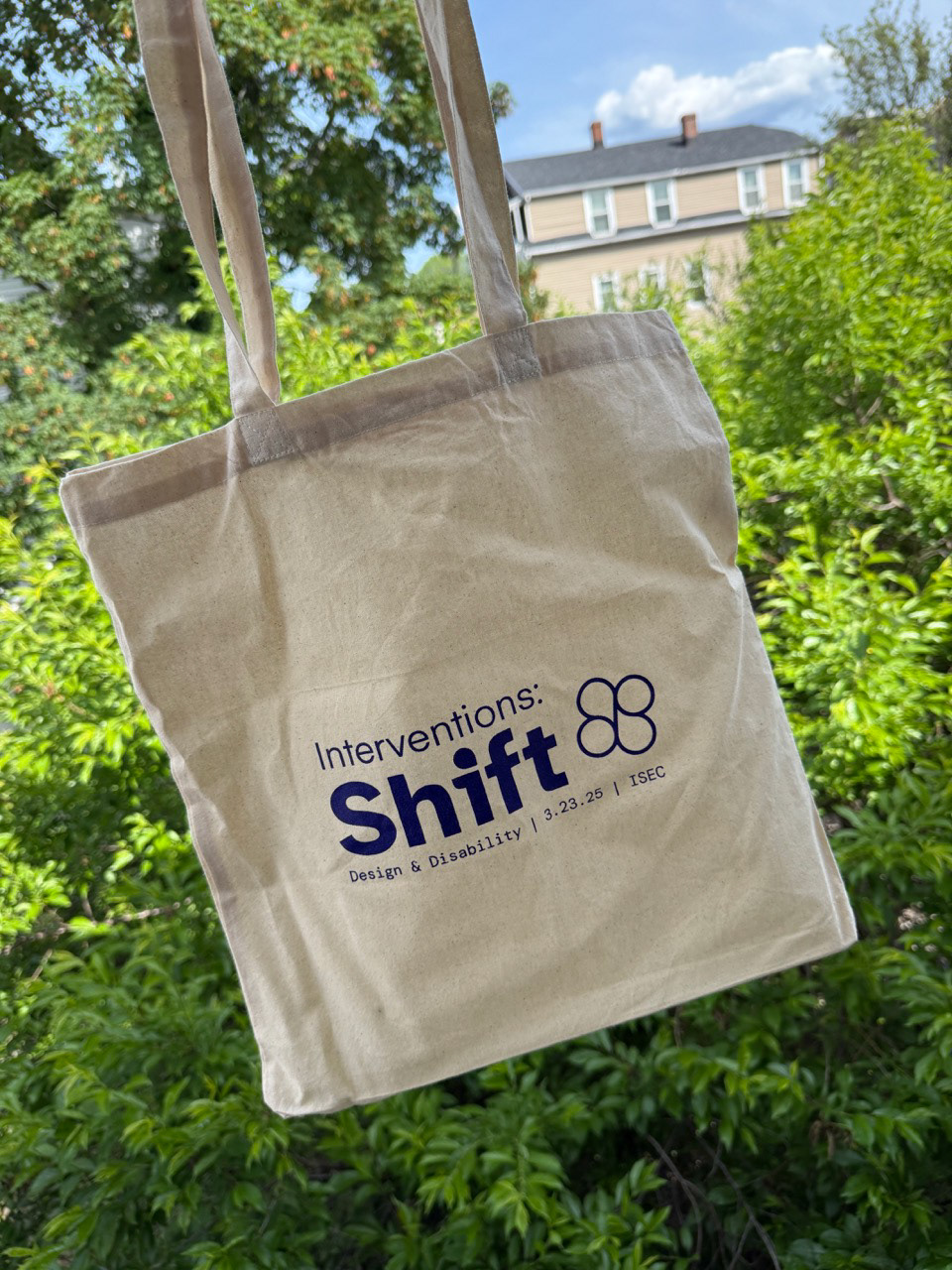
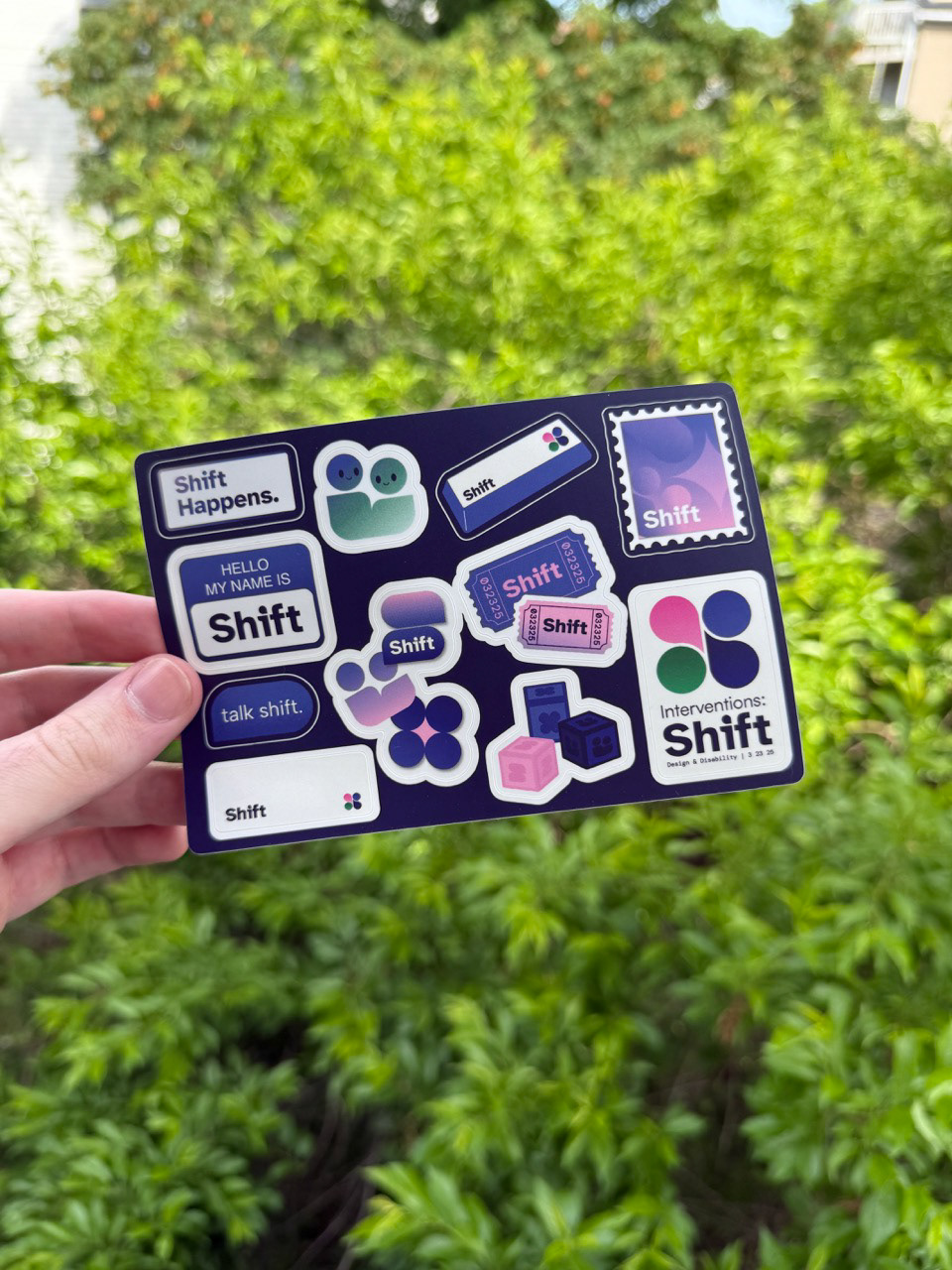
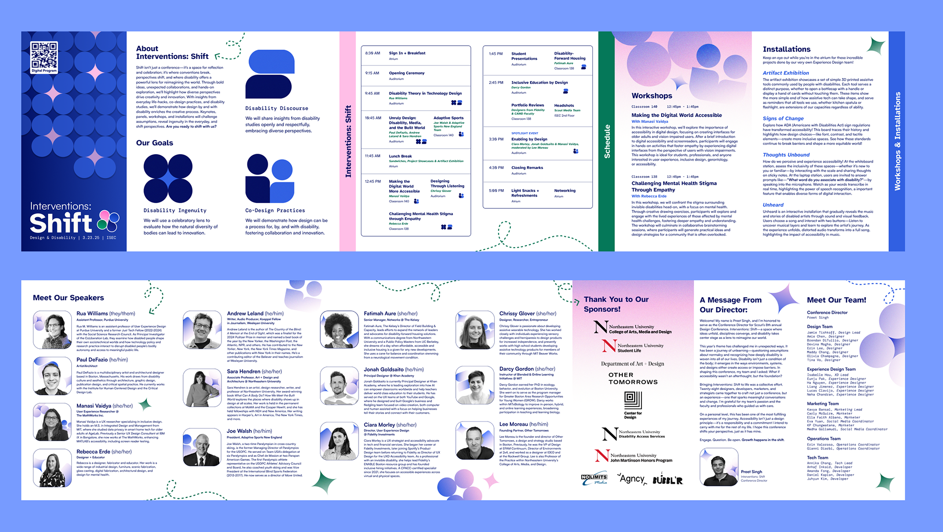
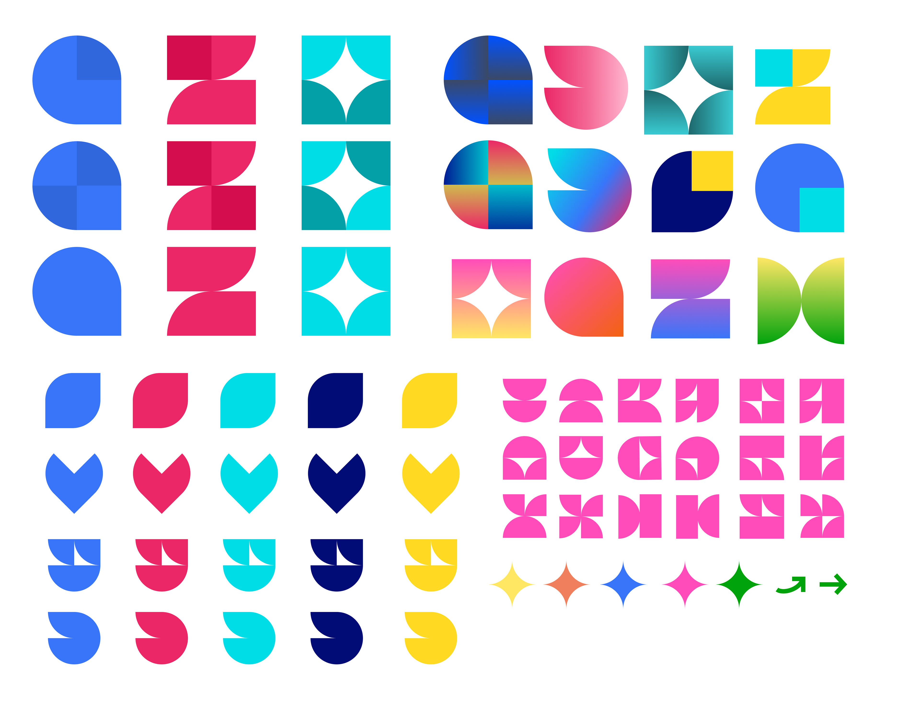
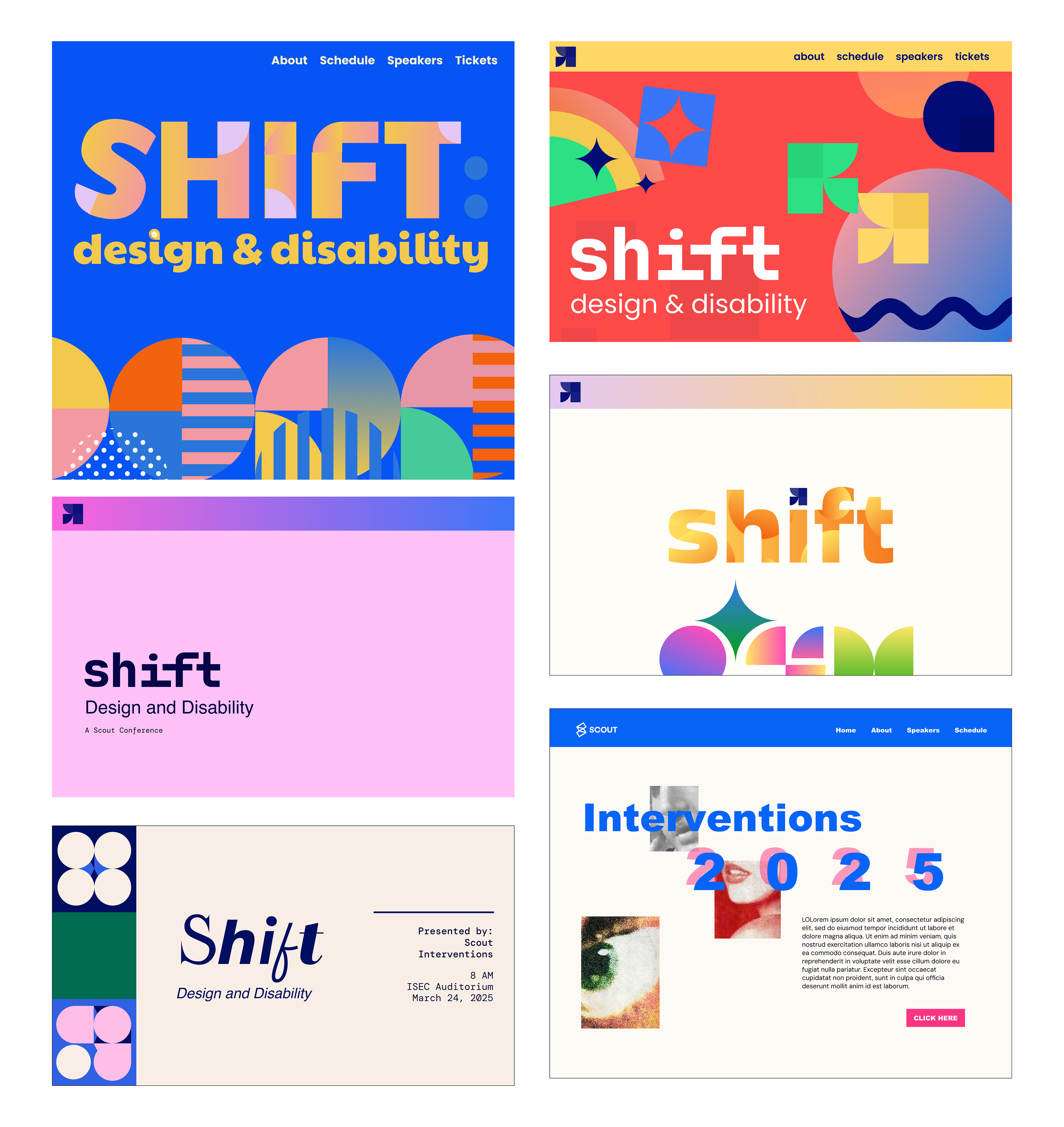
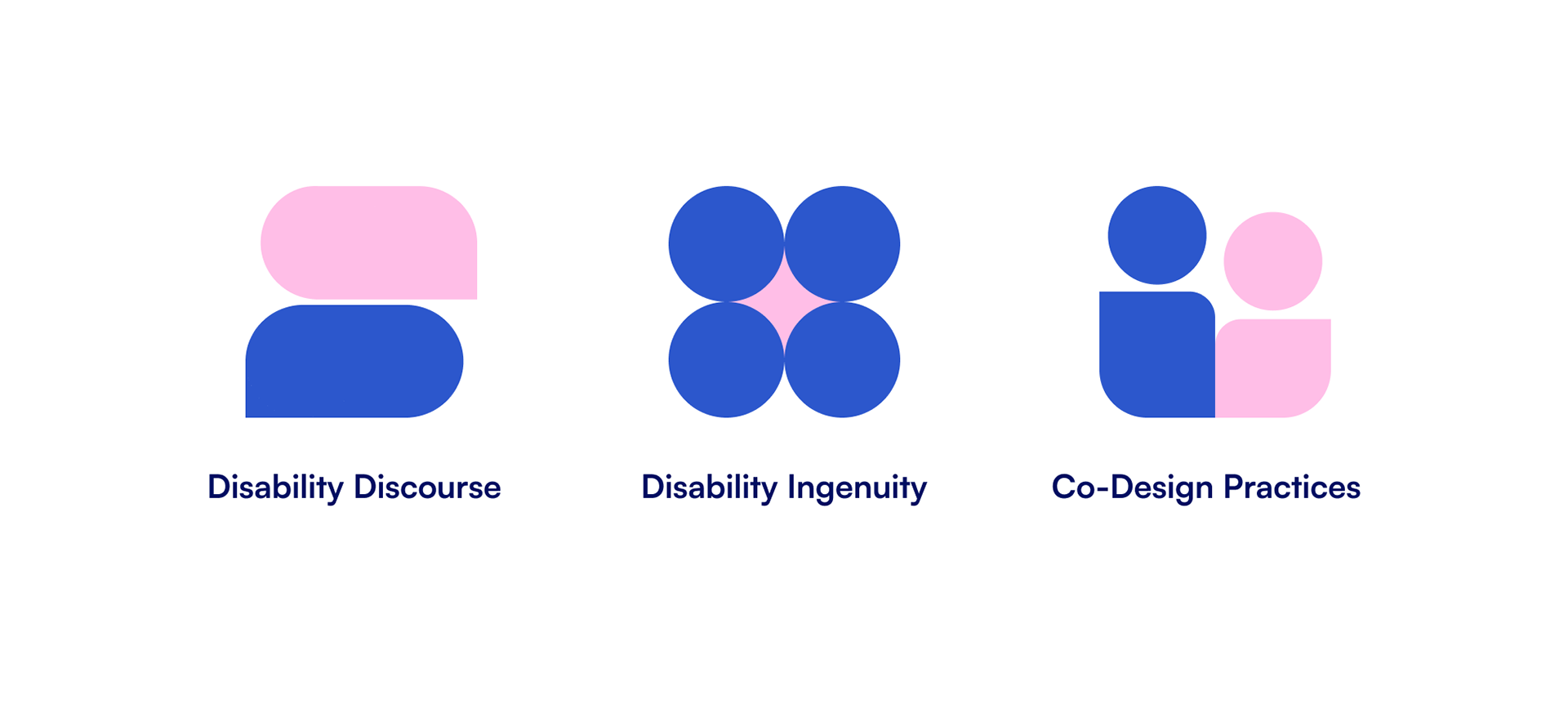
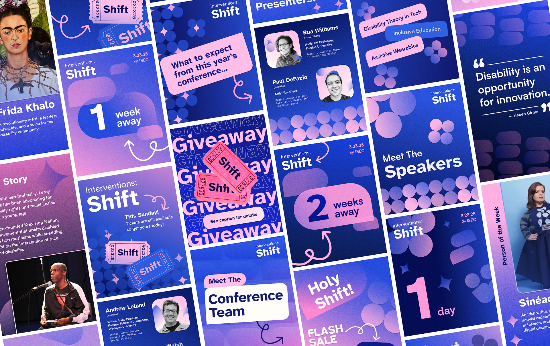
Using disability as a lens, we created the impactful visual language of Shift. Our design system featured dynamic shapes, color gradients, and tactile textures, all of which gave the conference its sleek yet welcoming feel.
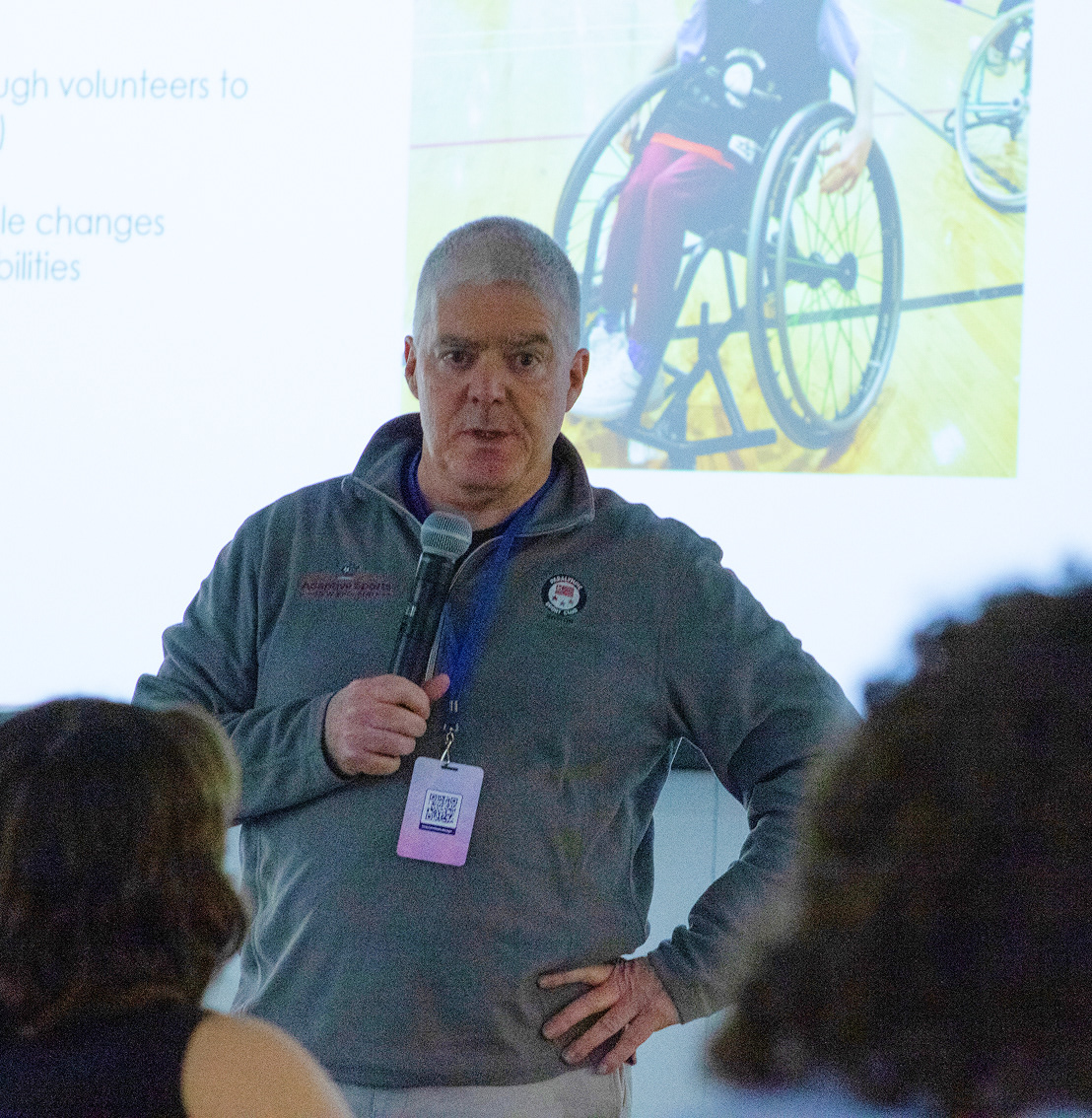
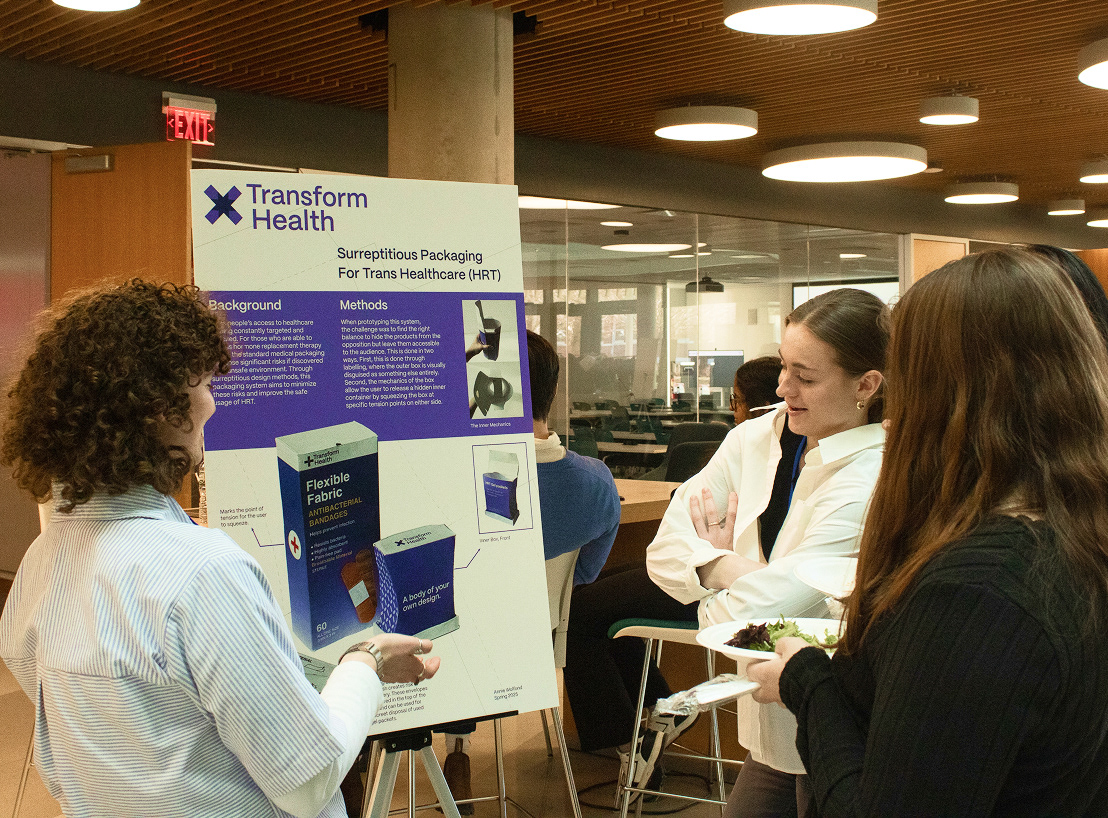
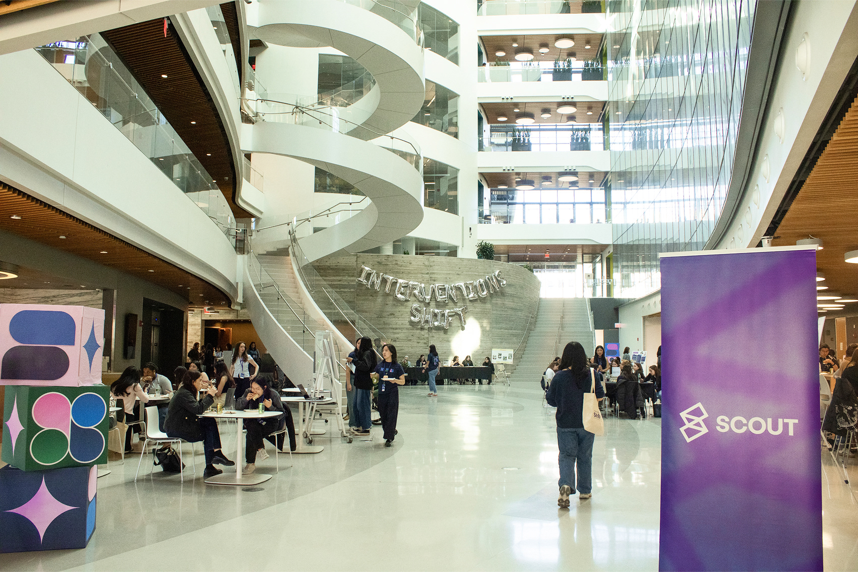
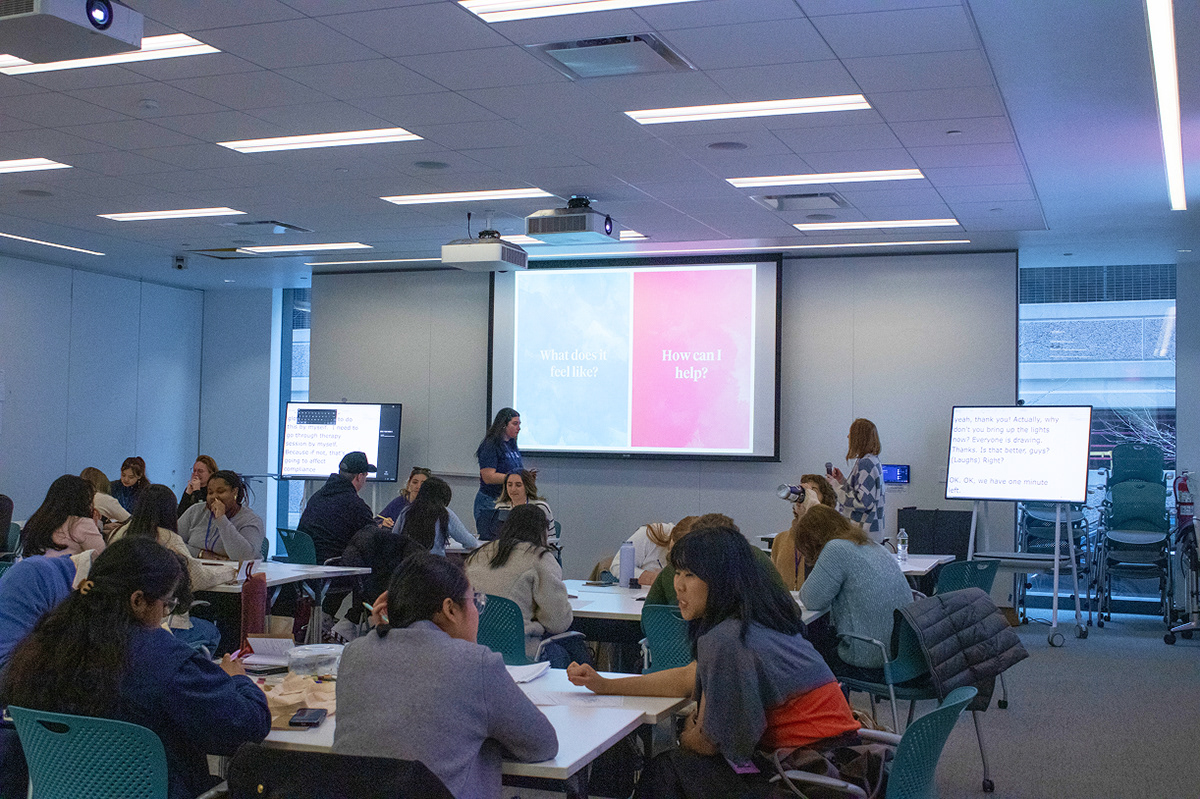
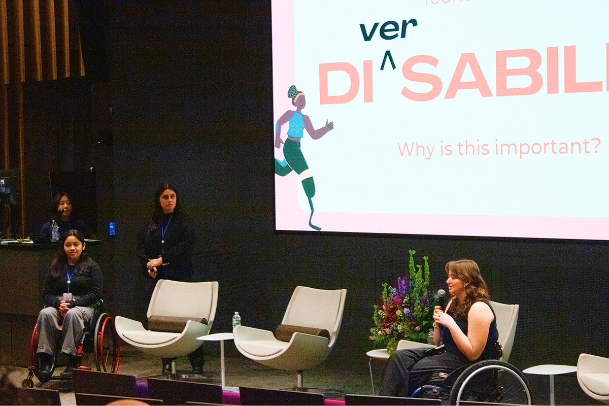
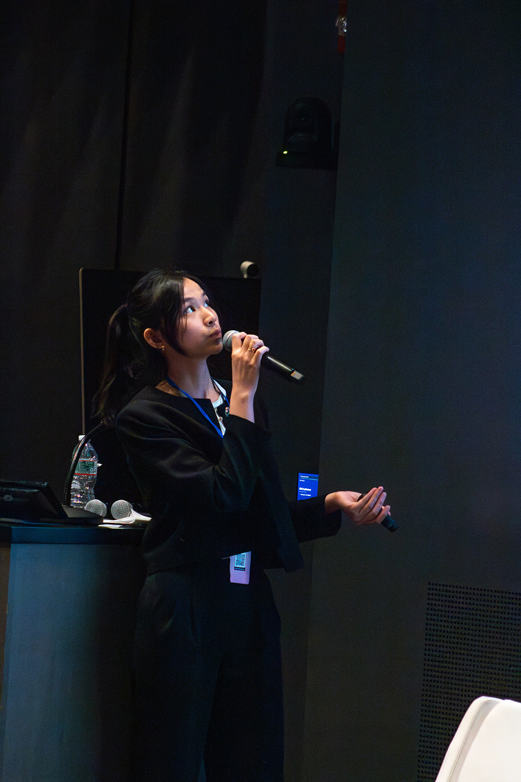
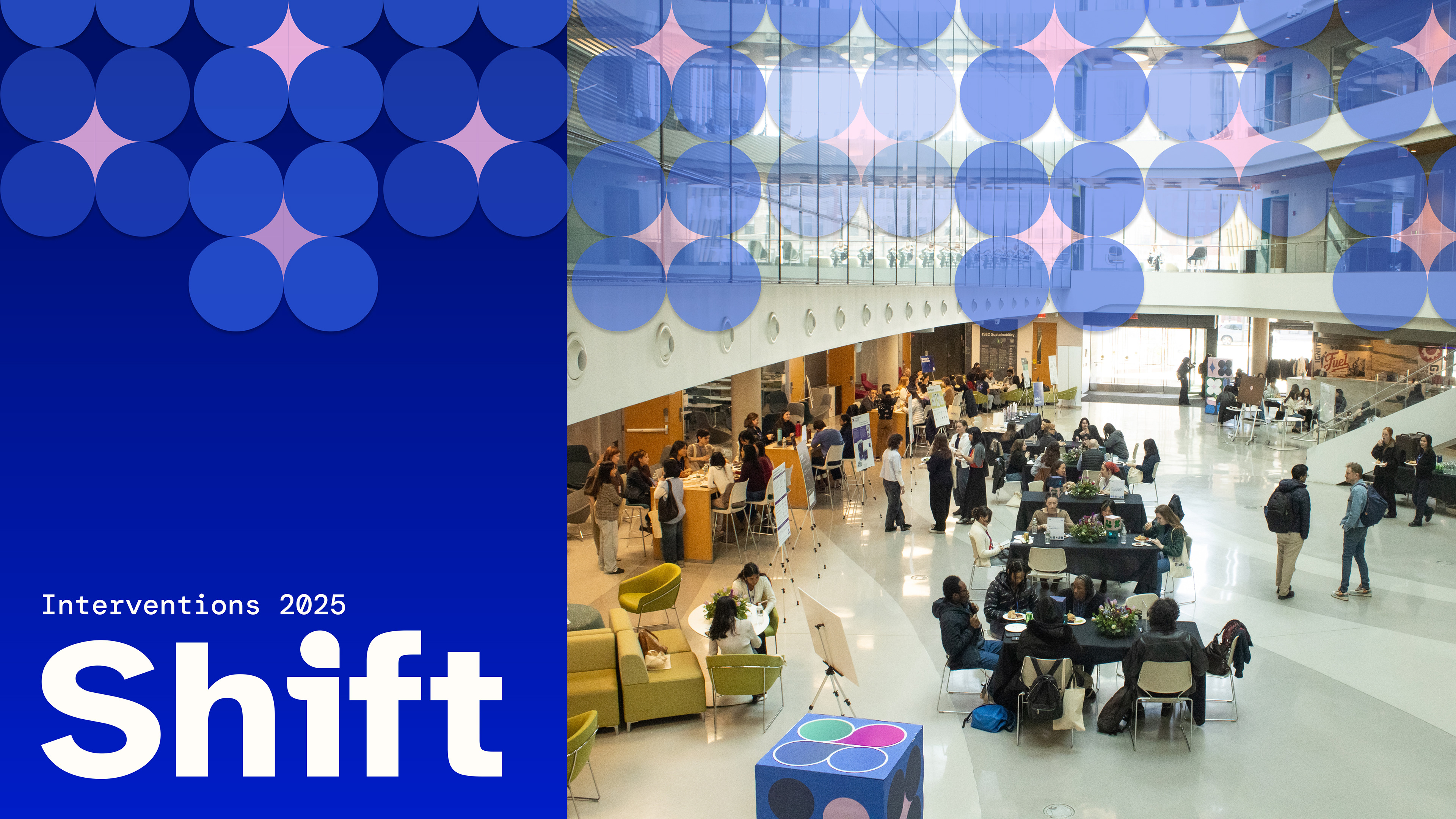
The event as a whole was a massive success. We attracted over 250 attendees, a record amount for this conference series. More importantly, we were able to shine a spotlight on the relationship between design and disability, challenging preconceived notions of accessibility within creative fields.

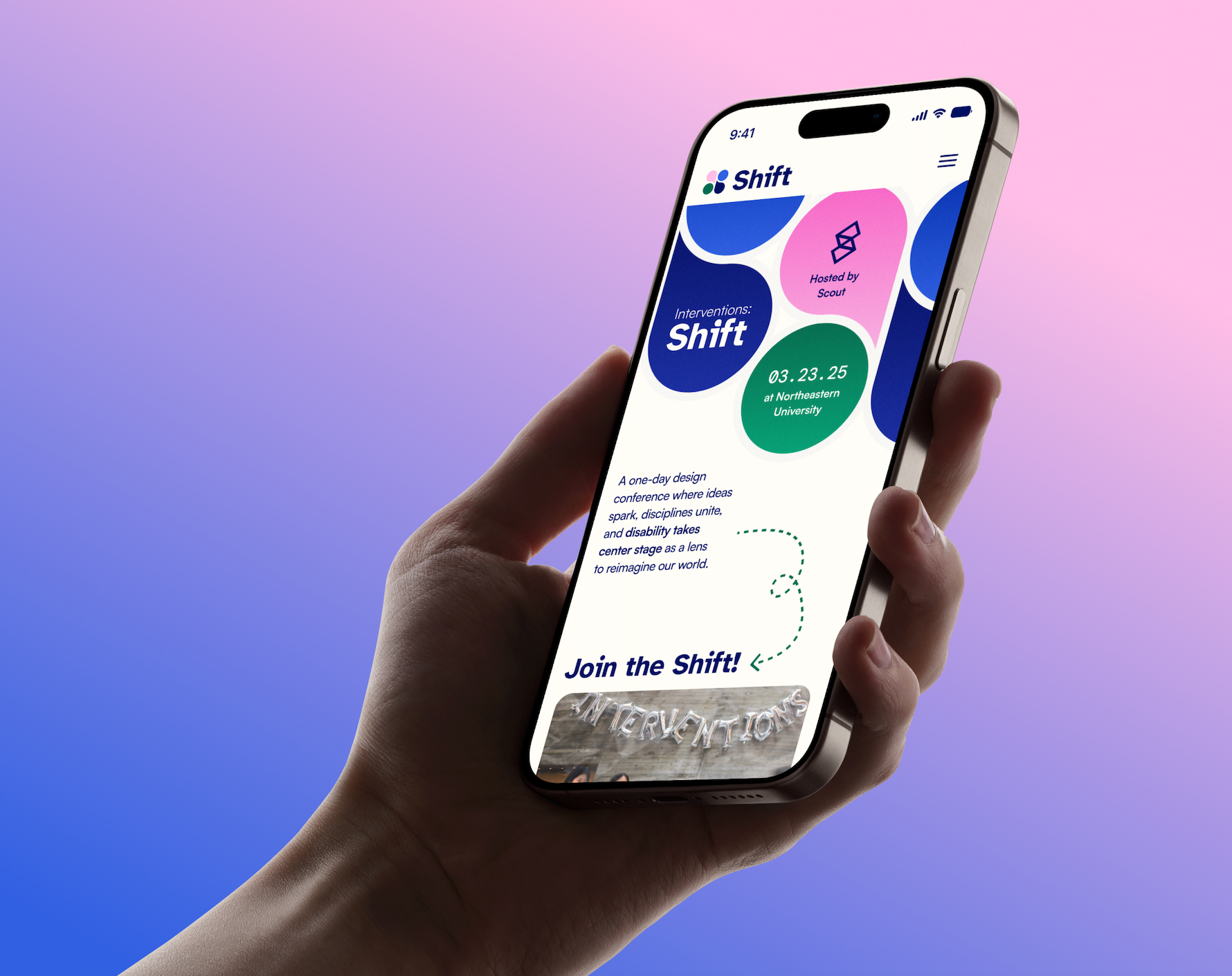
With the brand established, we shifted focus to our web deliverables. Our online presence acted as our main form of marketing, and I personally took charge of designing our social media content. Posts included infographics about disability initiatives, spotlights on team members and speakers, reminders counting down to conference, and much more.
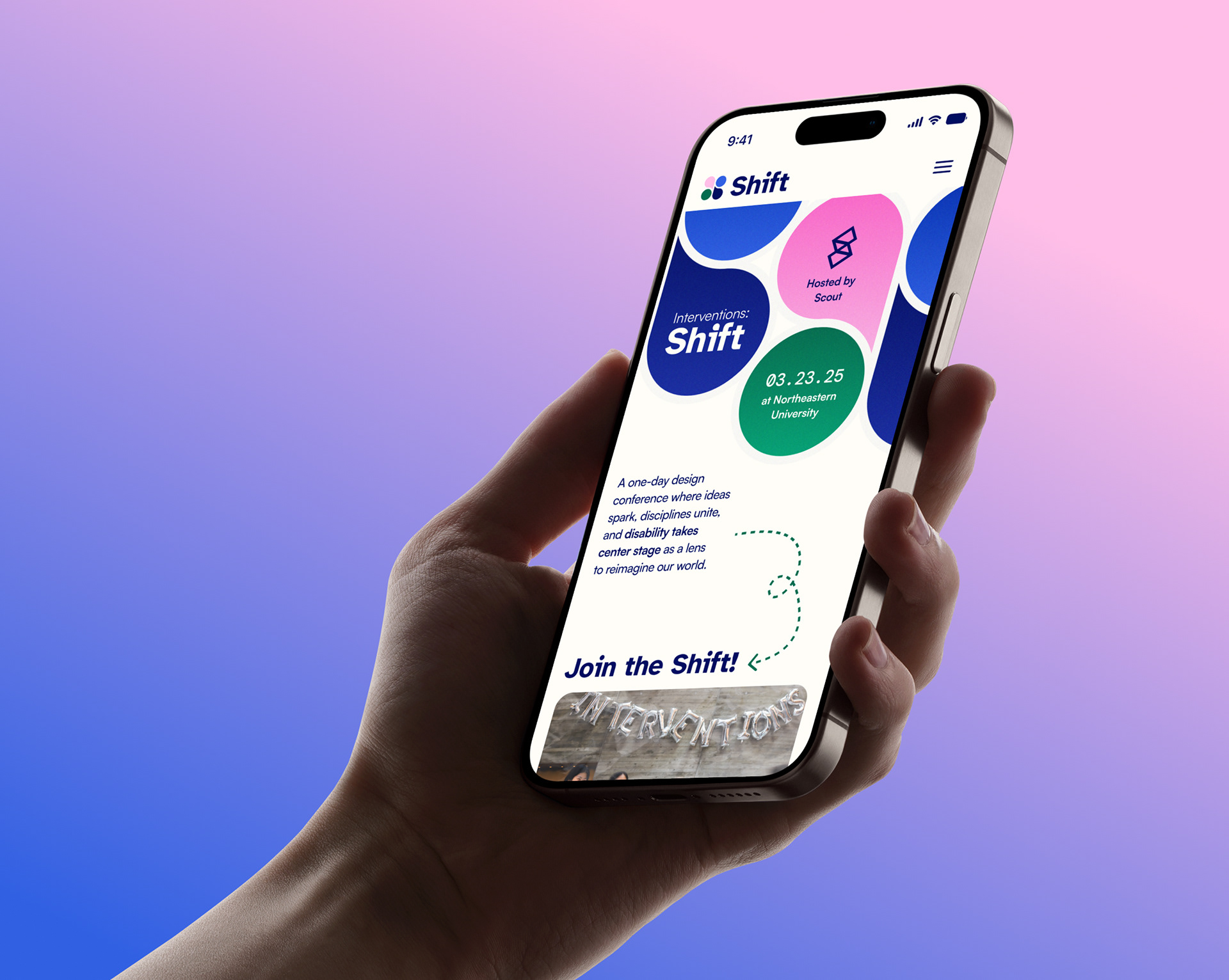
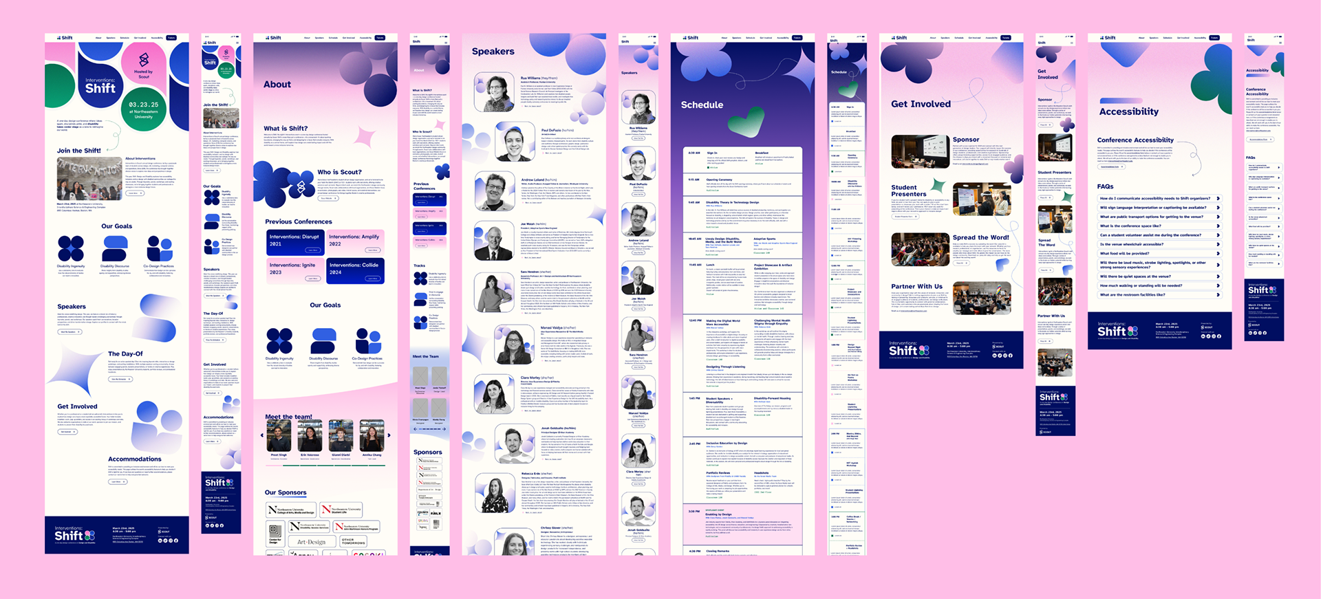
We designed desktop and mobile wireframes for the conference website, which acted as the main hub for information about speakers and scheduling.
These pages were designed with accessibility in mind, featuring intuitive navigation, proper contrast, and extremely legible content. The website was tested for screen readability, and an accommodations page was created for attendees with disabilities.
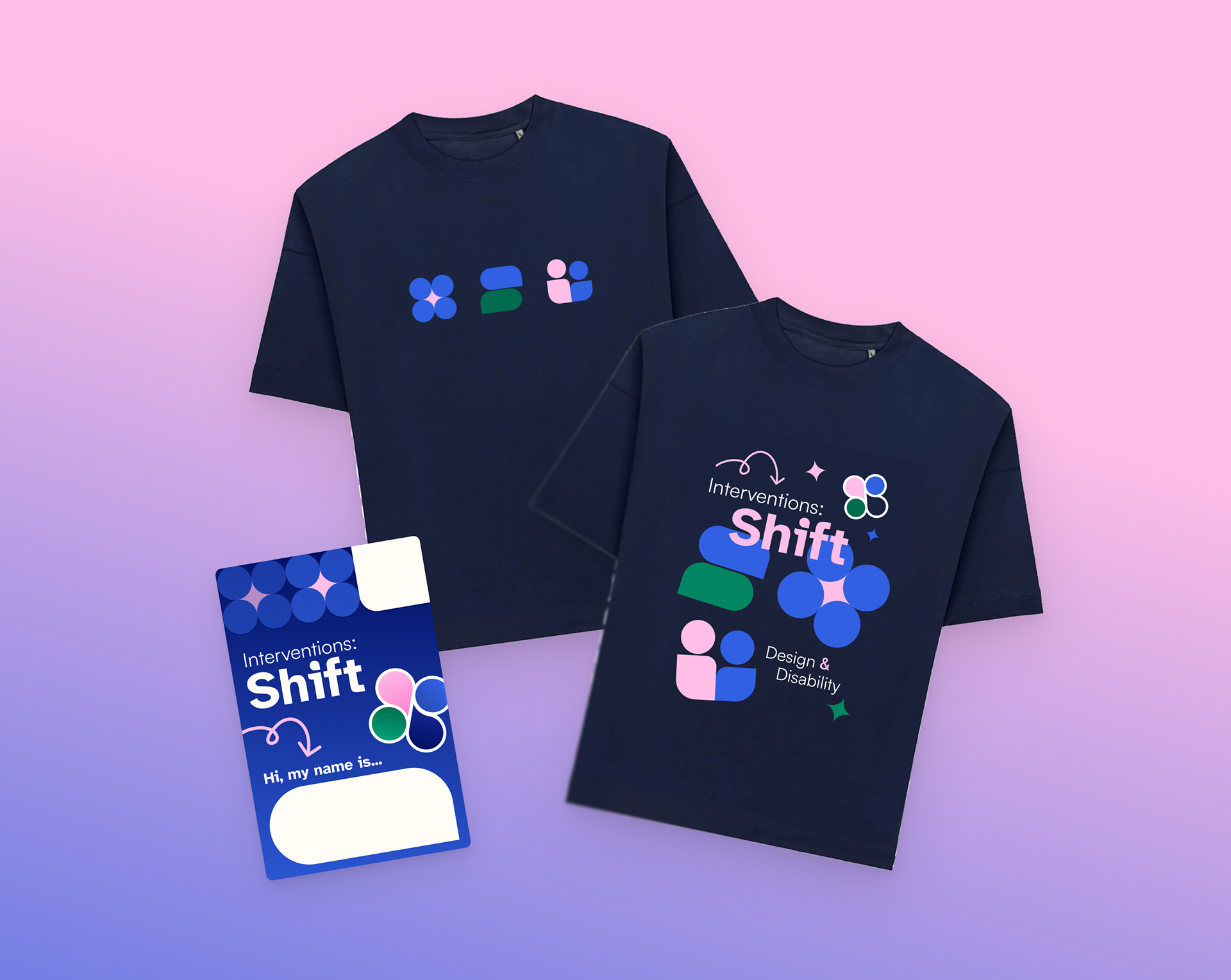
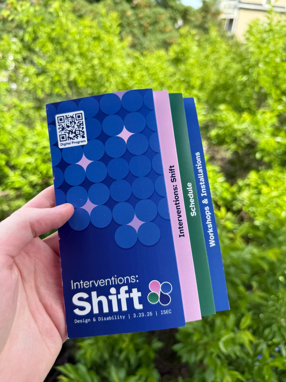
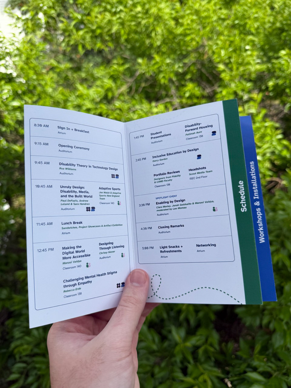
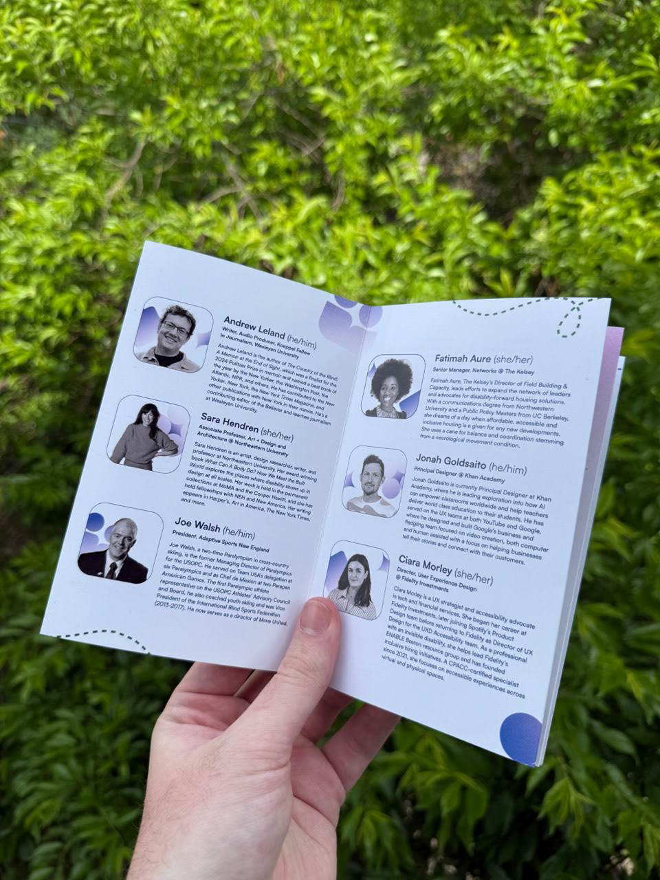
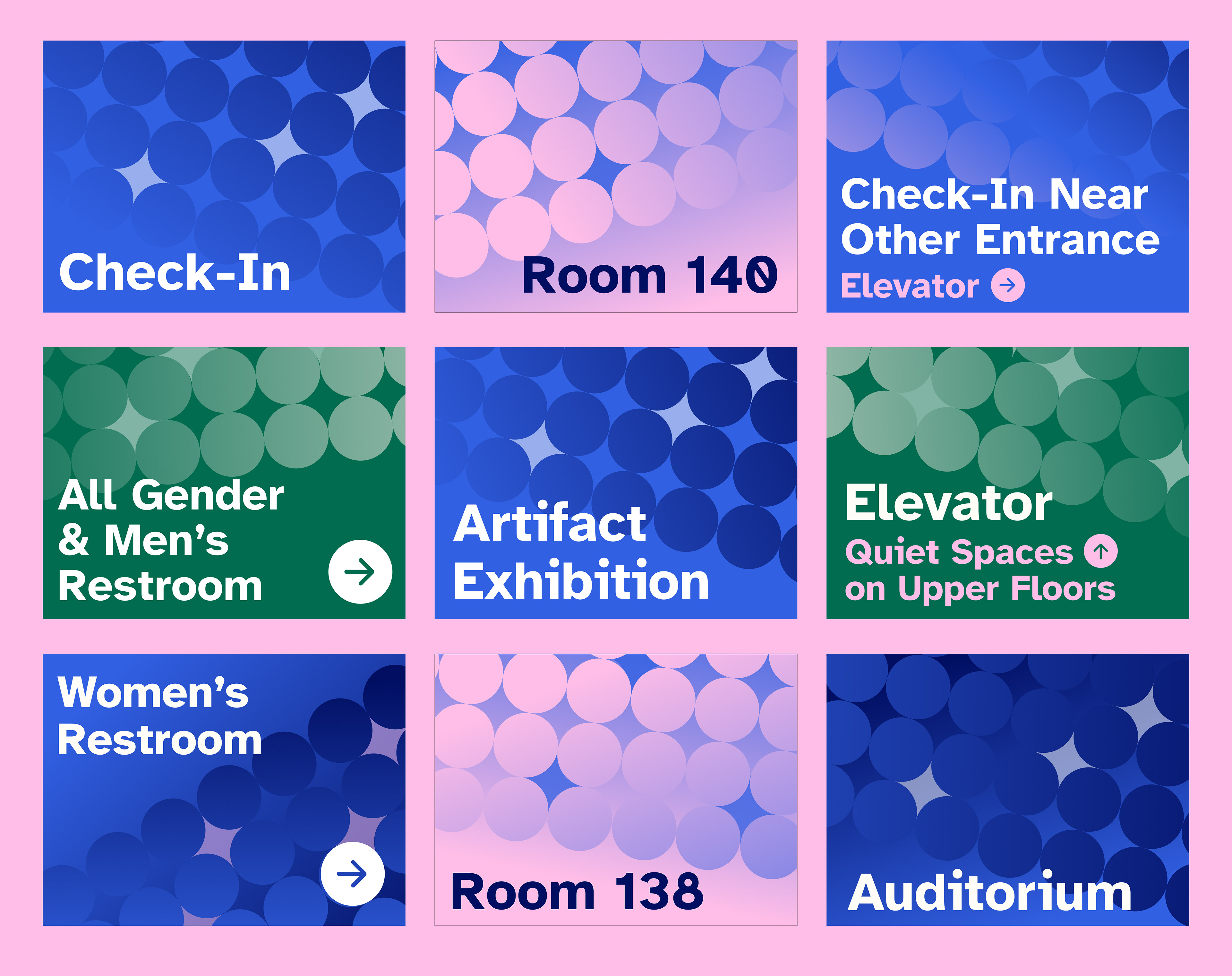
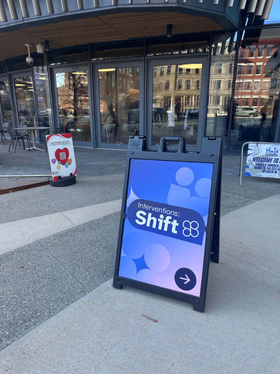
As the day approached, we were hard at work designing various collateral materials such as sticker sheets, pamphlets, posters, free merchandise, and wayfinding signage for the physical space.