Visualizing the birthplace of the Renaissance.
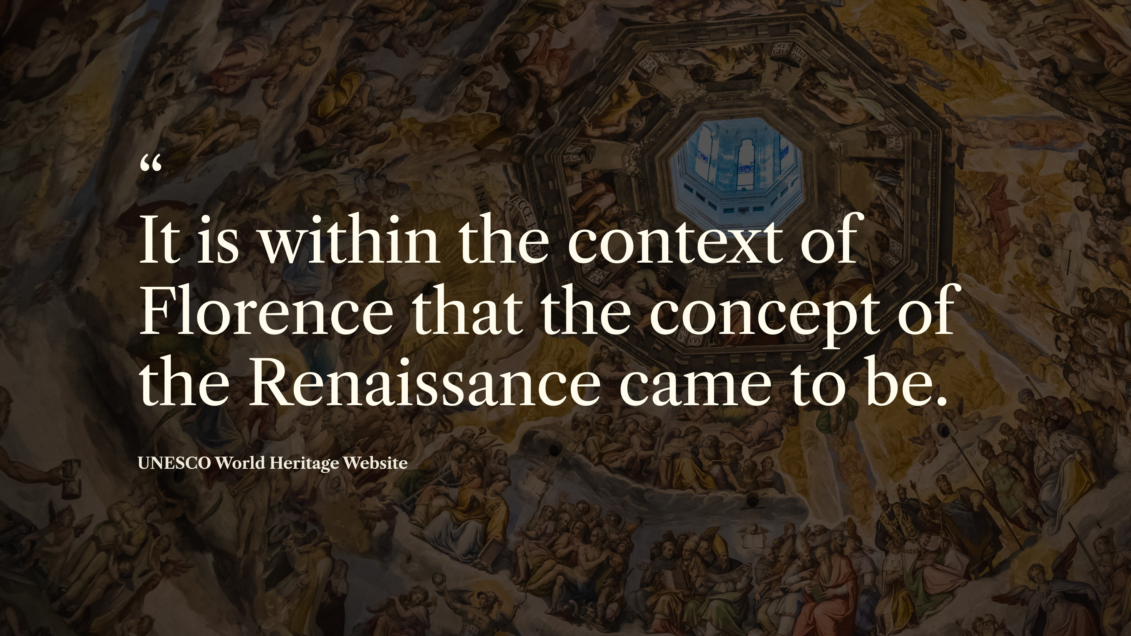
Known for its rich history in the arts, Florence is the result of persistent and long-lasting creativity. It's overwhelming influence on the development of architecture and fine arts within Europe cemented the city's status as a UNESCO World Heritage Site –meaning that the city belongs to all peoples of the world, irrespective of the territory on which it is located.
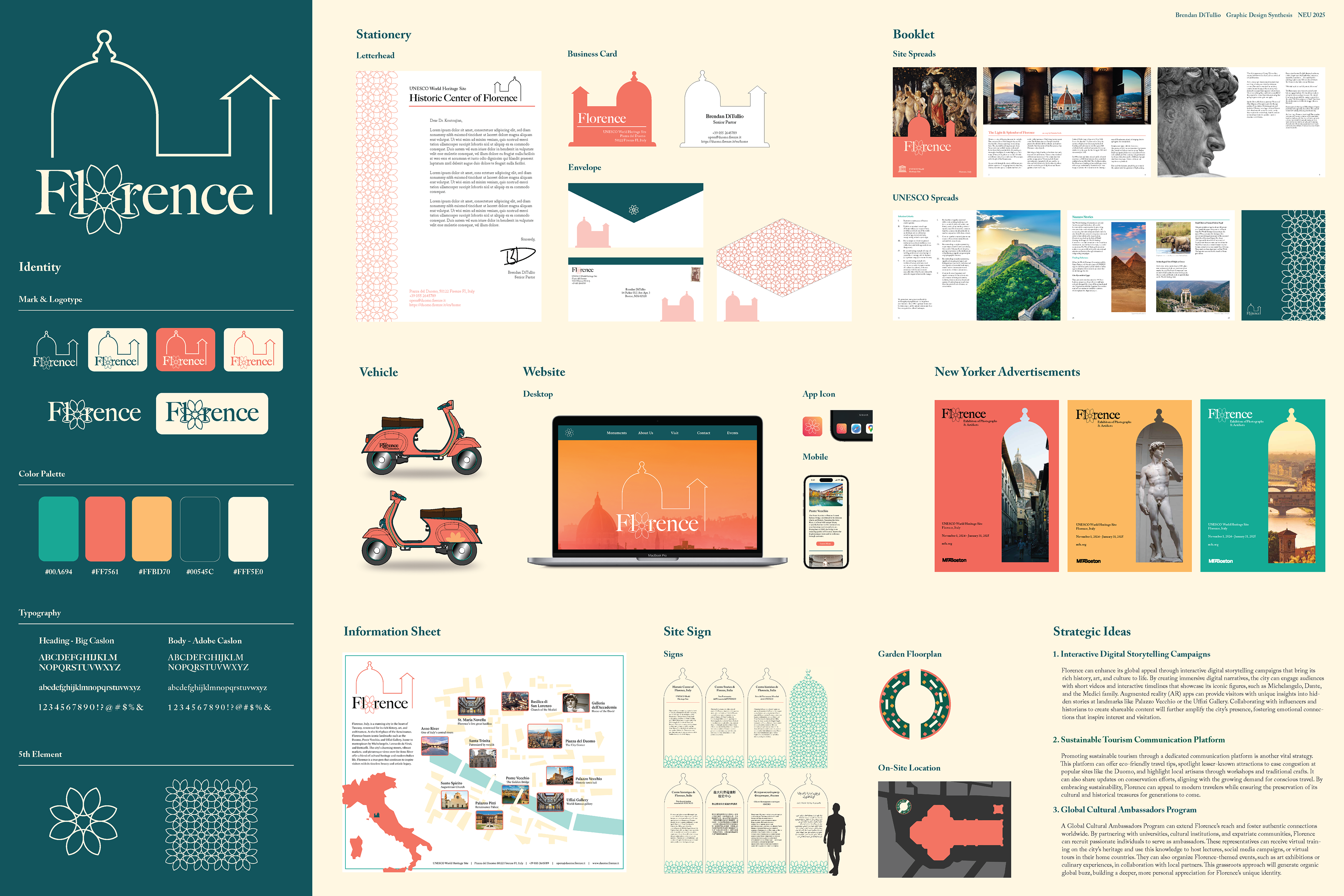
In this semester-long project, I chose a World Heritage Site and created a comprehensive design system that could be implemented across 15+ web and print deliverables.
Role
Designer
Tools
Adobe Suite
Class
Graphic Design Synthesis

Goal
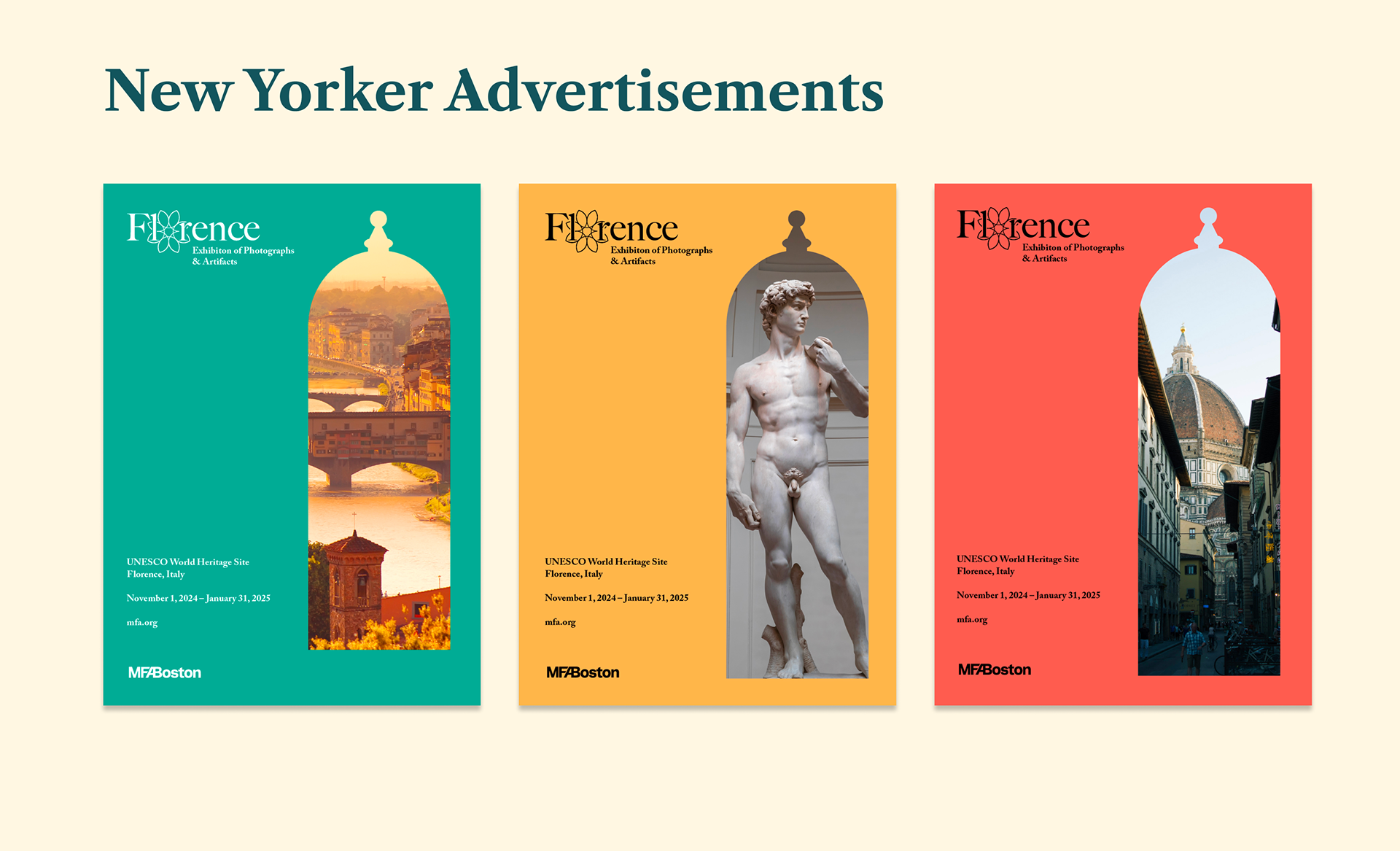
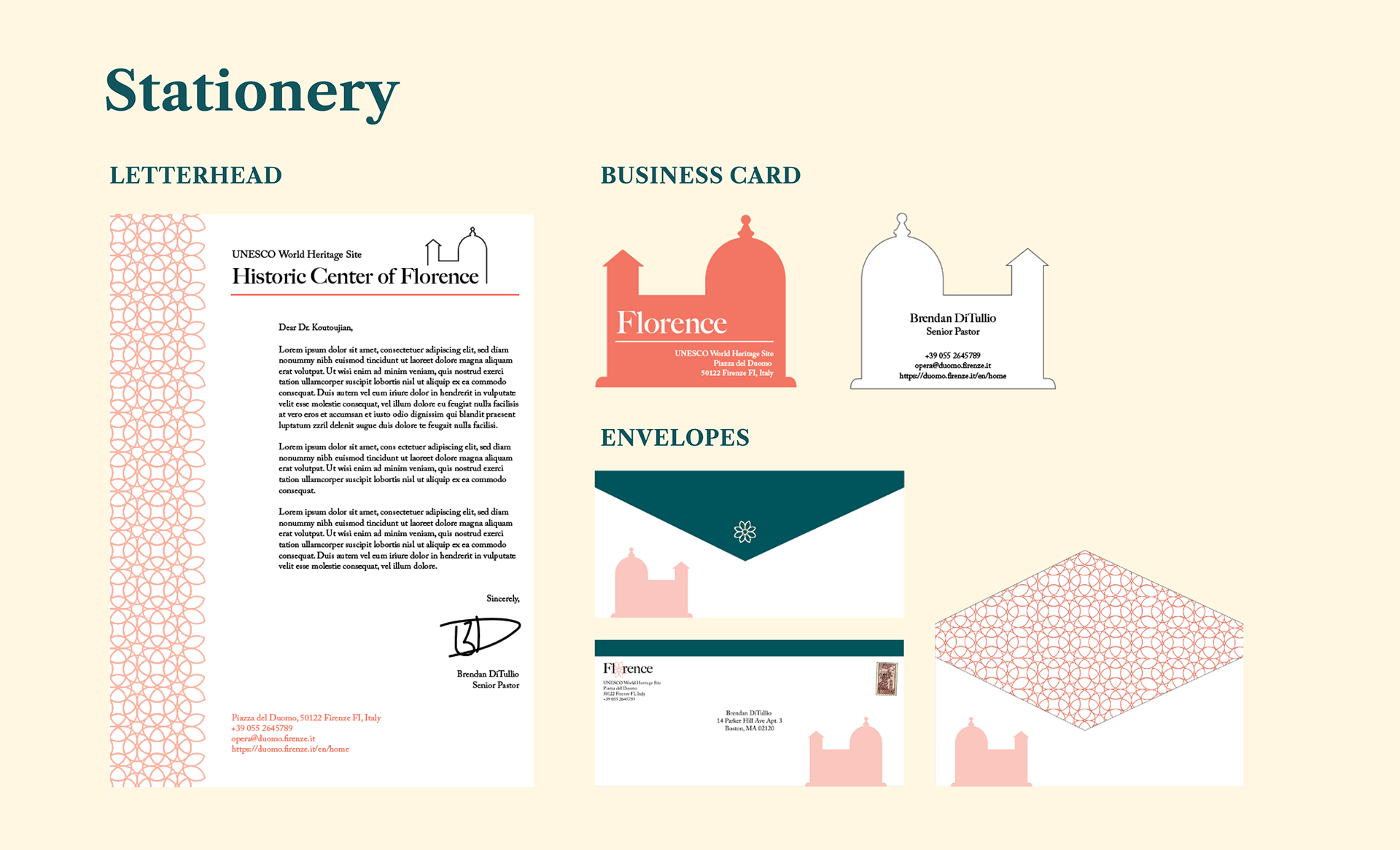
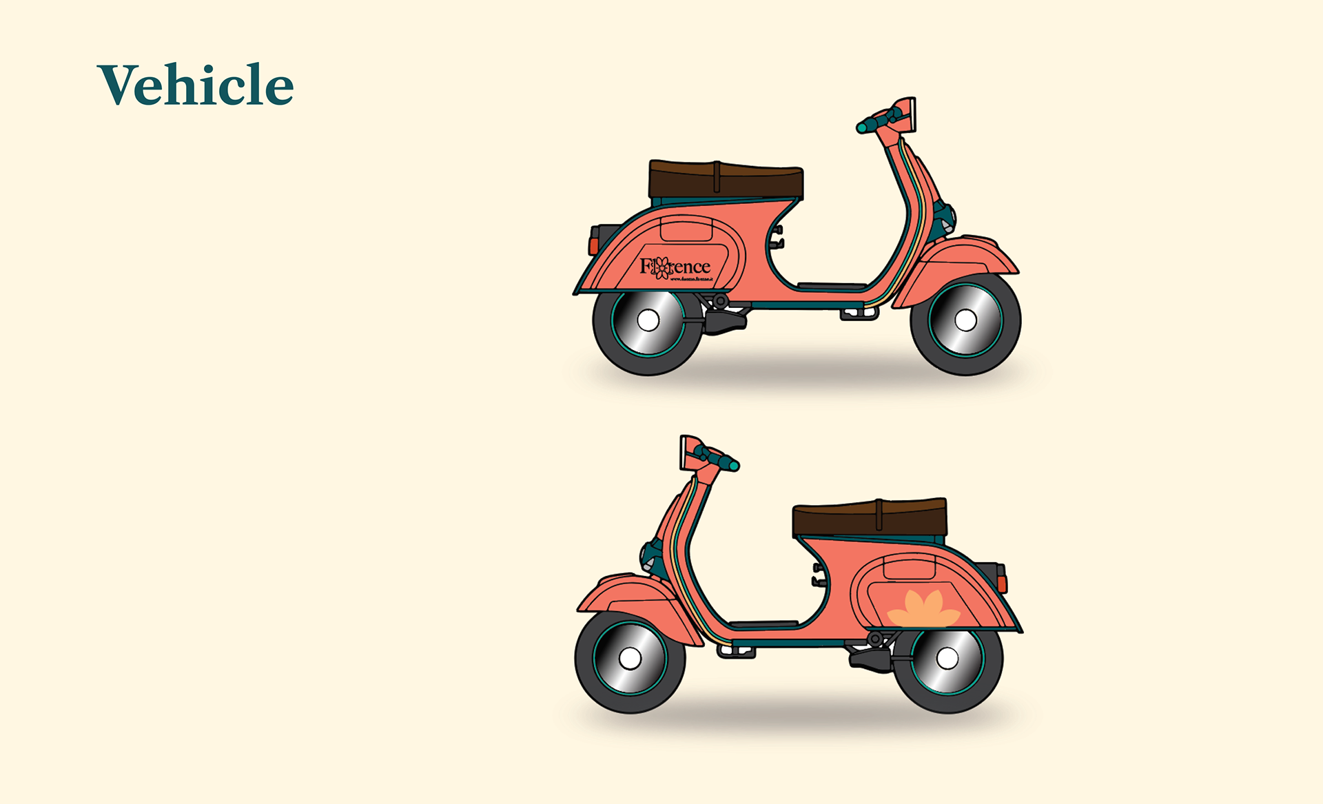
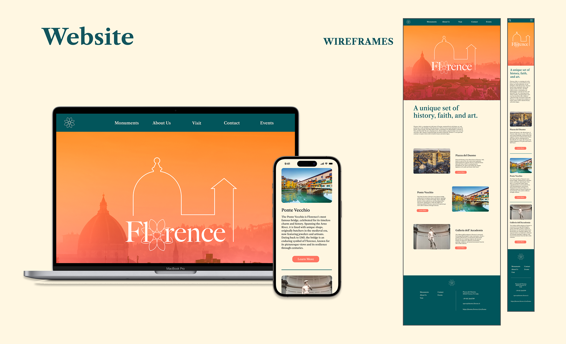
I was tasked with choosing a World Heritage Site and creating an identity system for the site, including a mark, logotype, color system, typography, and a fifth element. I then needed to apply this branding to over 15 print and web deliverables, including letterheads, envelopes, New Yorker advertisements, a booklet, mobile and desktop websites, a three dimensional site sign, and more.
I chose Florence because I was seeking the challenge of developing a visual identity for a city with over 600 years of artistic history. I aimed to spotlight the city's history of creativity, its present role as a UNESCO world heritage site, and its future as place that should be protected and preserved.
Process
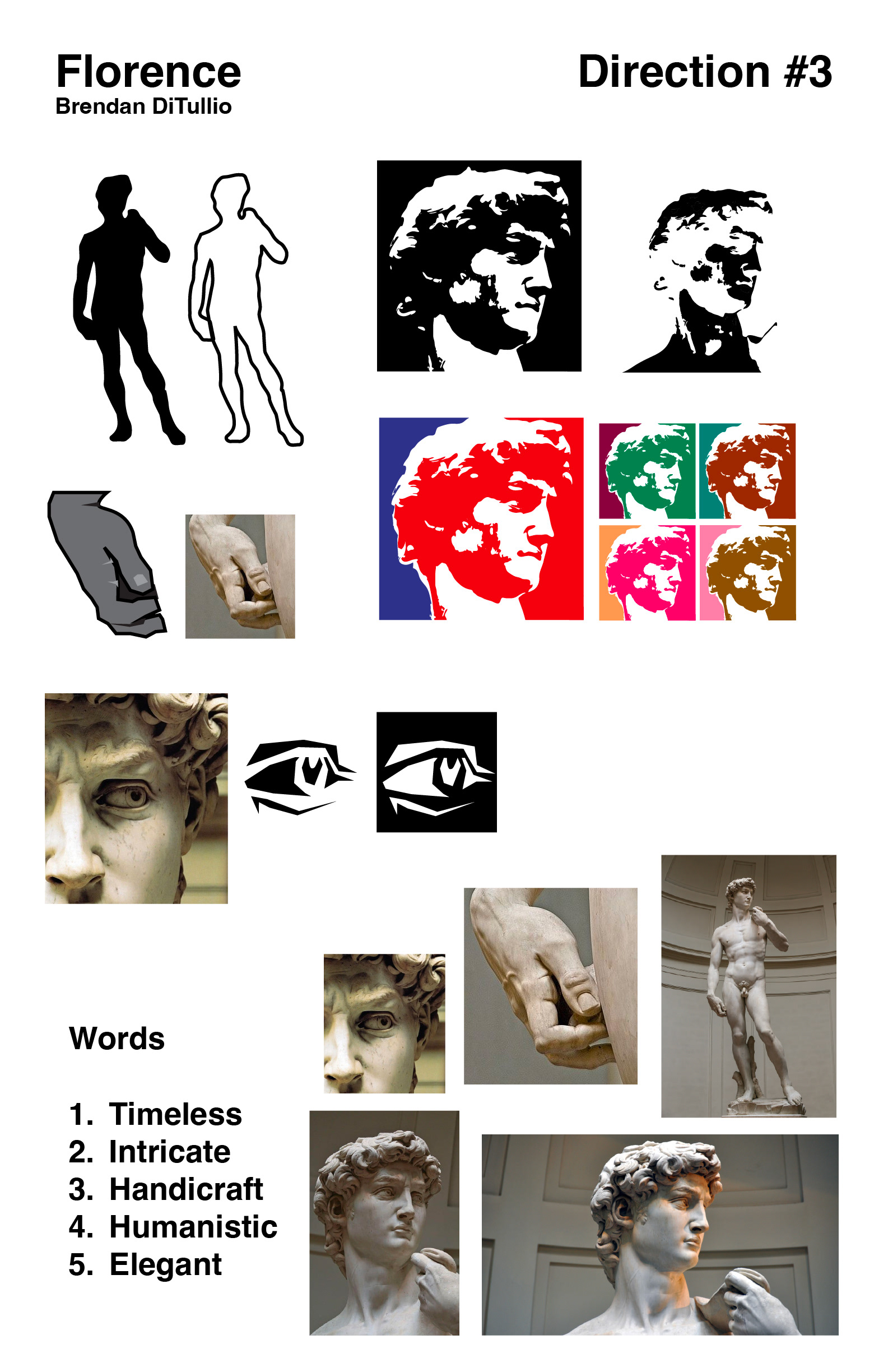
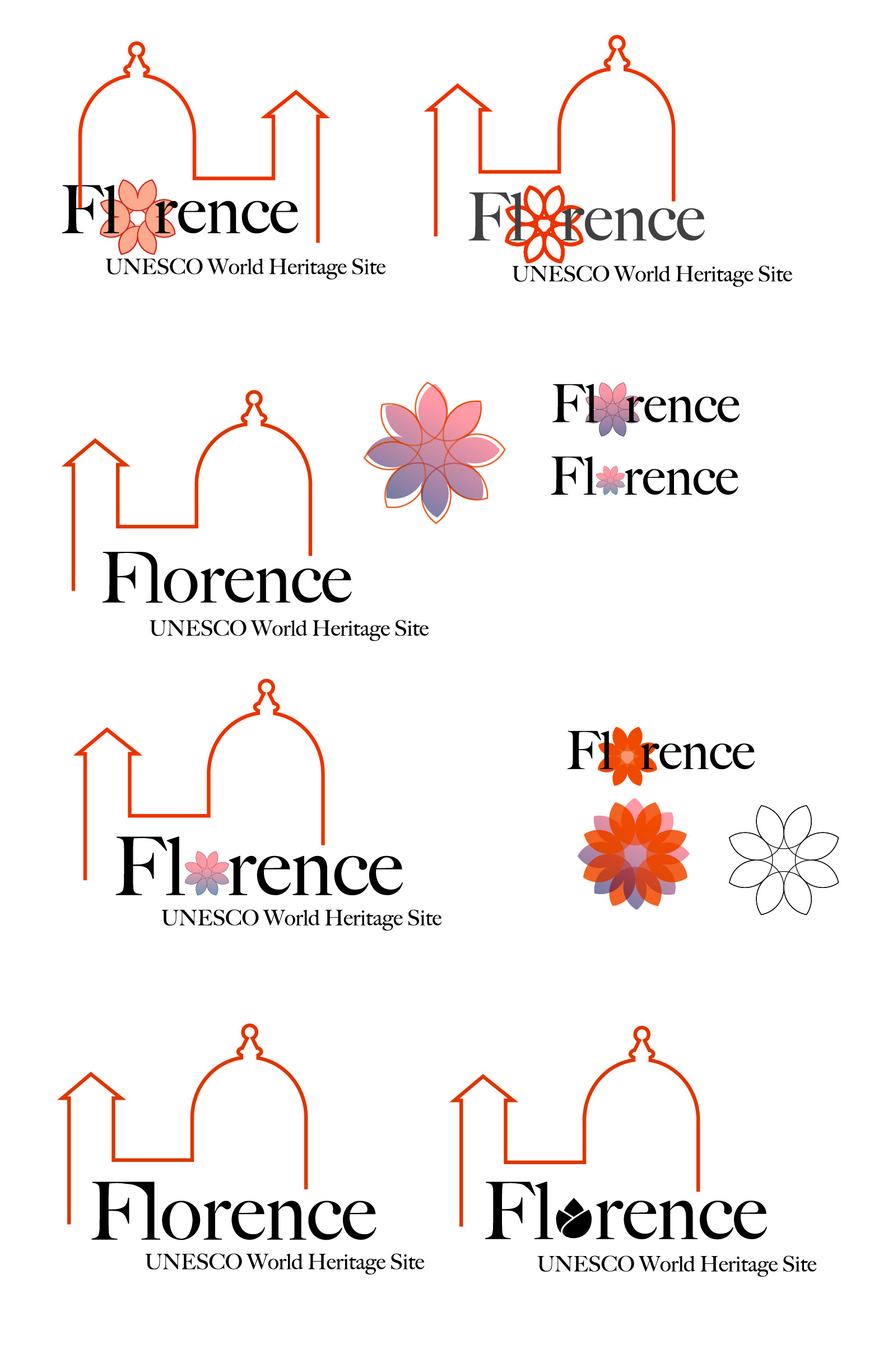
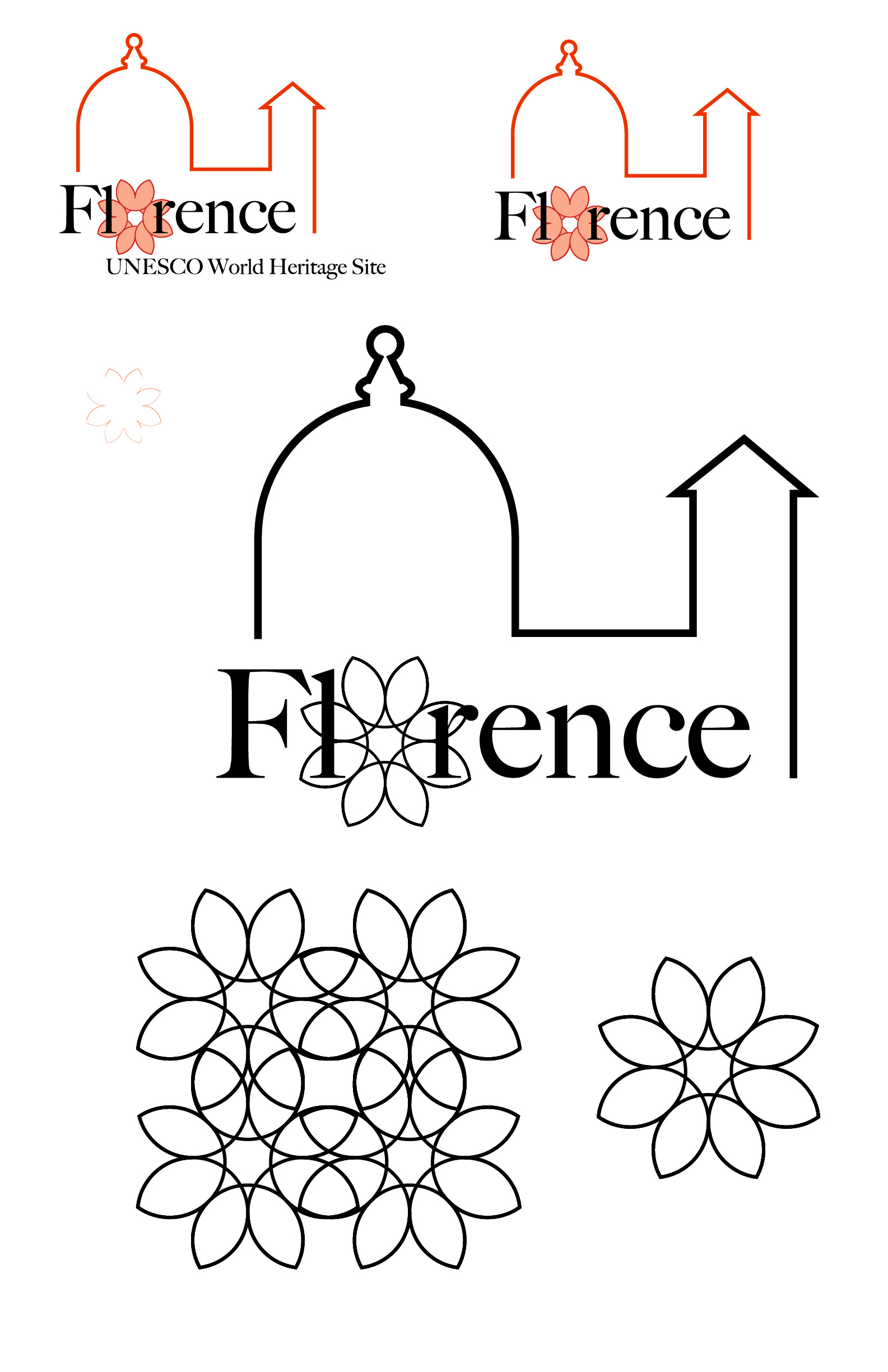
Throughout my process, I kept in mind the context in which I was designing. I began by listing keywords relevant to Florence before leveraging those to create logo sketches. I was exploring ways to capture the city's famous artworks, architecture, and landmarks in a single graphic.
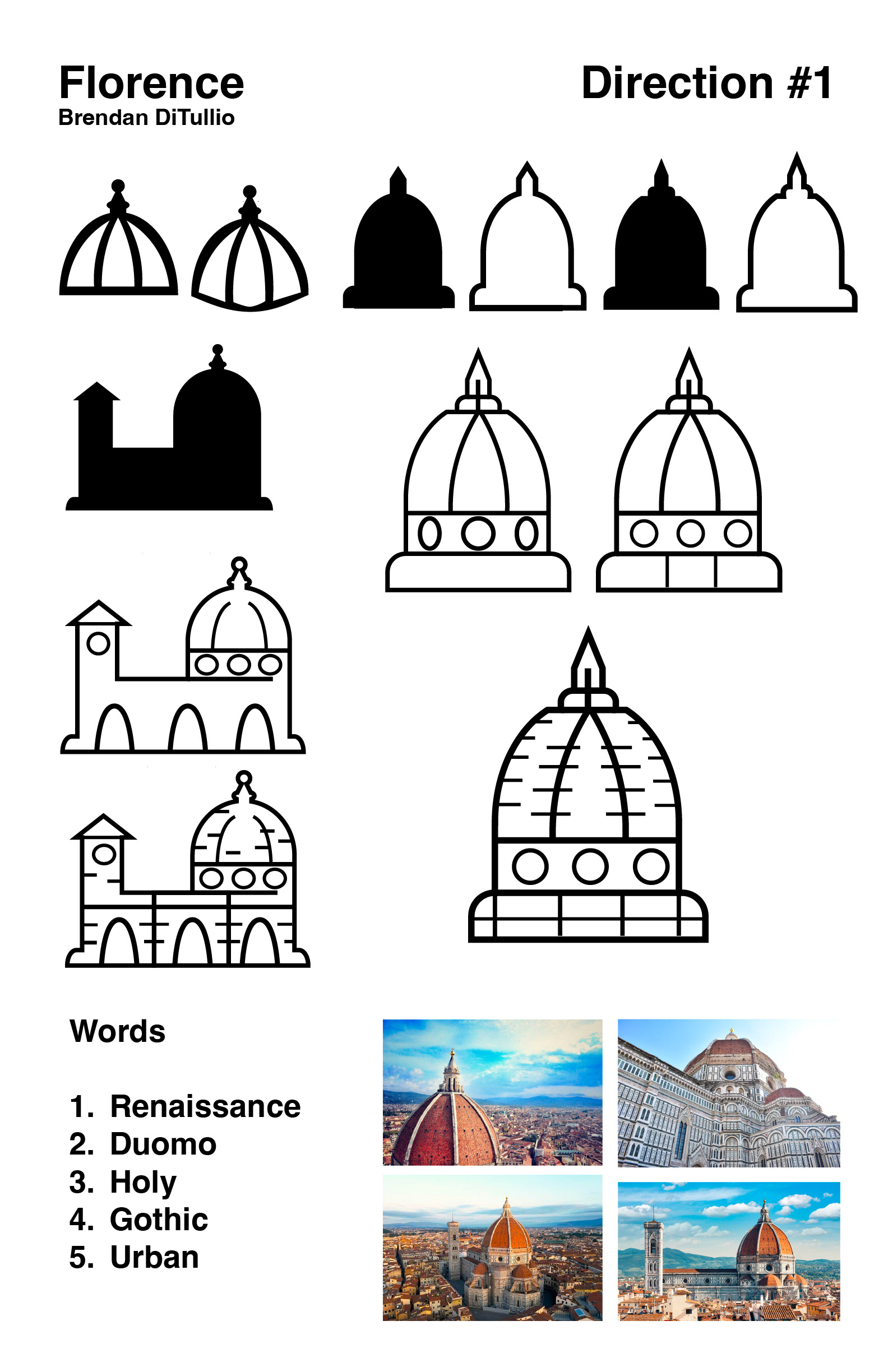
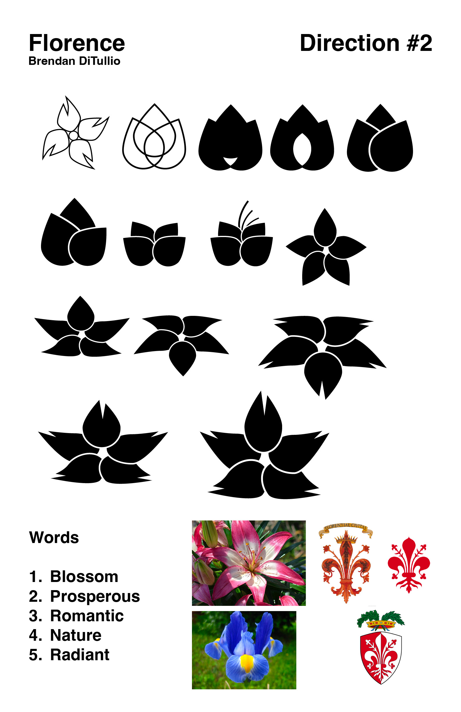
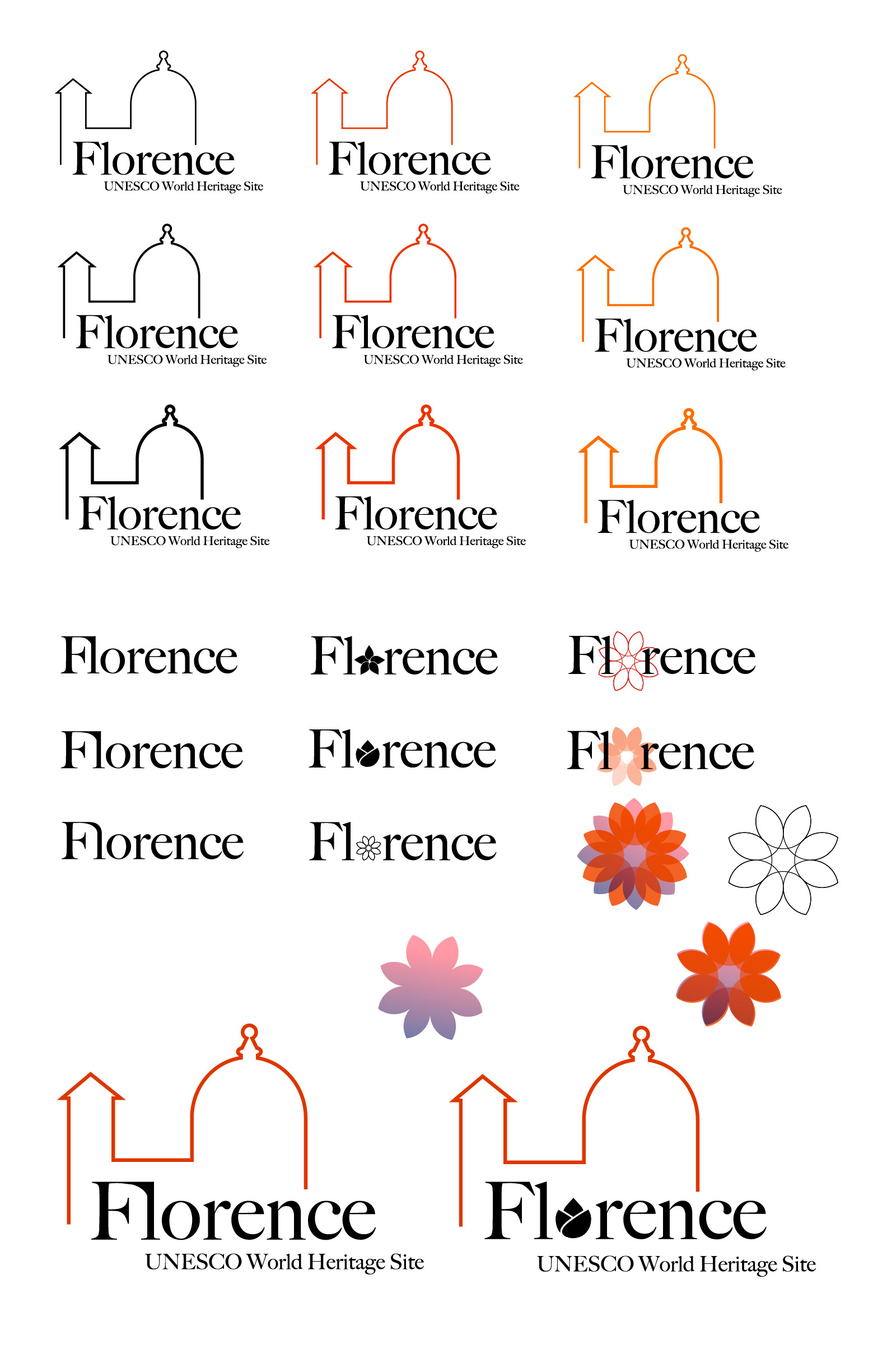
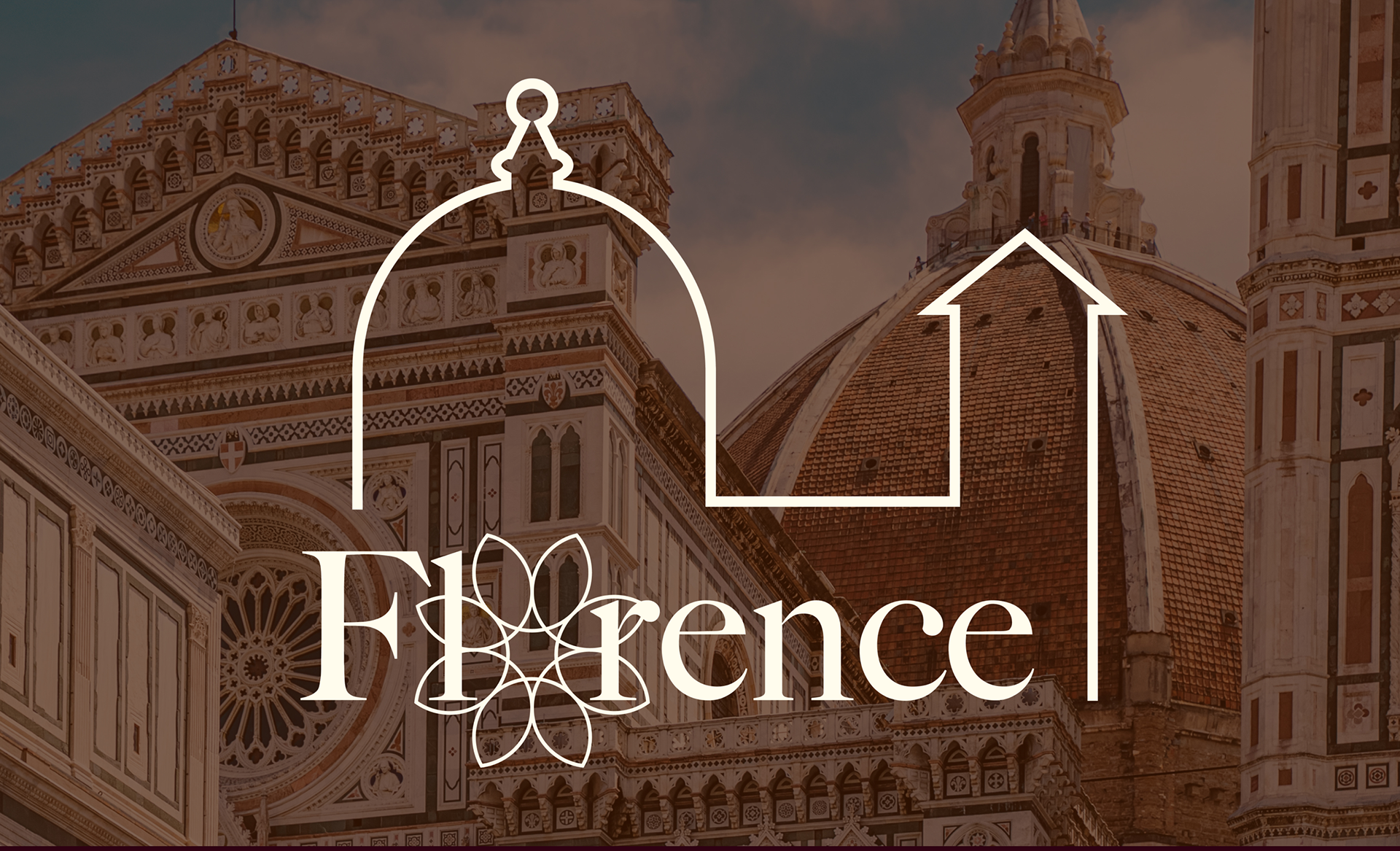
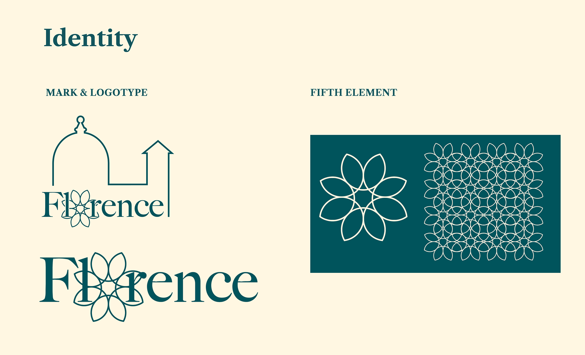
After much experimentation, I refined my concepts and narrowed in on one direction. The simplified line of the Duomo's silhouette highlights the city's artistic achievements, while the flower represents the blossoming natural beauty that inspired these manmade feats.
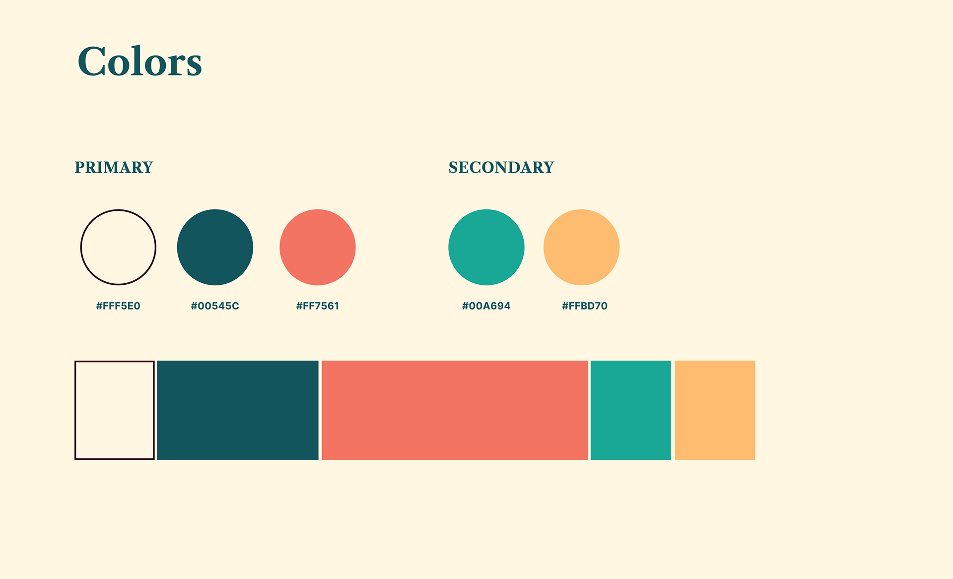
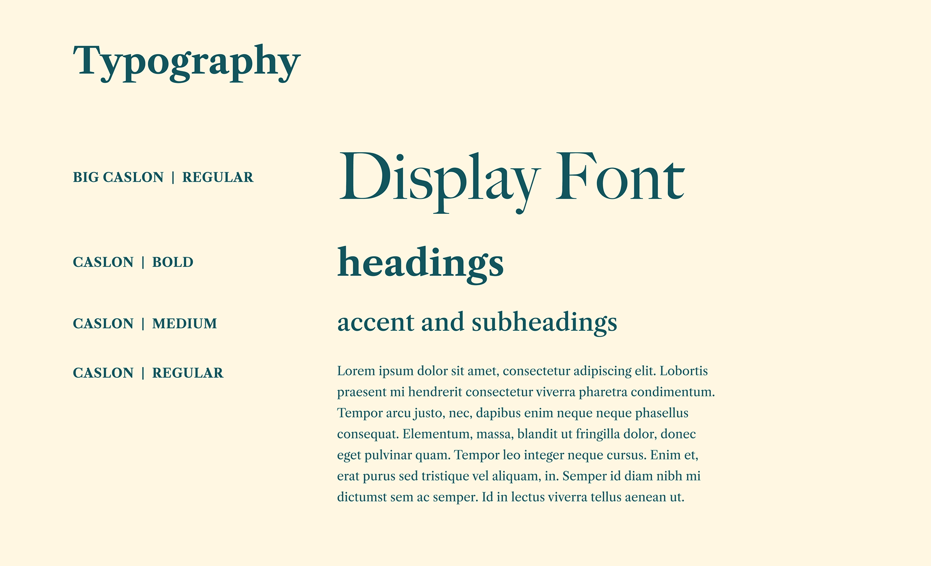
With the main logo decided, I then focused on color, type, and fifth element. I pulled from the city's architecture to create my color palette – blossoming and vibrant, yet classical. I felt that a Roman typeface was right for this project, so I naturally decided on Caslon. Lastly, I developed the fifth element by expanding upon the flower in my logomark, transforming it into a pattern.
Product
With the identity system complete, I began to implement the brand into a wide range of 2D and 3D deliverables. This process was challenging – the more collateral materials I made, the more I found myself revising the original identity.
Seeing the identity system come to life across real world applications gave me a fresh perspective and pushed me to iterate, refine, and ultimately elevate the work beyond its original state. After all of the materials were complete, the final step was to compile each deliverable into a comprehensive visual summary.
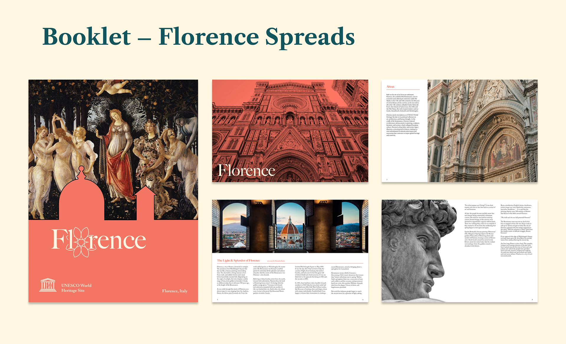
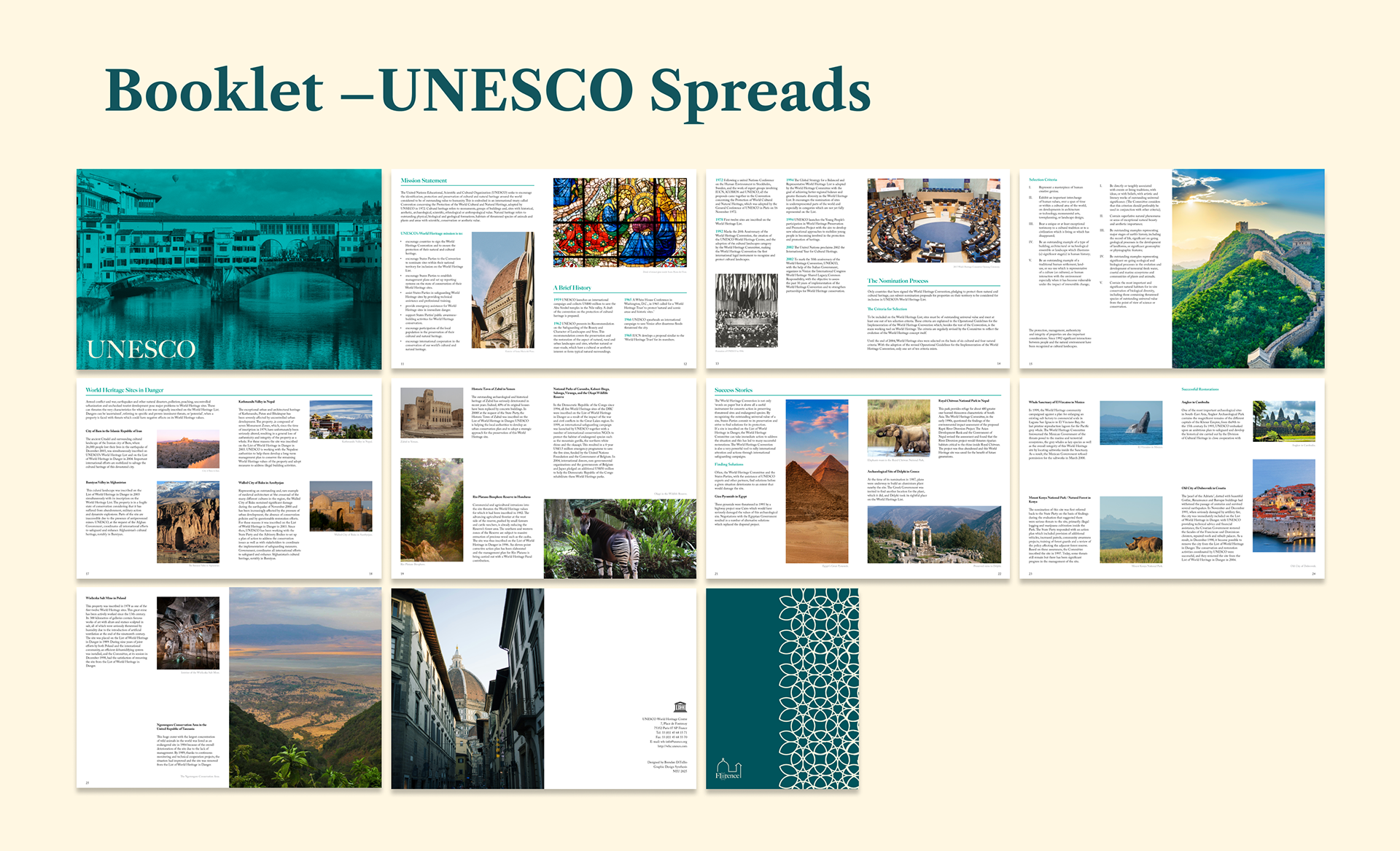
Part of the project was to design a booklet that contained two texts: one of my choosing about the site, and the other a large set of copy detailing UNESCO World Heritage sites and their histories. I had to find the best way of balancing all of this information in a clear and concise layout.
For my Florence text, I chose a short essay by Daisaku Ikeda, a Buddhist philosopher and educator. I felt that this piece captured the city's beauty and splendor in an elegant manner.