Bringing queer energy to the music scene.
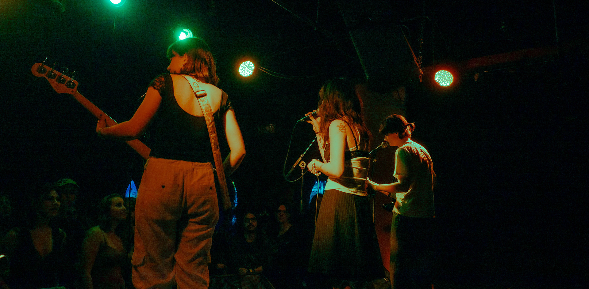
Cherry Crisis is a genre-bending group of 4 non-male identifying musicians based in Boston. They're all about bringing more queer, feminine energy to the music scene while making it a safer and more inclusive environment for everyone.
Design Team: Brendan DiTullio, Taylie Kawakami, Emlyn Griffiths, Amie Chen, Amanda Fong
Role
Designer
Tools
Adobe Suite, Figma
Organization
Scout
Goal
Cherry Crisis approached the team seeking a cohesive brand identity that could highlight their unique sound. They also wanted to create a website that served as a digital hub for upcoming shows and song releases. Our goal was to create an identity that would amplify queer voices while building a sense of connection within the local music community.
Process
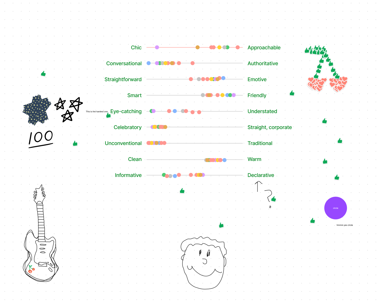
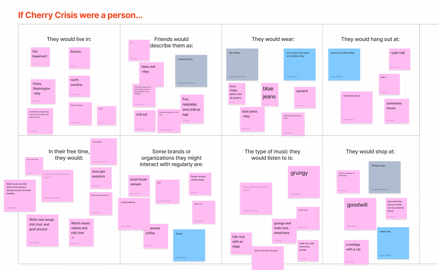
We started by working with the band members on a series of brand exercises so we could get a clear picture of who they are both individually and as a band.
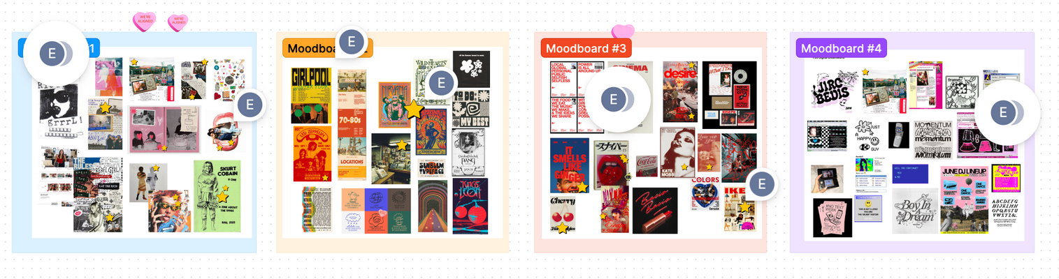
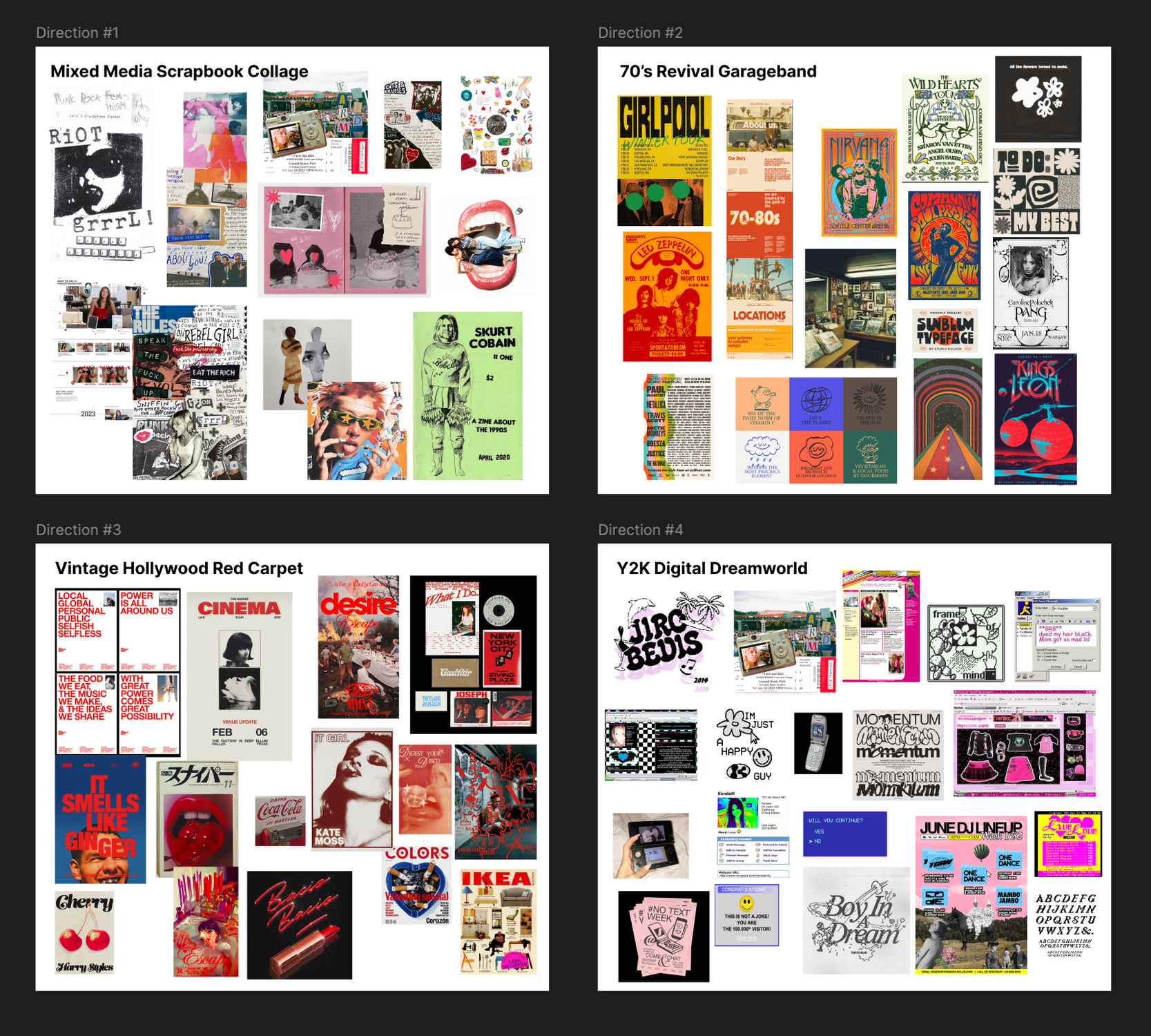
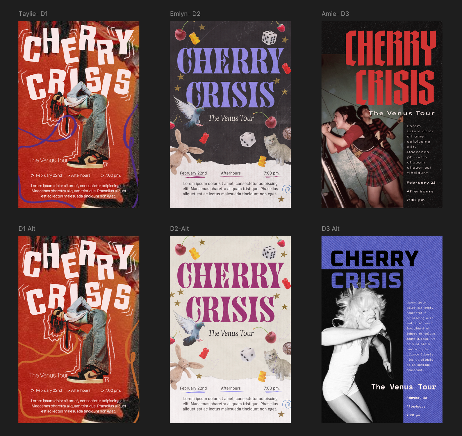
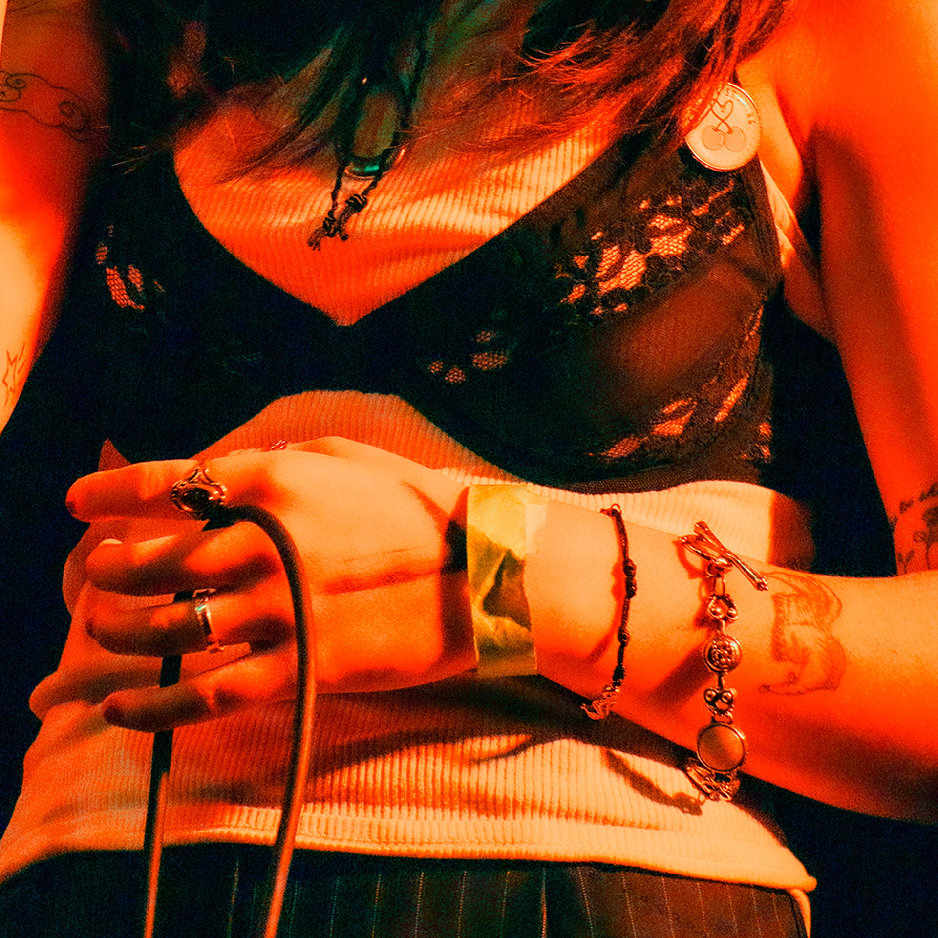
After our brand exercises, we created moodboards for four distinct design directions that all captured the eclectic, creative soul of Cherry Crisis in different ways. The band gravitated the most towards the “Mixed Media Scrapbook Collage” and the “70’s Revival Garageband” directions, so we created flyers showing three different ways we could fuse these directions into an identity. The band loved the first example, so it became the basis of our brand.
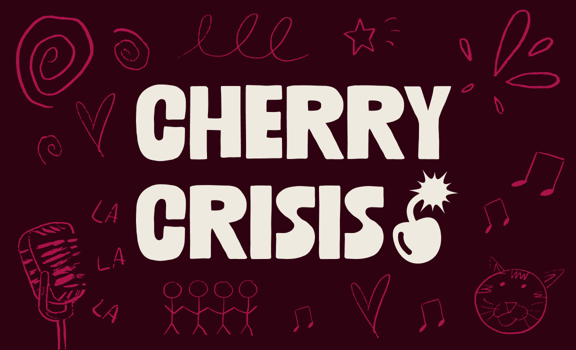
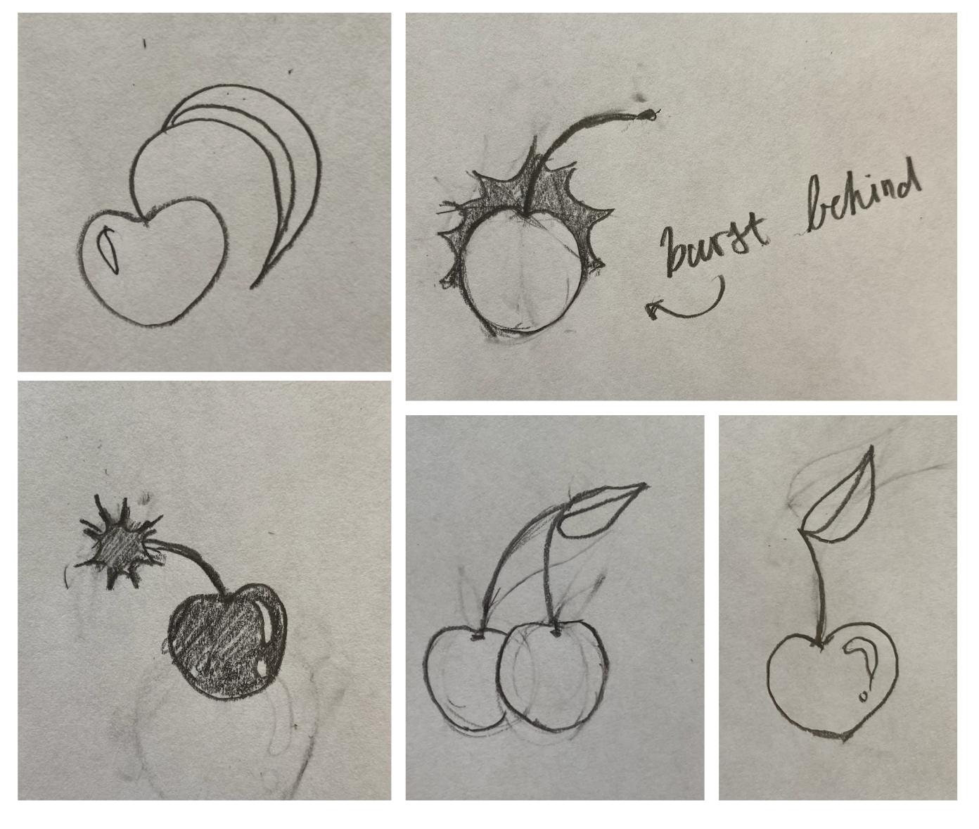
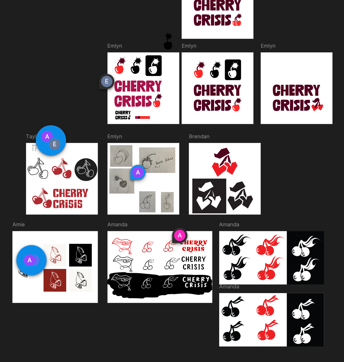
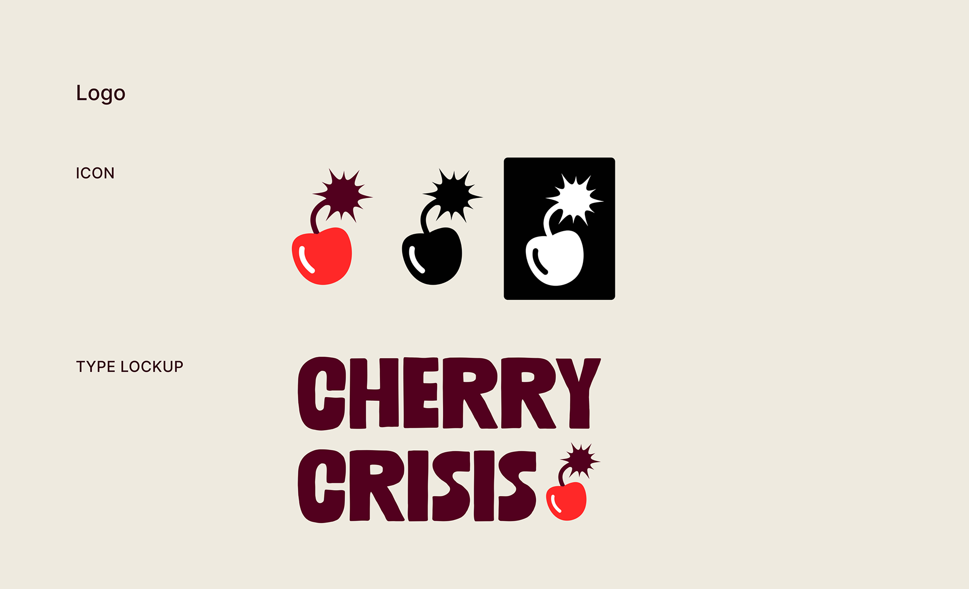
Each designer also created multiple potential logos for Cherry Crisis. The final logo combines a recognizable cherry with a lit fuse to exemplify the fiery energy of their music.
Product
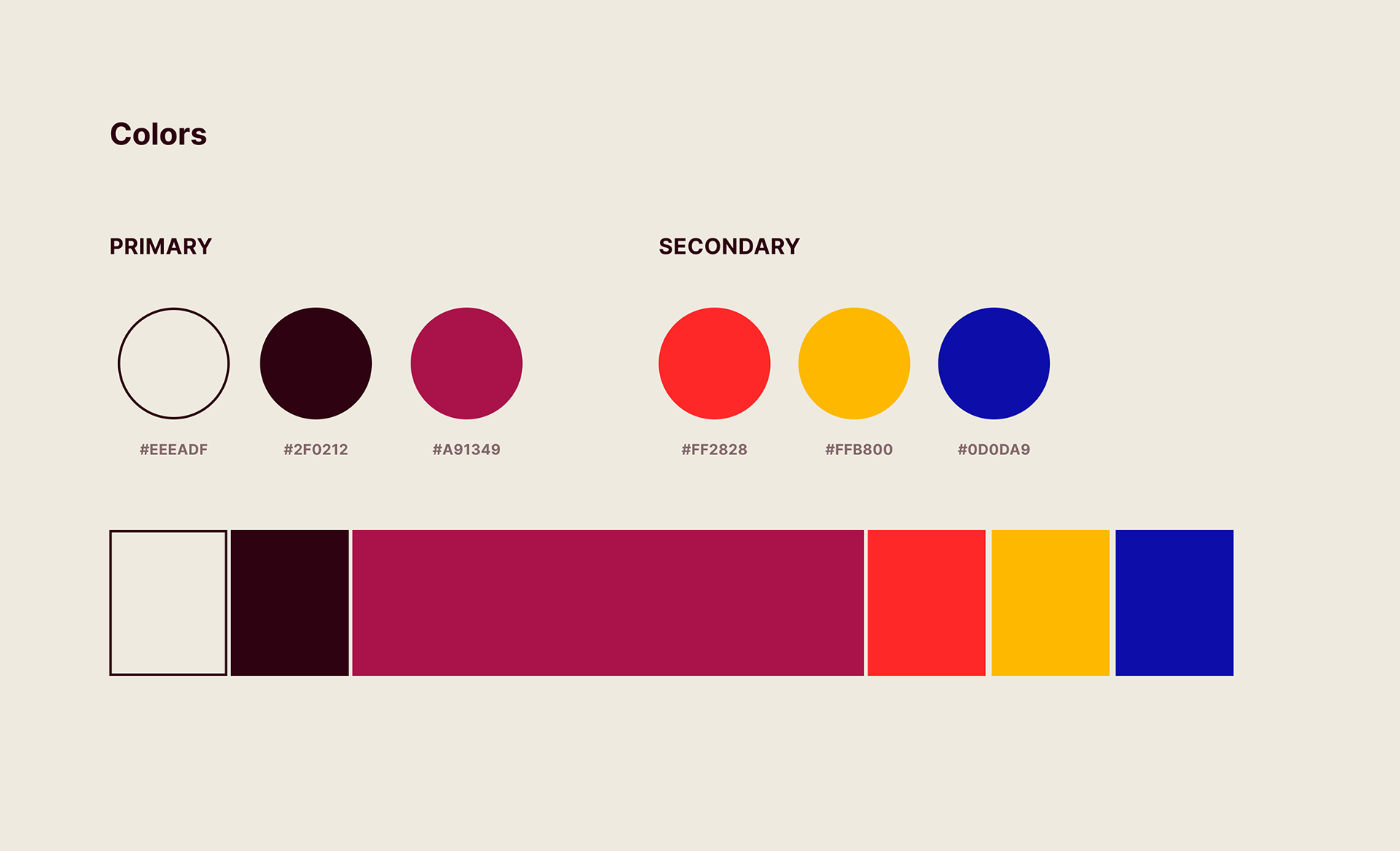
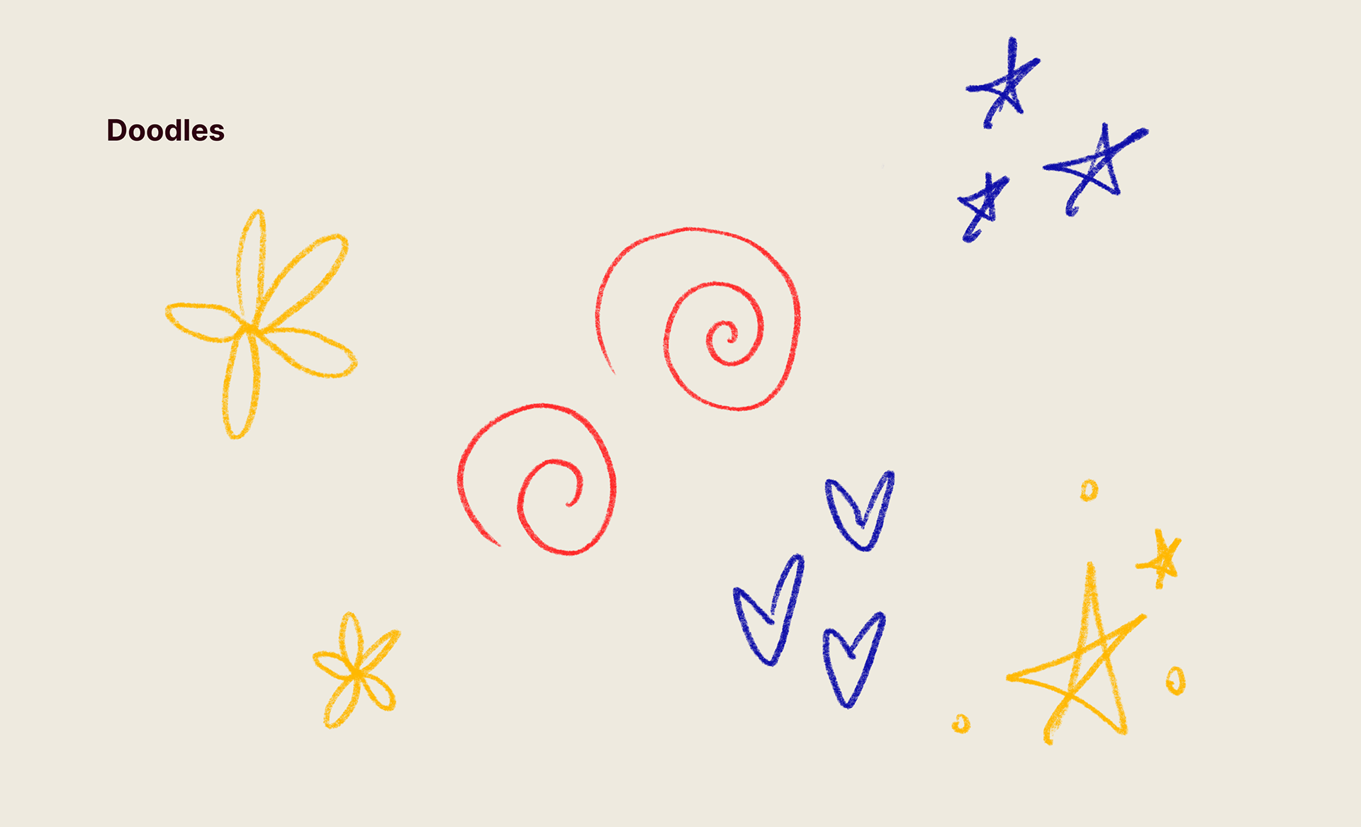
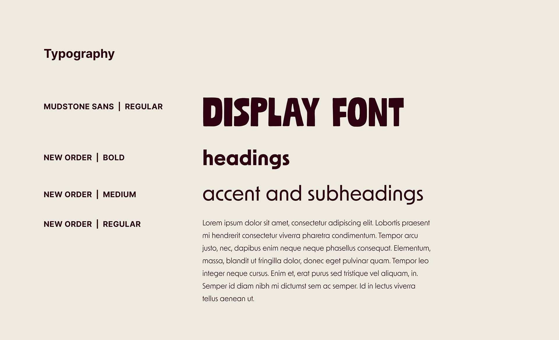
The final brand is grounded in a clean hierarchy and intentional brand choices but just like Cherry Crisis, has elements of DIY. We had the band members create their own doodle elements so that each voice was heard both in their music and in their visuals.

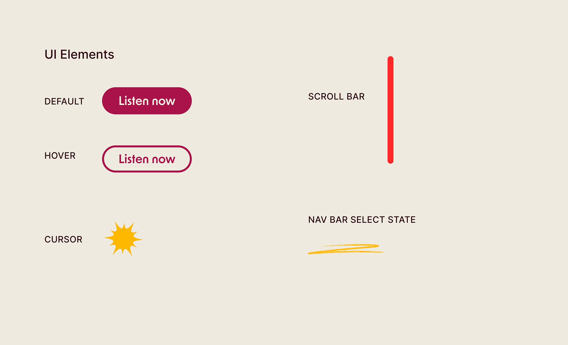
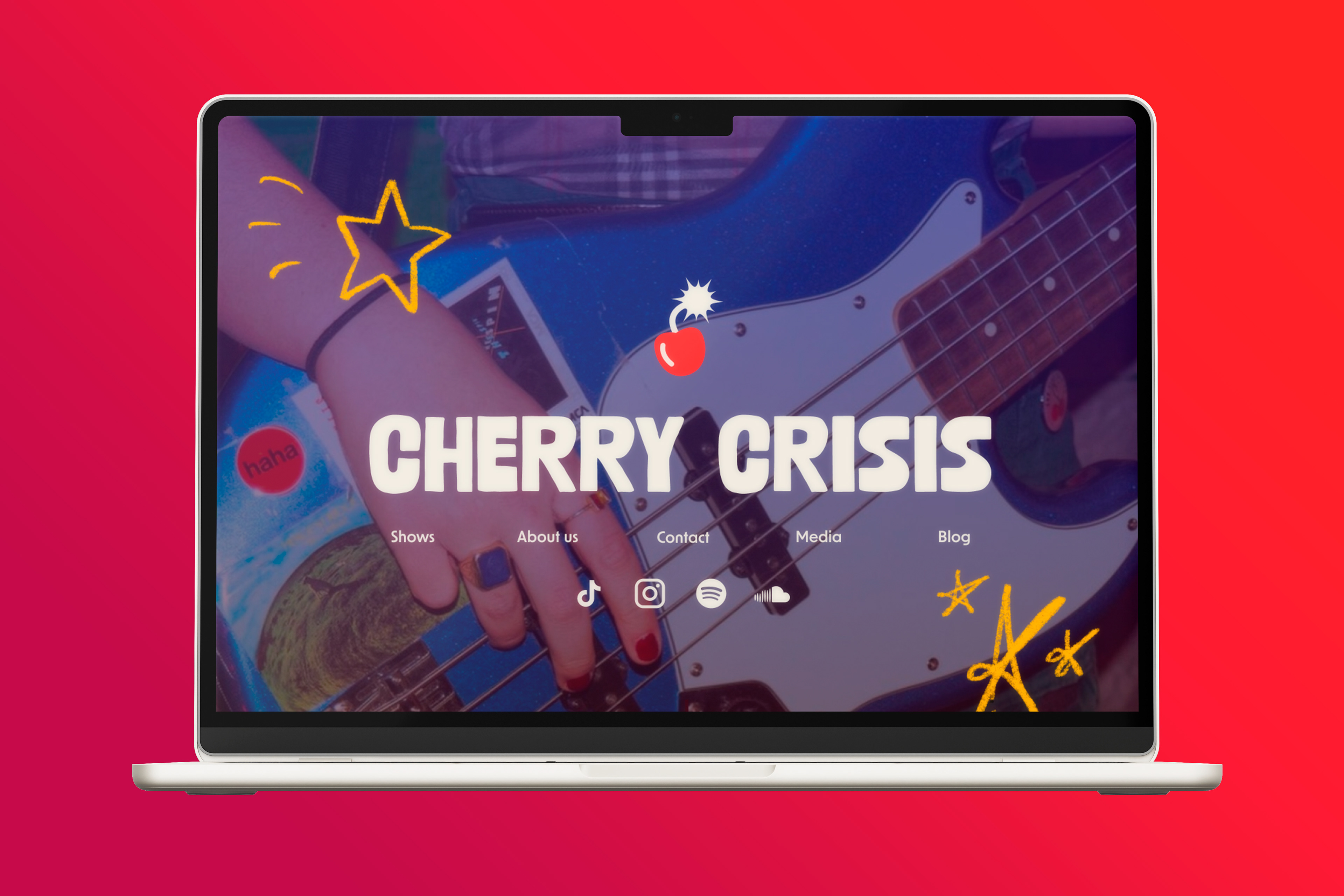
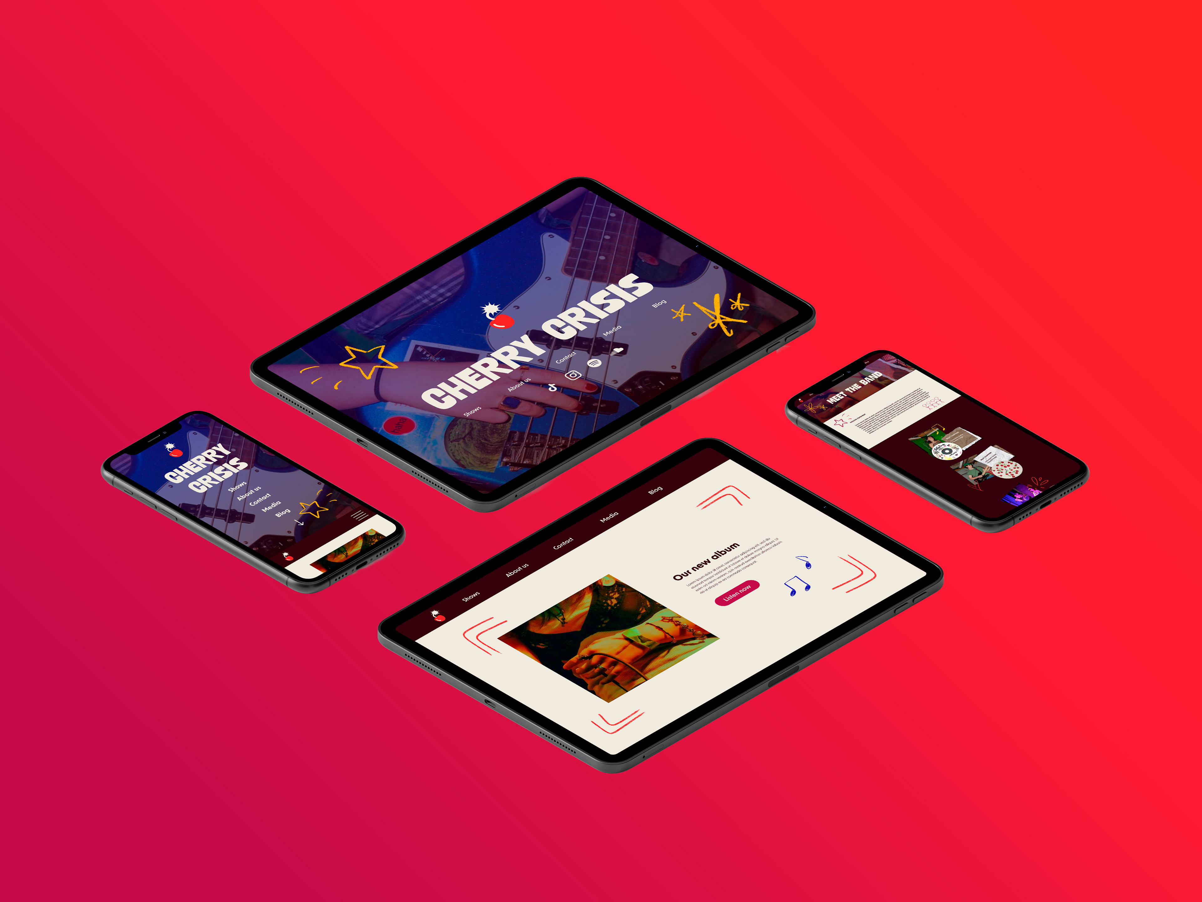
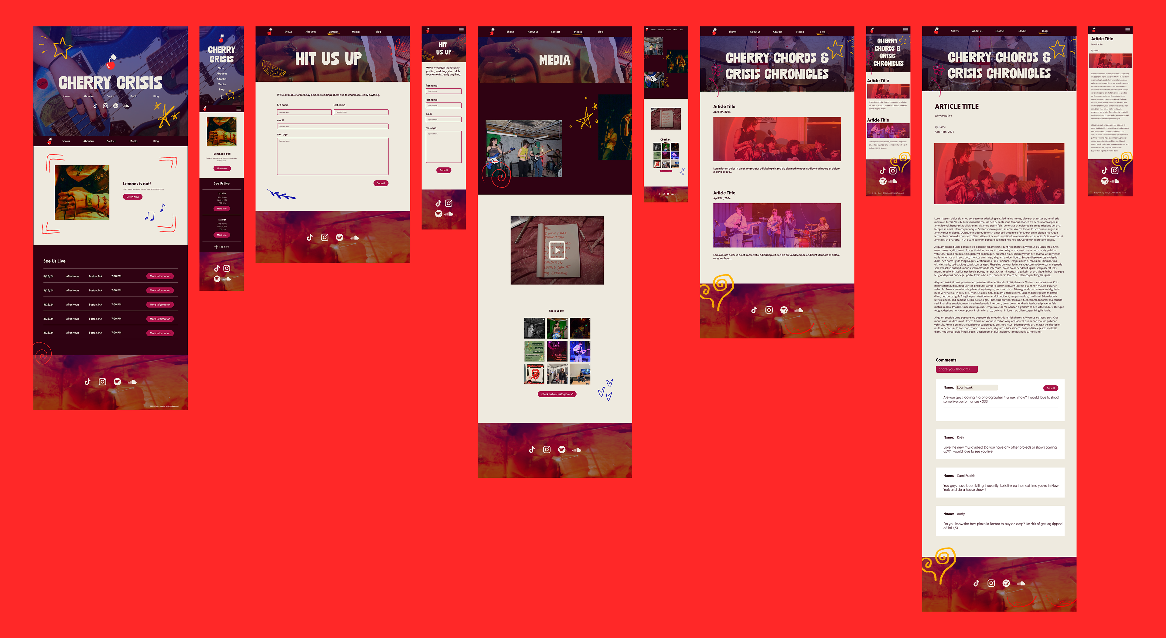
The final step was to implement Cherry Crisis’ new brand into a website. We had worked with our clients to create a site map and user stories. From there, we designed lofi wireframes, conducted user-testing, and revised them until they were easily navigable.
Finally, we brought our wireframes to life with our branding and photography from Scout’s Media Team. The final website highlights Cherry Crisis in a way that feels true their band persona.

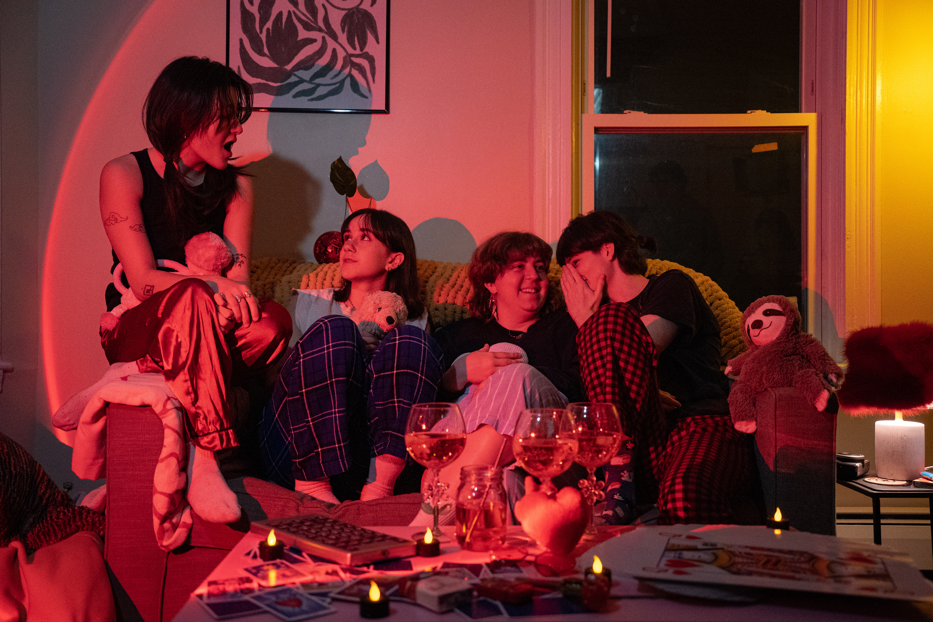
After the project concluded, I kept in touch with Cherry Crisis as a designer and visual advisor, designing posters and potential merch concepts.
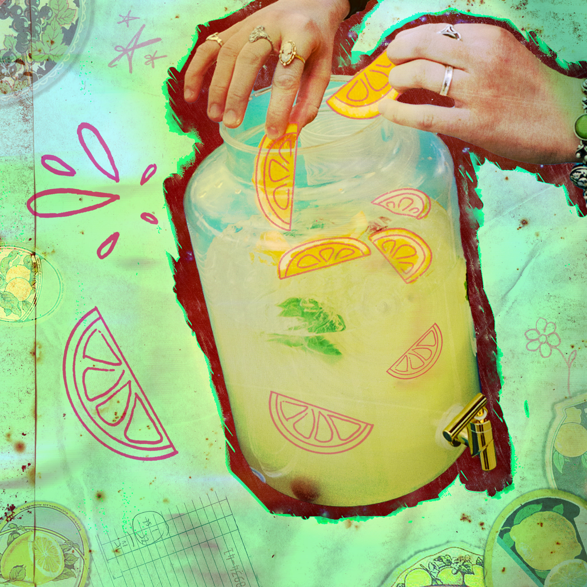
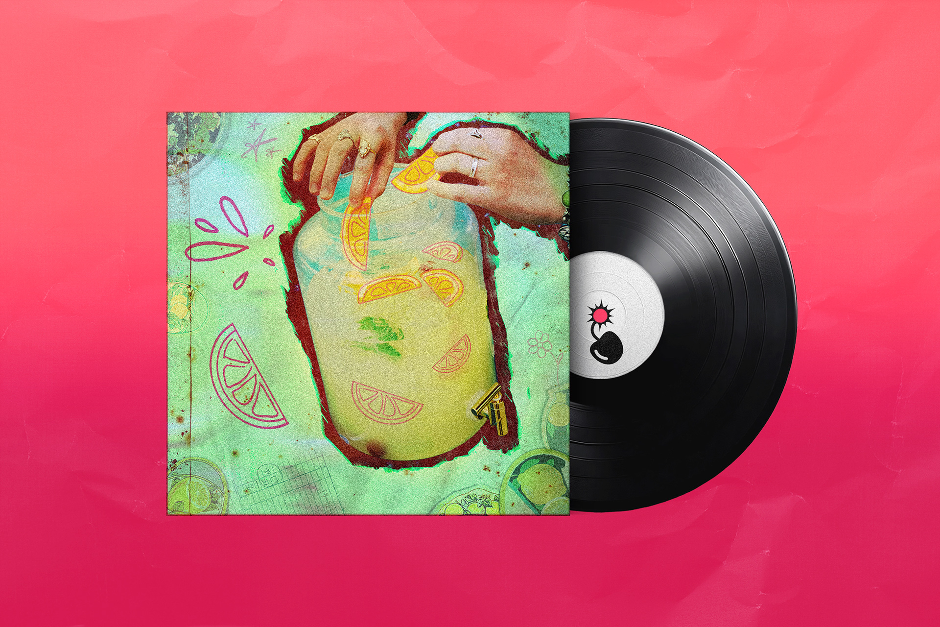
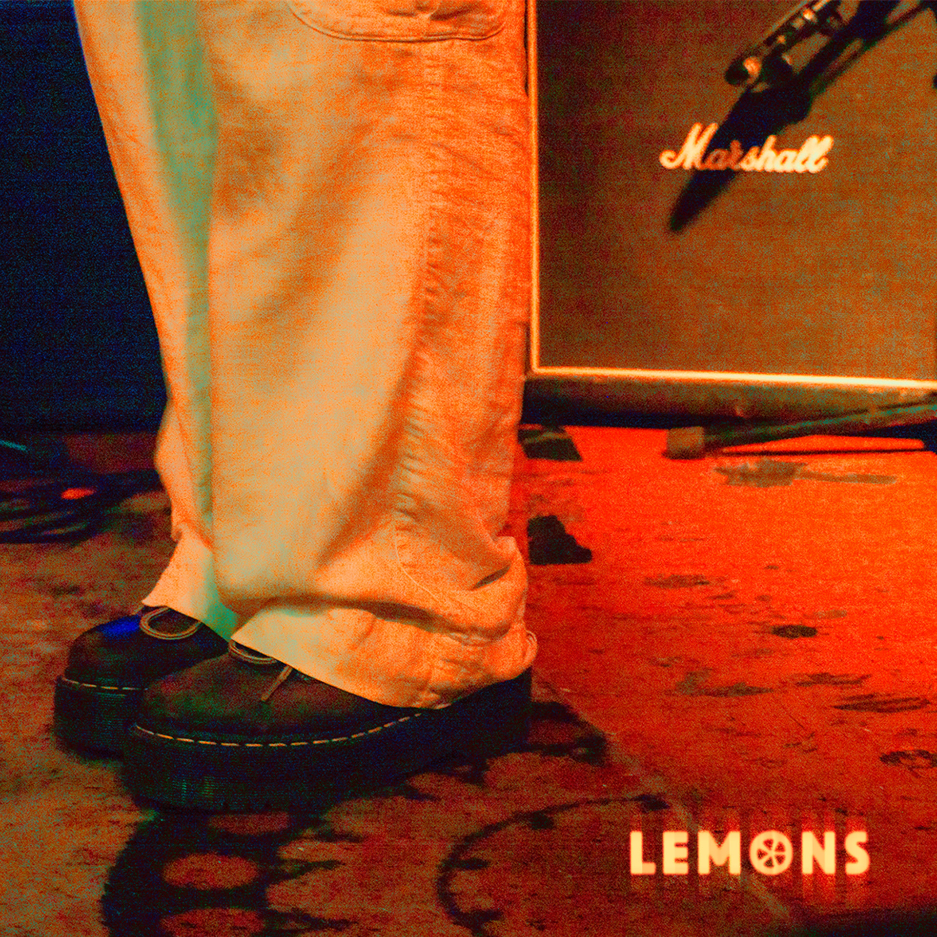
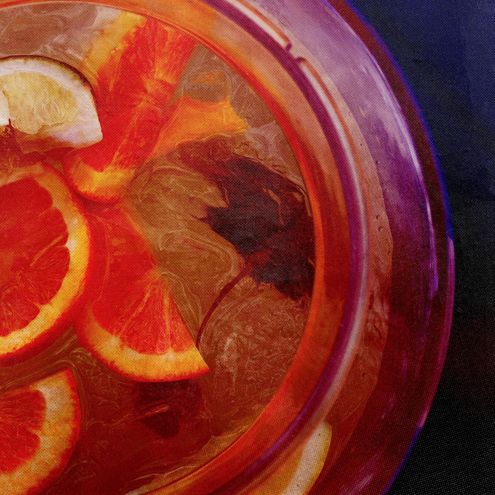
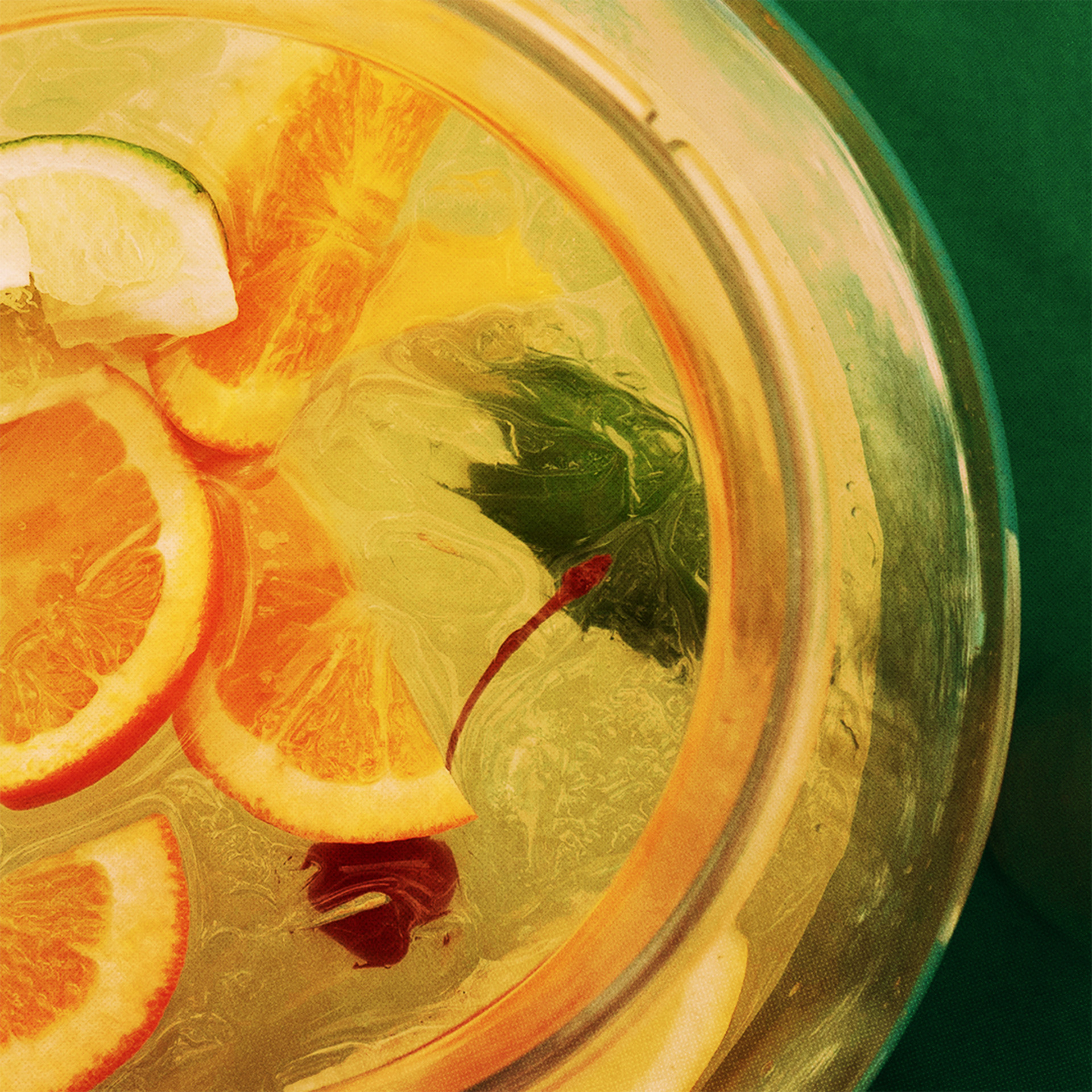
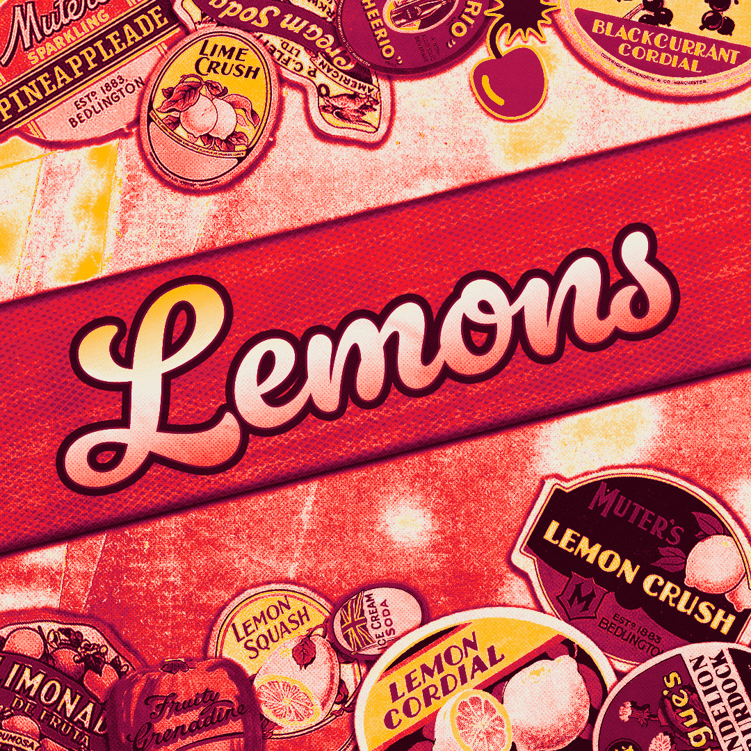
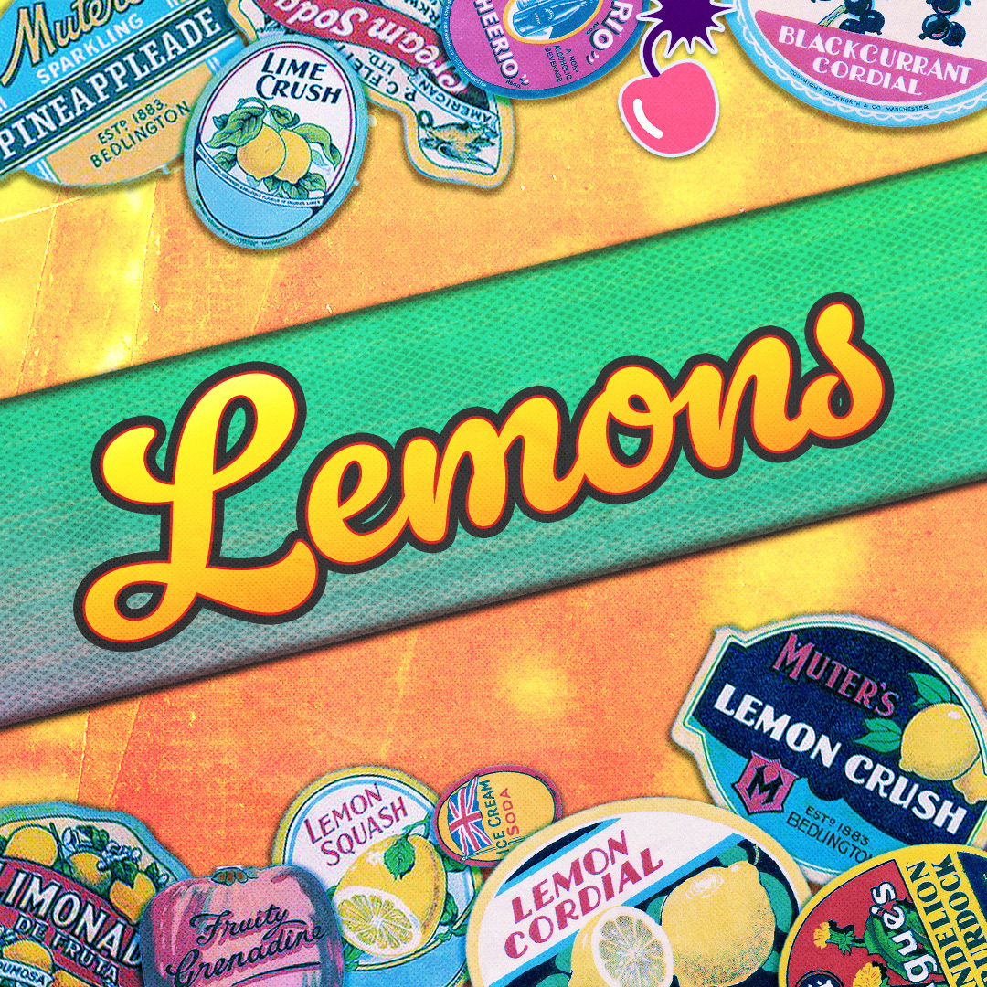
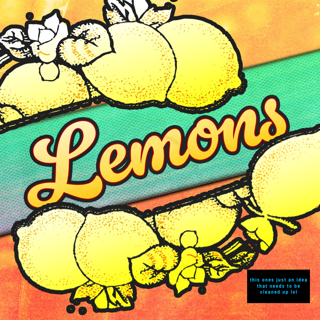
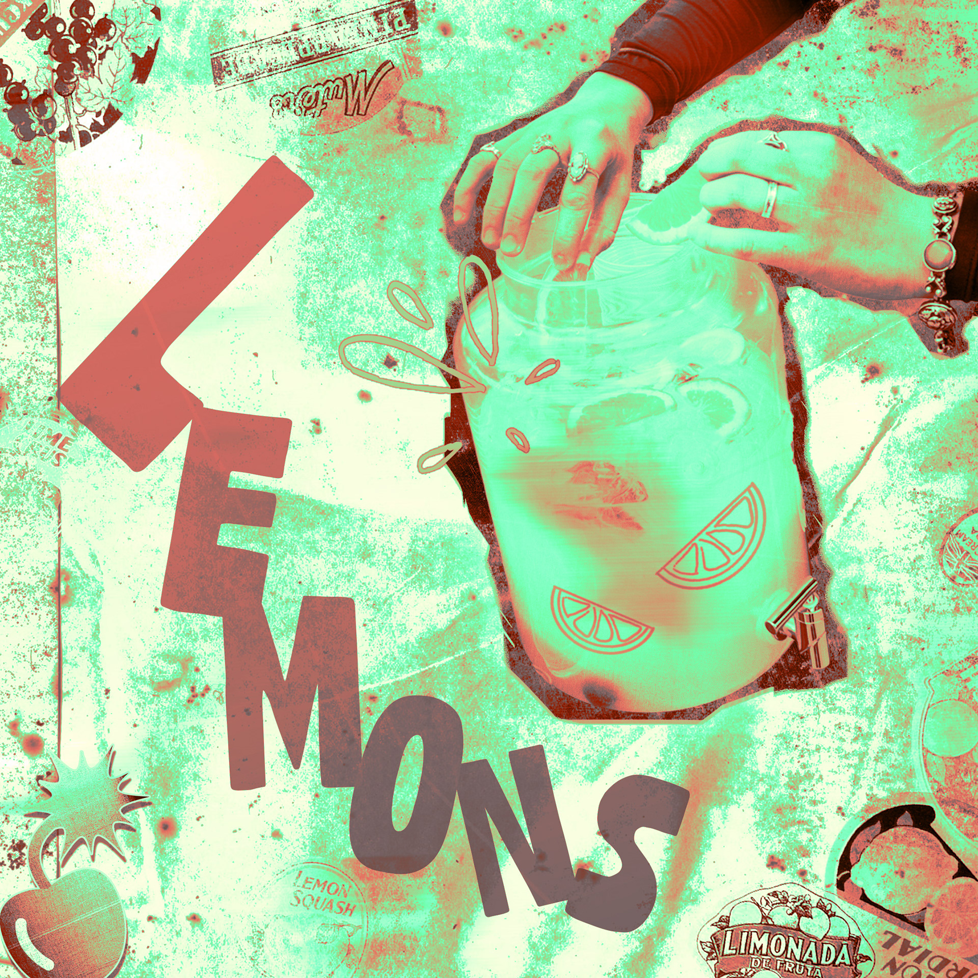
I was personally asked to design the album art for their very first release, "Lemons." I worked closely with the band through a series of iterations, finally landing on a playful cover that captures the momentum of their debut single.
Concept iterations.
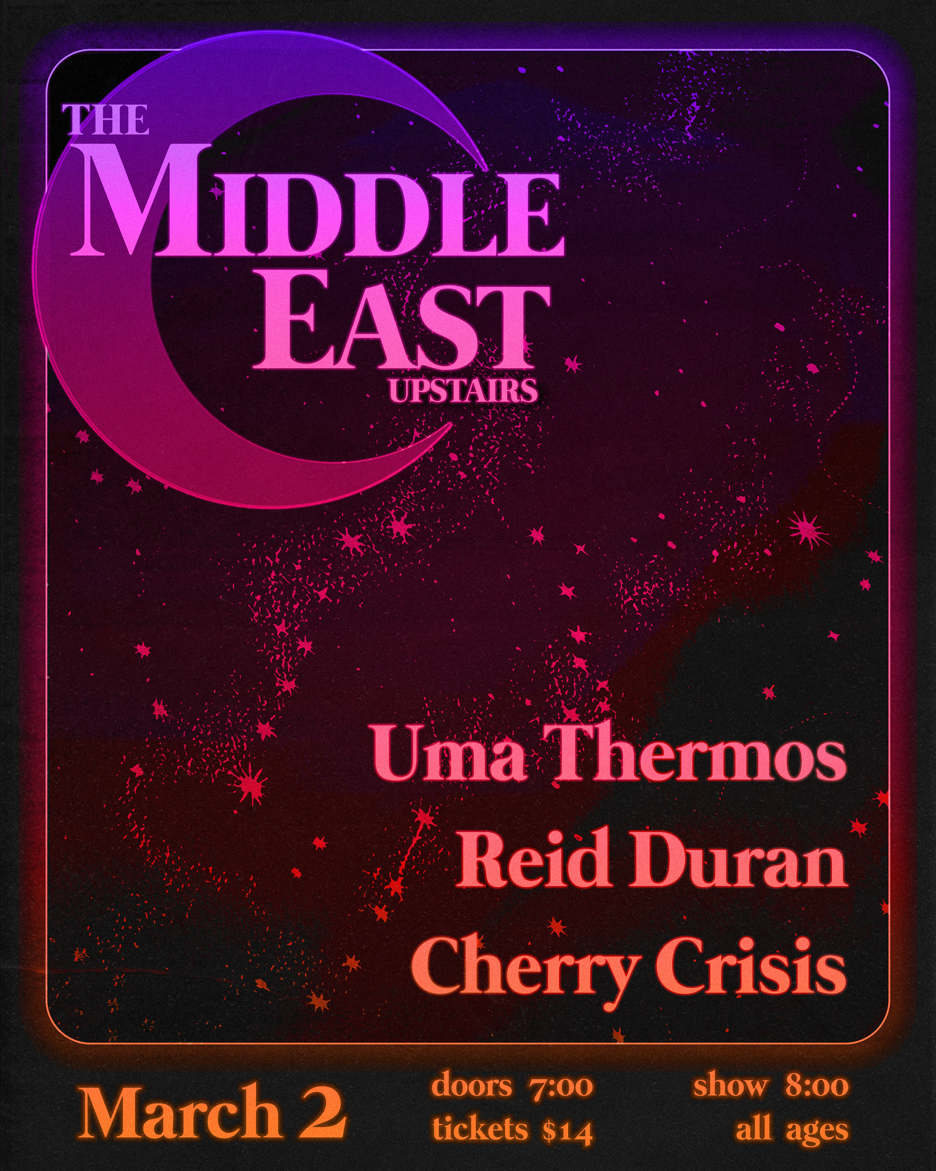
I designed this poster for the band's first show at an official venue.