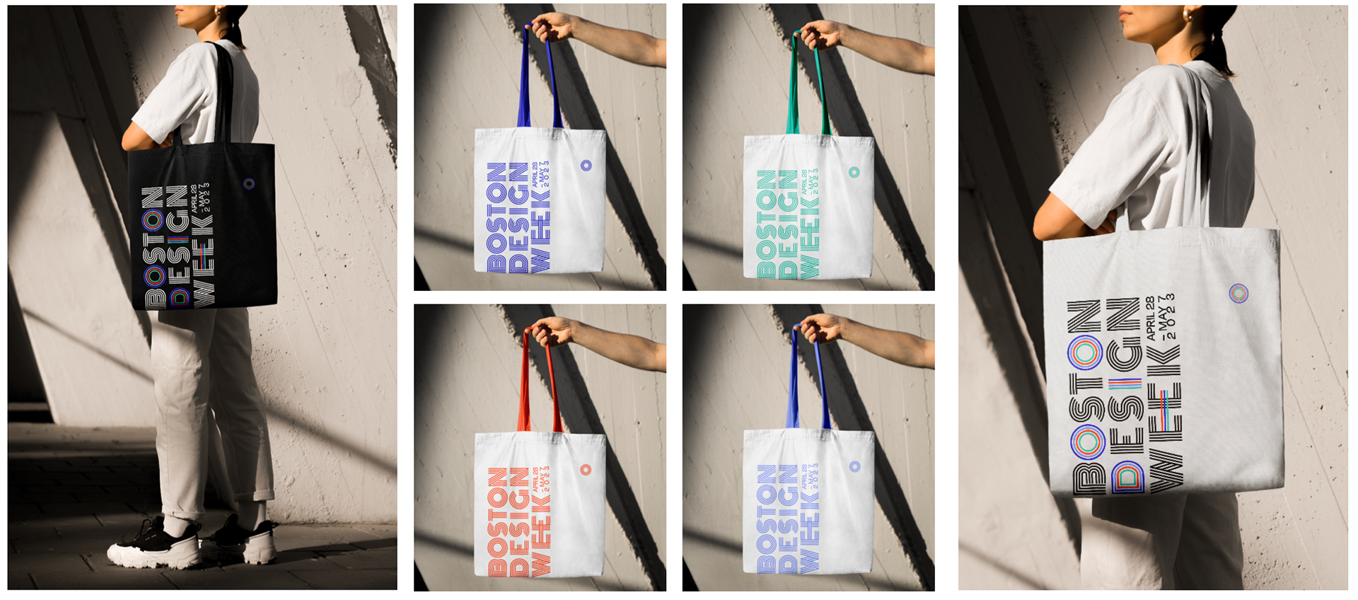
Wicked impactful.
Boston Design Week is an annual celebration of the city's design community. In this group project, I was tasked with rebranding the event's lackluster visual language. We gave BDW a complete visual overhaul to modernize the event and increase the brand's impact.
Design Team: Brendan DiTullio, Jenna Ory, Eric Chen, Ana Urrutia
Role
Designer
Tools
Adobe Suite
Class
Identity & Brand Design
Goal
The goal of this rebrand was to modernize and unify the visual identity of Boston Design Week. With dozens of independent events spread across multiple neighborhoods, the challenge was to create a cohesive brand system that could be adaptable, appealing, and impactful.
Process
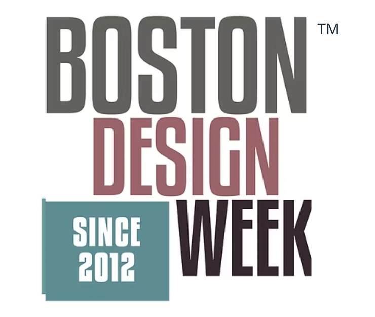
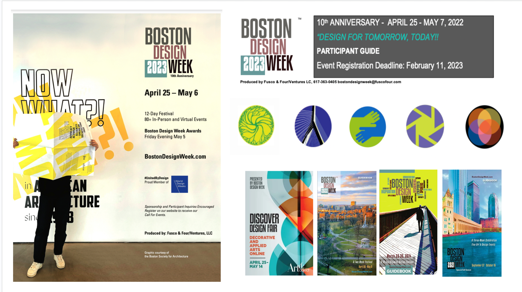
The rebranding process began with research into past BDW materials and audience demographics. We found that the event had no consistent color palette or visual language, and overall, the event feels overly corporate. For a design-centered event, this was not ideal.
Current branding.
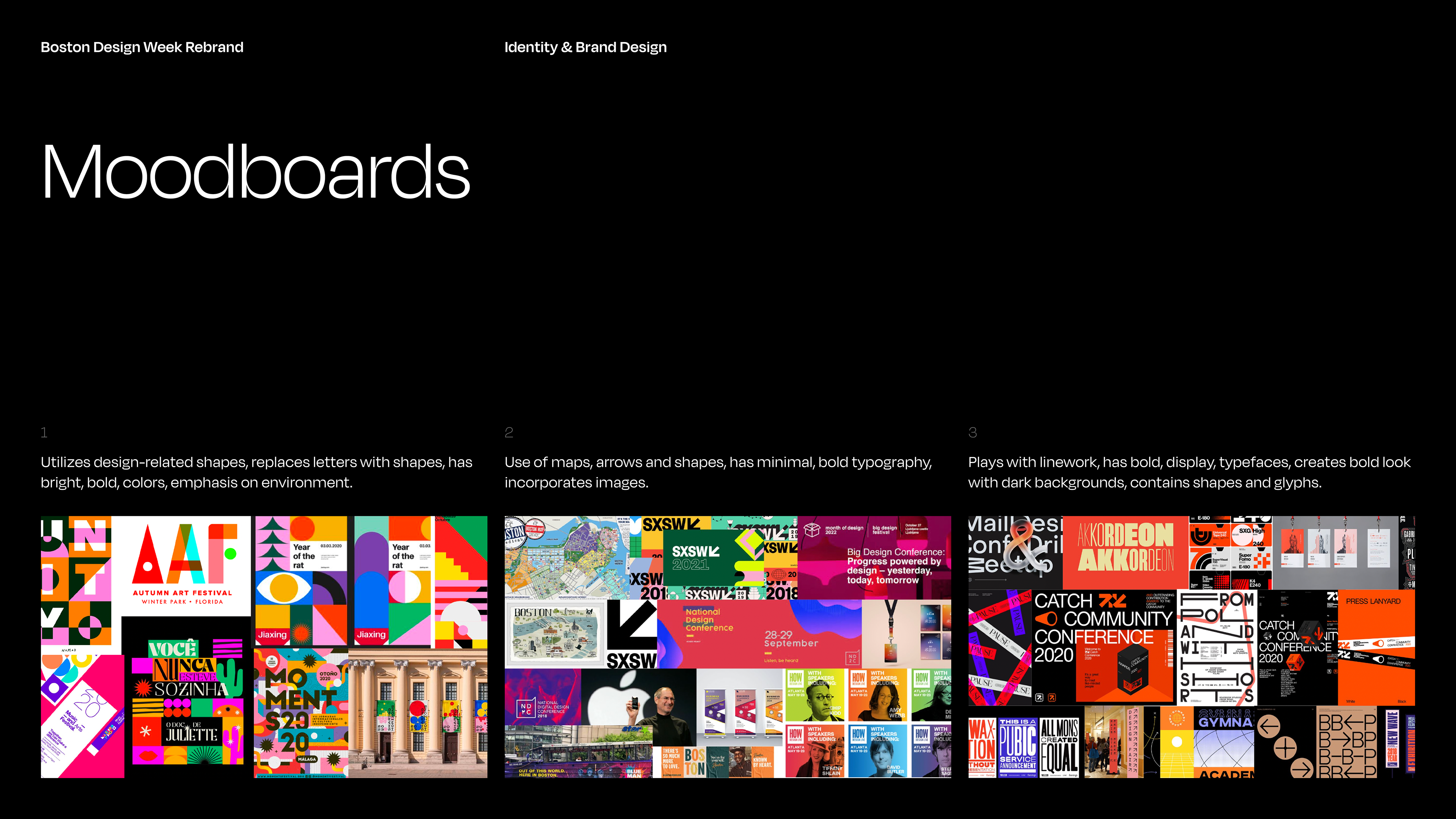
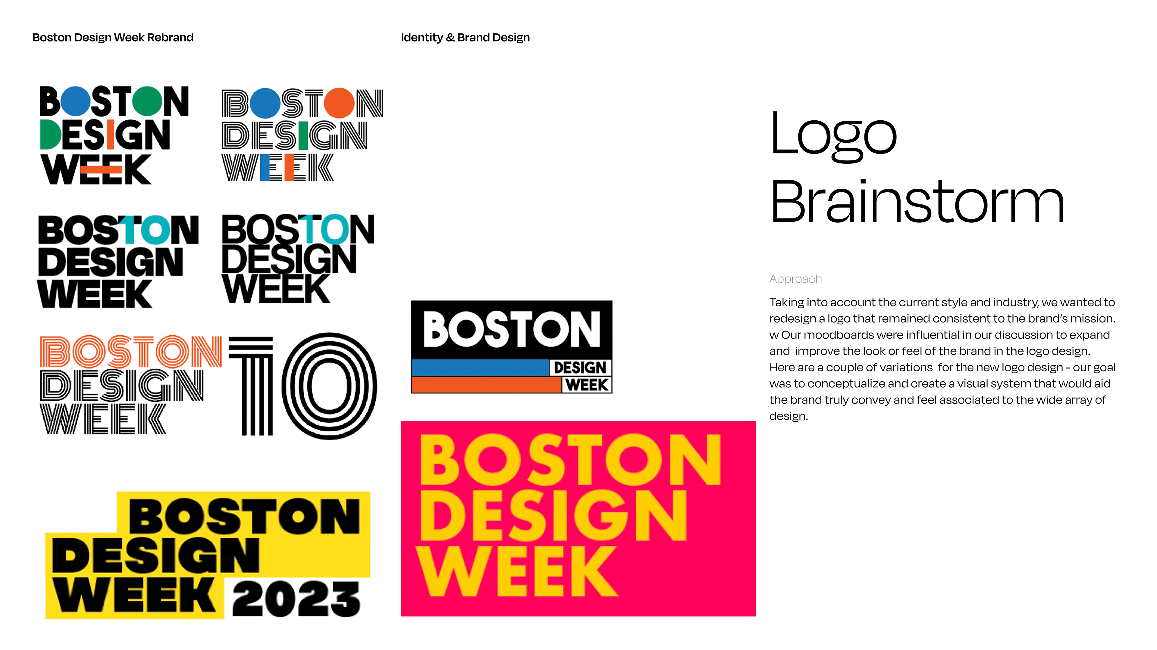
Our moodboards and logo concepts all leaned towards a system that was minimal yet striking, something that would give the event a sense of importance and impact. We wanted our new visual direction to be bold and contemporary – a complete break from the current brand's inconsistent colors and outdated typography.
Product
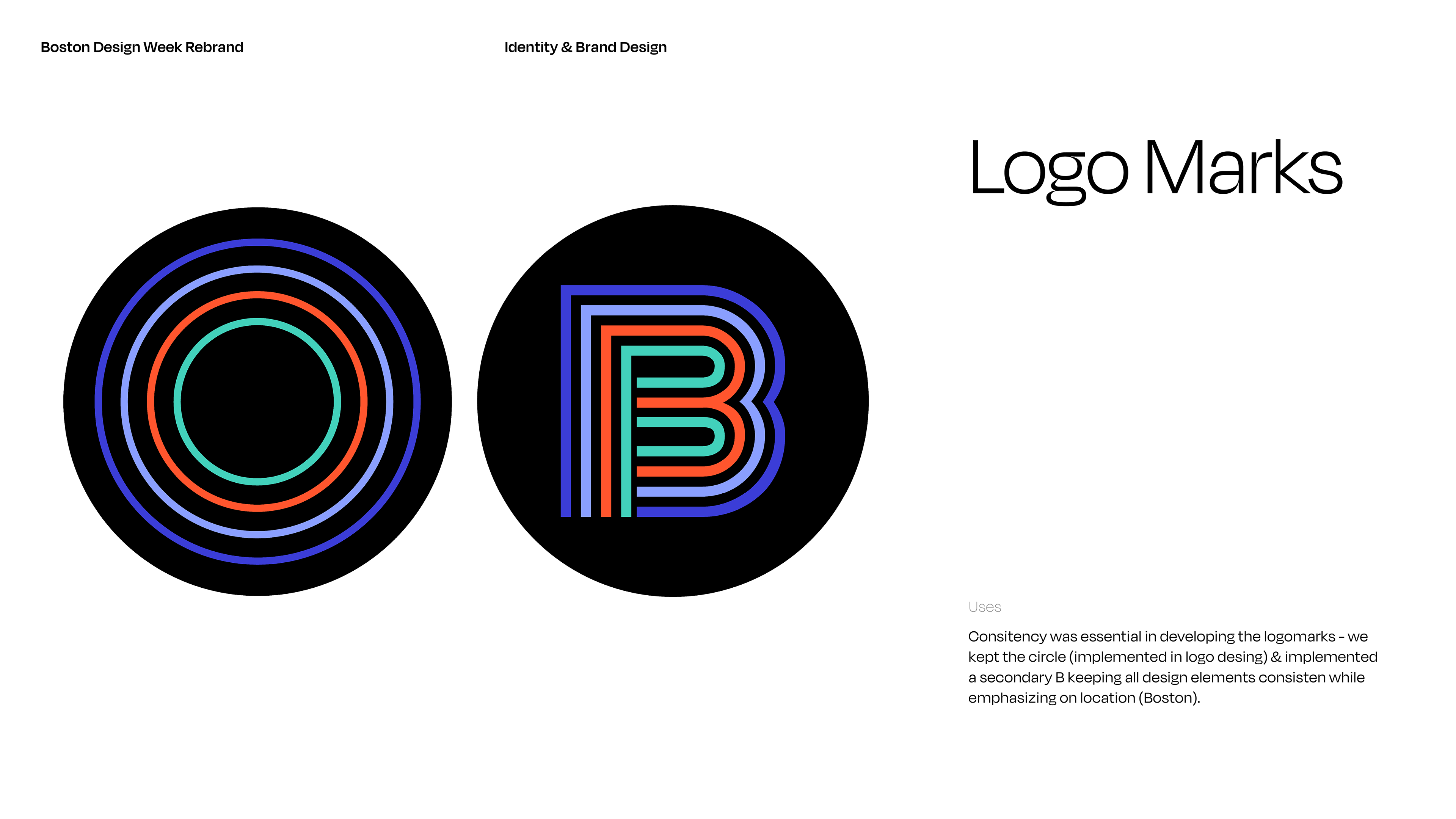
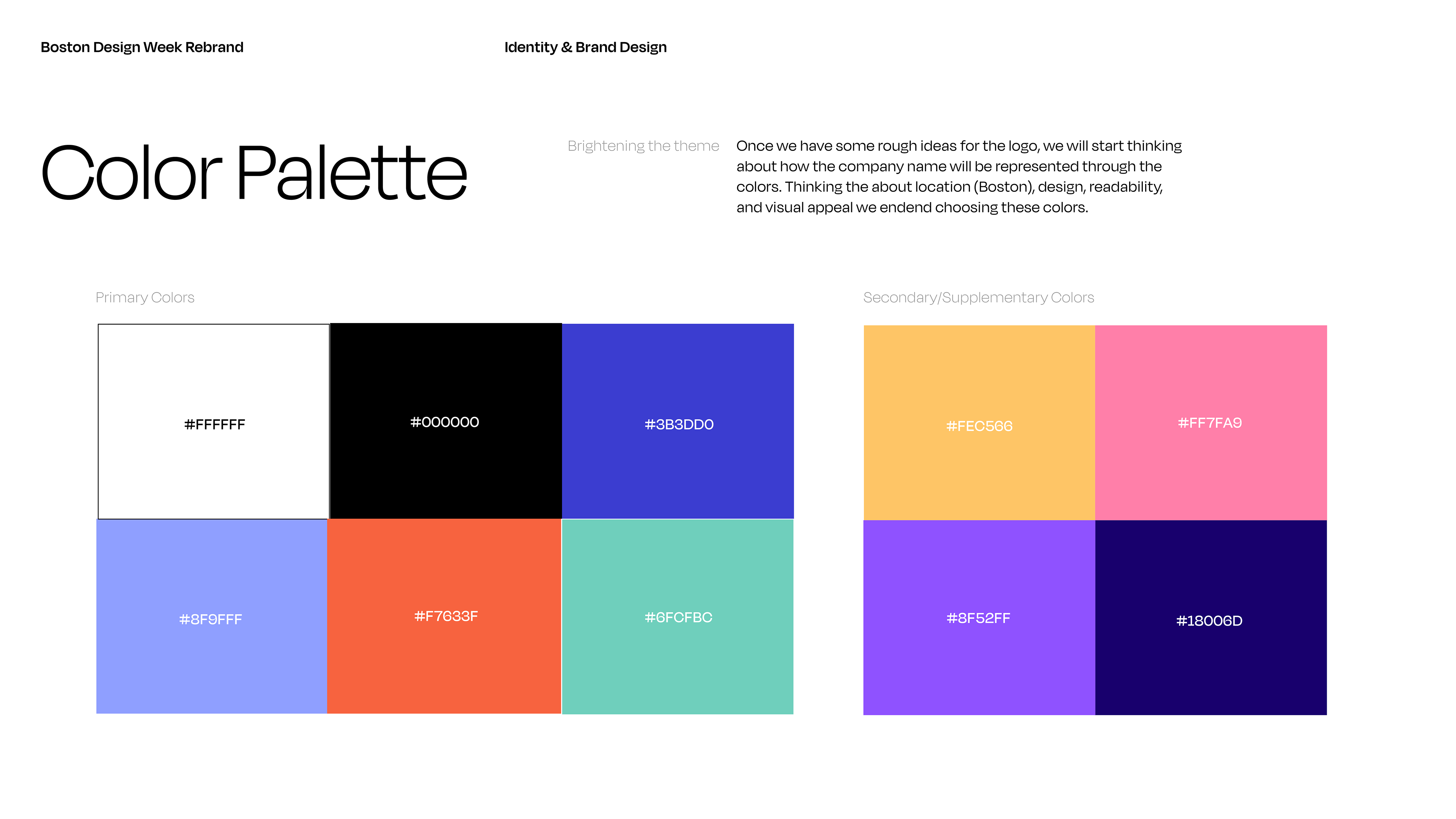
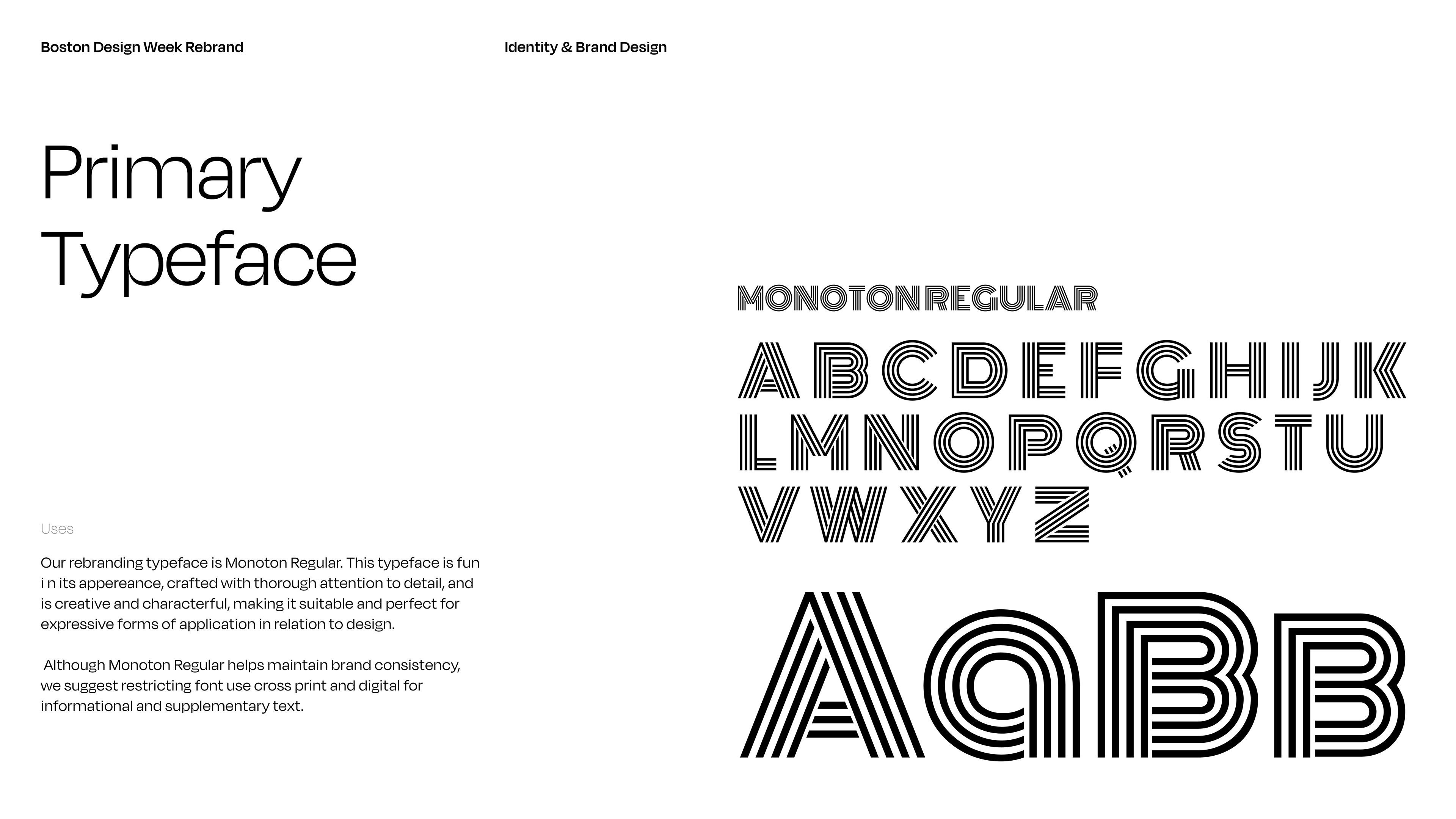
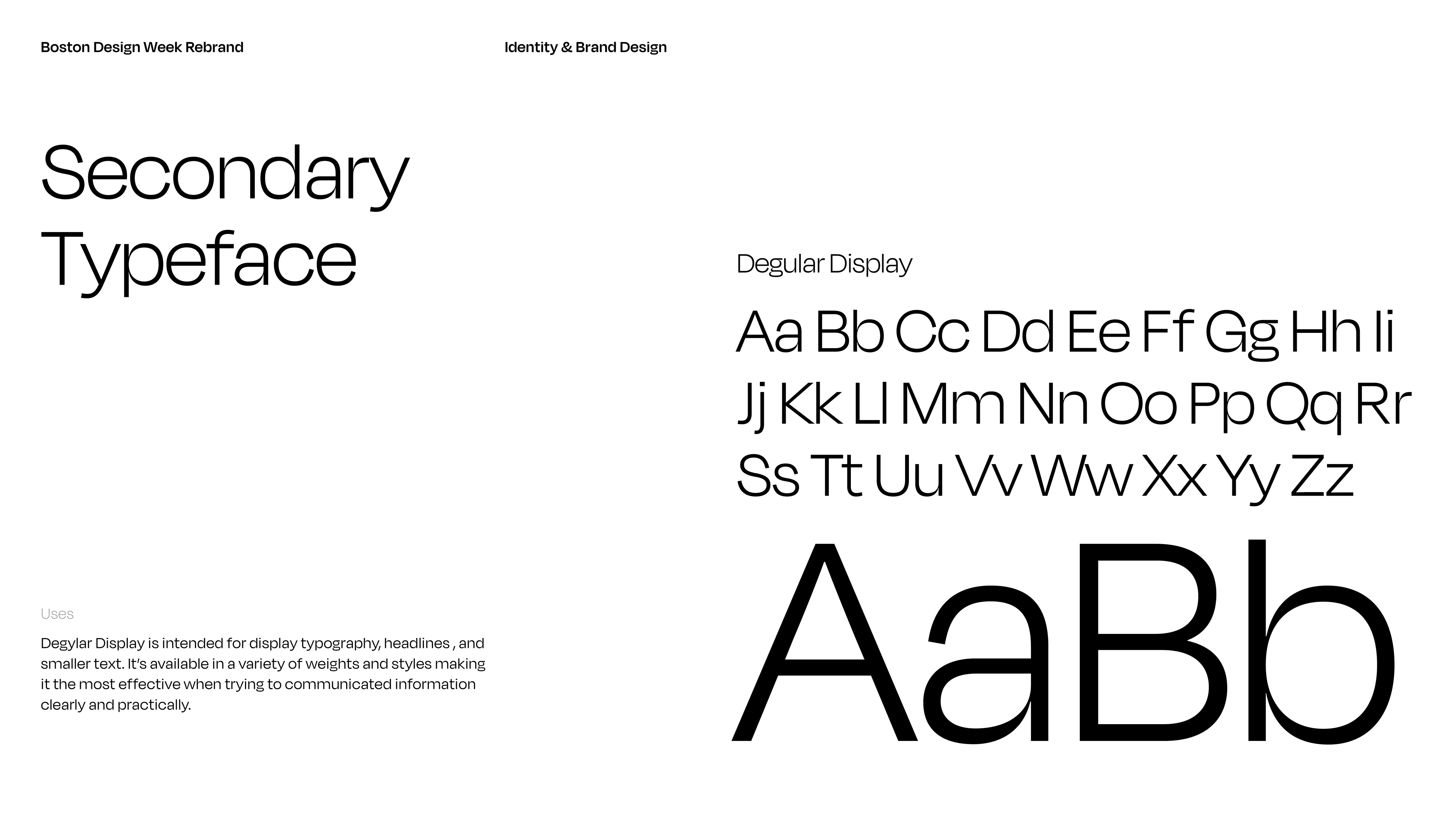
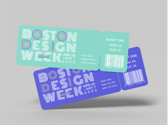
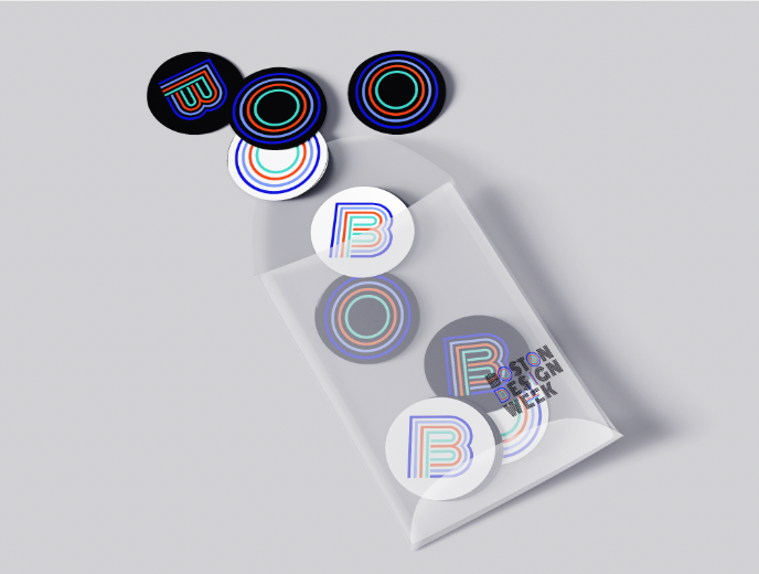
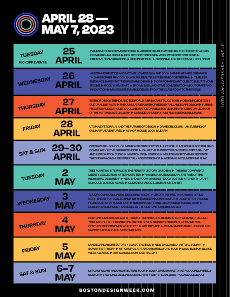
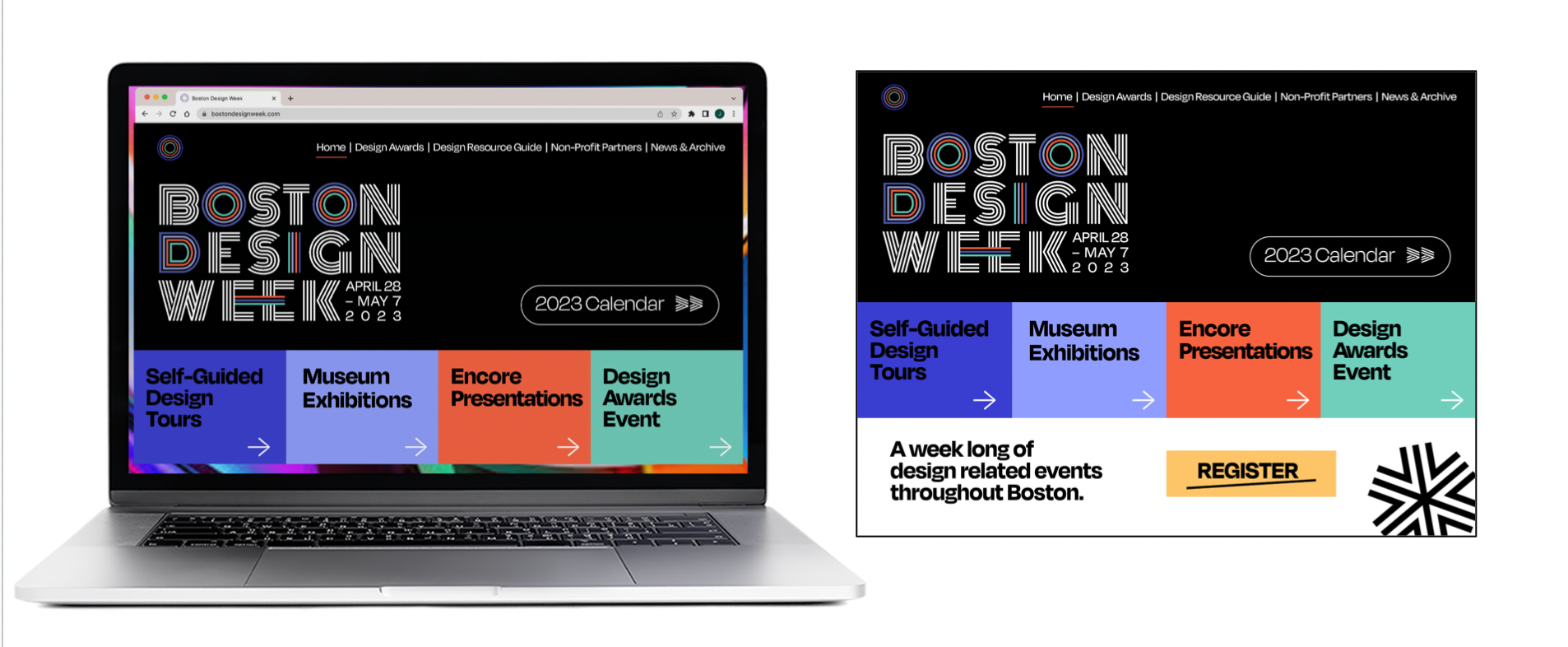
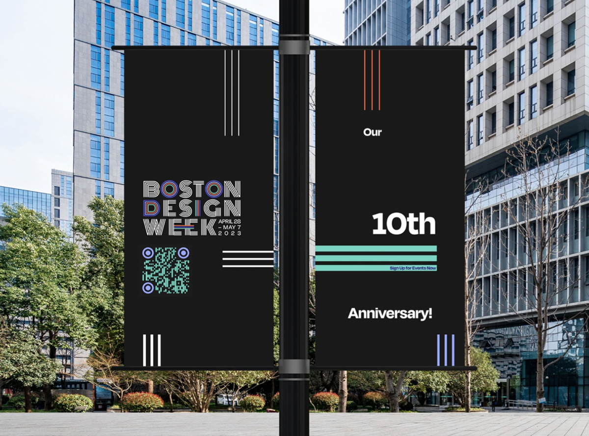
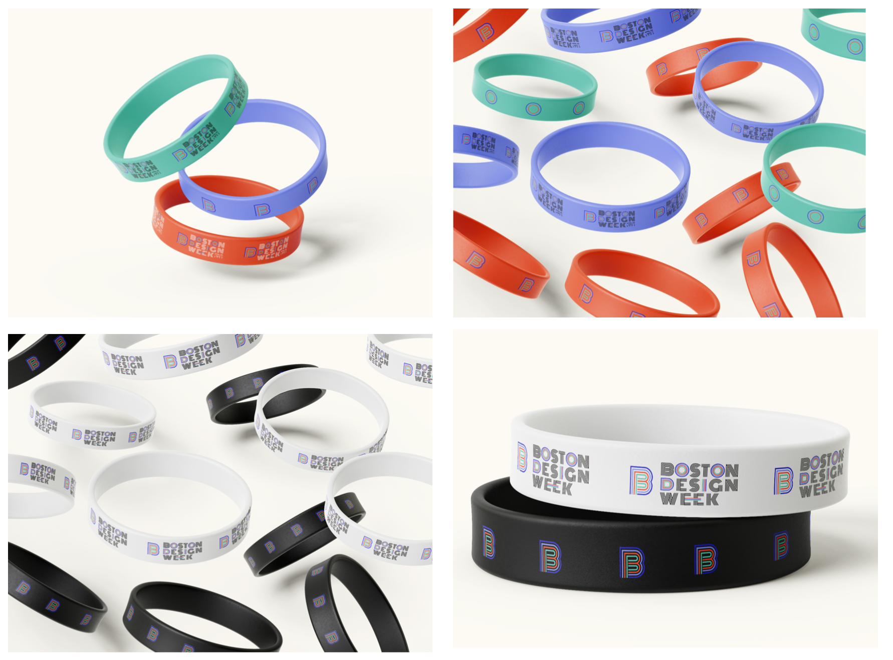
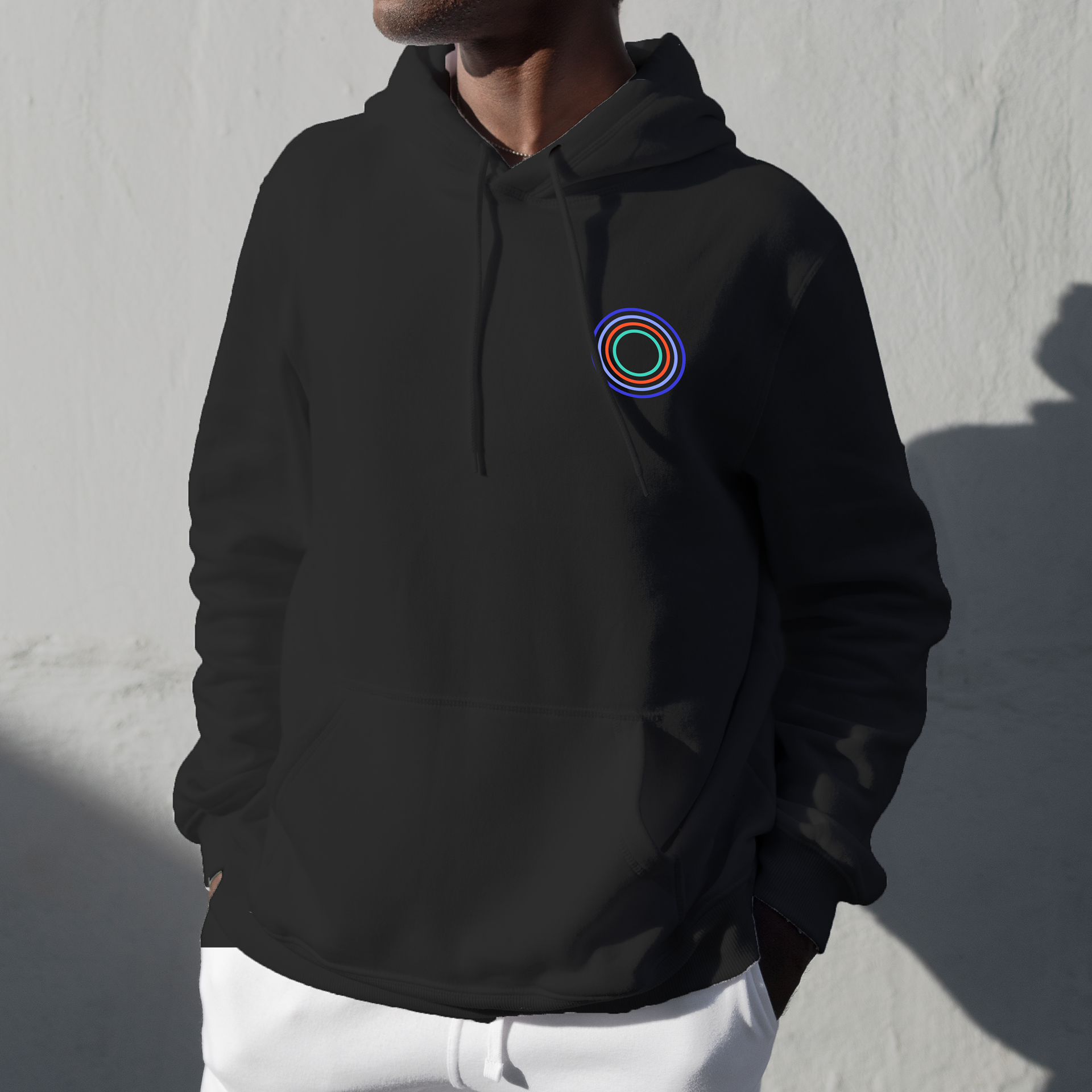
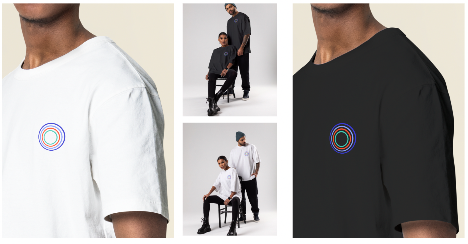
We developed a flexible identity system that included updated typography, a vibrant yet balanced color palette, and textural graphic elements. Our layered circular logo was designed with recognizability in mind, providing a sense of order to the city-wide event. The system was tested across dozens of mockups for web, print, and signage to ensure scalability and clarity.
